![30+ Examples of The Most Exciting 404 Error Pages from Real Websites [PART 1] 30+ Examples of The Most Exciting 404 Error Pages from Real Websites [PART 1]](https://blog.simplified.com/wp-content/uploads/2021/05/The-Most-Exciting-404-Error-Pages-from-Real-Websites-800x400.jpg)
You attempt at clicking an intriguing link and you suddenly come across the “404. Page not found” notification. The 404 page is a landing page no user wants to land on. It’s standard for most companies to say “Sorry, the page you’re looking for can’t be found.” It’s polite, but it’s also expected and boring. A well-designed and creative 404 page design keeps users engaged and motivated. So, the next time you stumble upon a 404 page, remember – within the realm of graphic design, even errors can be transformed into moments of delight and discovery.
What are 404 error pages and what should they include?
A 404, also known as an “error page” is a page that users are directed to if they click a broken or deleted link. A good 404 error page includes:
- An error message
- Brand look and feel
- Light comic relief
- Links to your best content
- Call to Action (CTA)
We at Simplified have compiled our most favorite 404 error pages for you to take inspiration from.
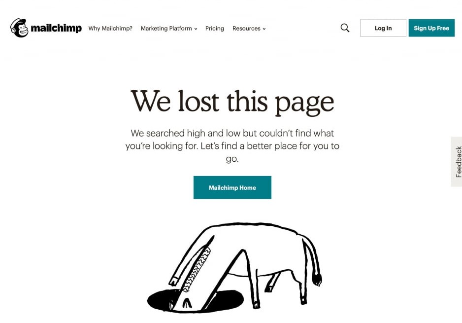
1. Mailchimp
Mailchimp is the most well-known CRM platform at the disposal of marketers. Their website is all about branding and personality. Additionally, their 404 page design is right on the money.
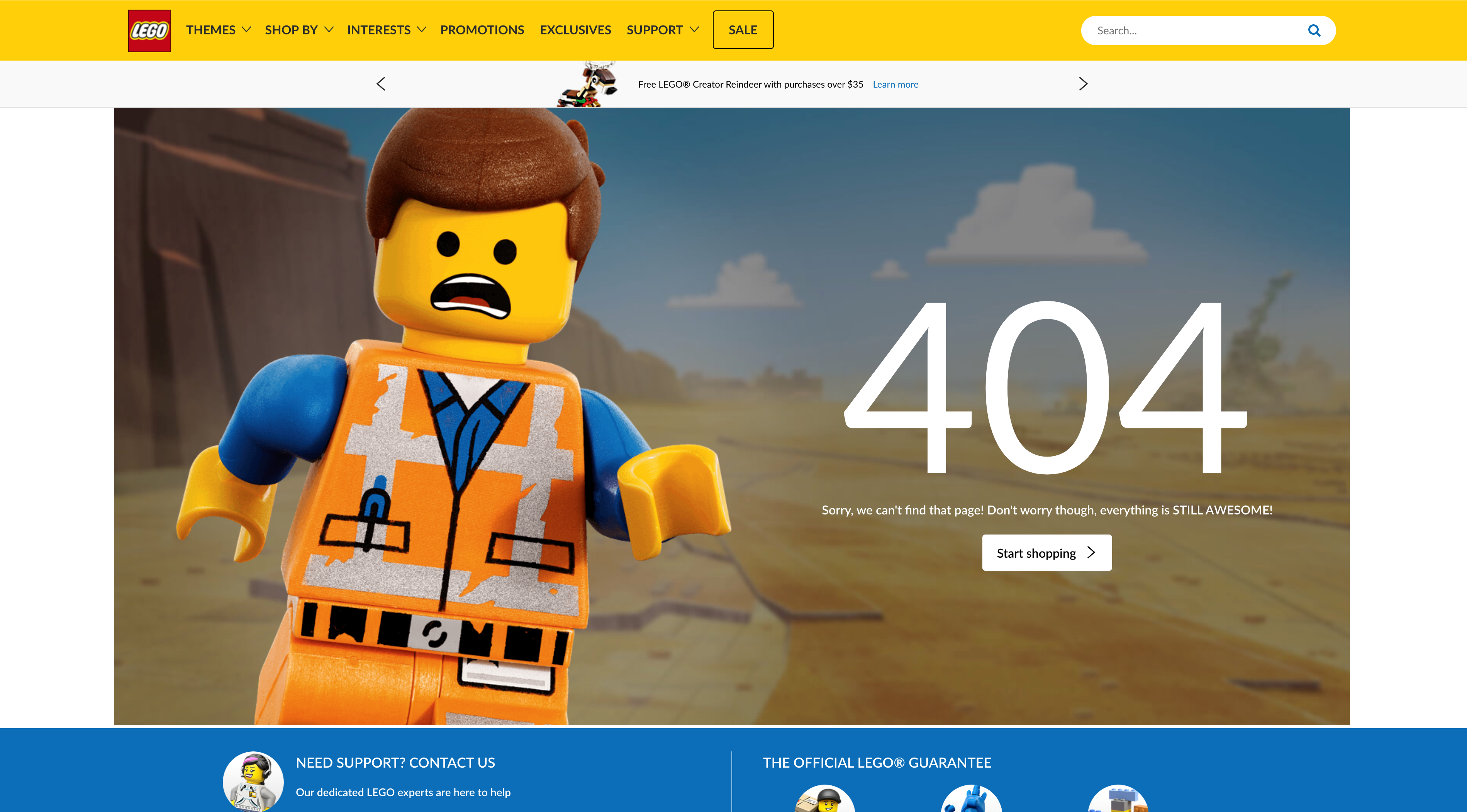
2. Lego
Lego takes a bad situation and turns it into an opportunity. The 404 page design is both on-brand and useful. That is, the page’s CTA redirects the users back to the homepage.
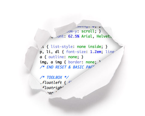
3. CSS Tricks
CSS Tricks bares it all to show what’s at their core. This creative 404 page design is clever and reminiscent of what their brand is about: CSS.
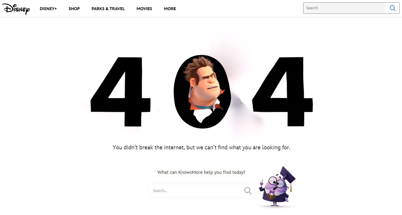
4. Disney
Disney’s witty use of the most popular character for destruction- Wreck-it Ralph is worthy of applause. Moreover, they have added a search bar to ensure users stay on the page.
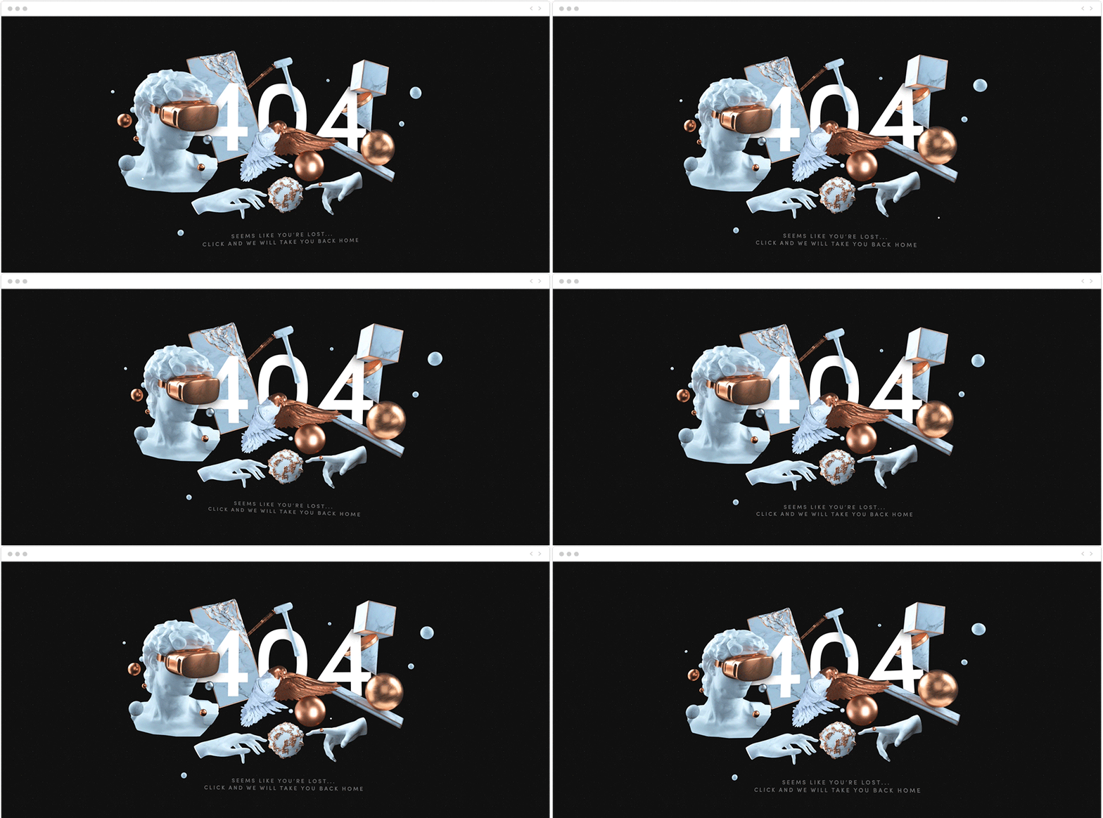
5. The Artery
This artsy 404 page is in sync with the rest of this creative studio’s website. The image moves in response to the cursor and definitely made us linger a little longer on this page. Most importantly though, clicking anywhere on the image directs you back to the home page.
Bonus: 30+ Examples of Exciting 404 Error Pages [PART 2]
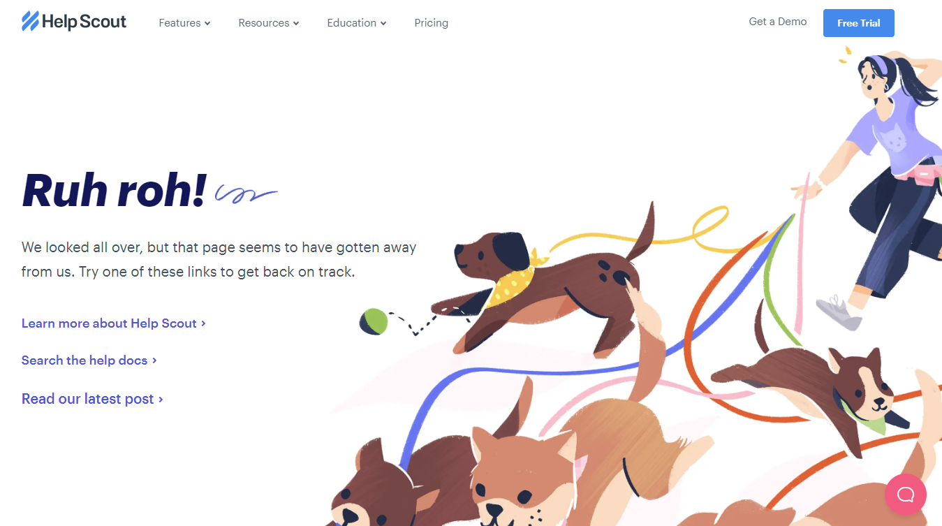
6. Help Scout
Help Scout has perfectly linked the content of the 404 page with the cute illustration of dogs on the right. Their 404 page also has alternate navigational links.
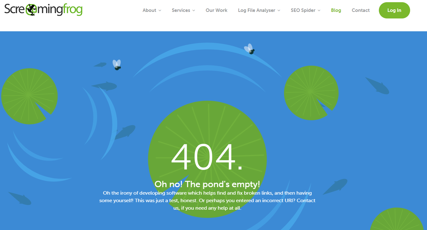
7. Screaming Frog
Screaming Frog is a tool designed to help find and fix broken links. Their 404 error message recognizes the irony and pokes a bit of fun at themselves. They also offer links to their blogs, contact page, and services.
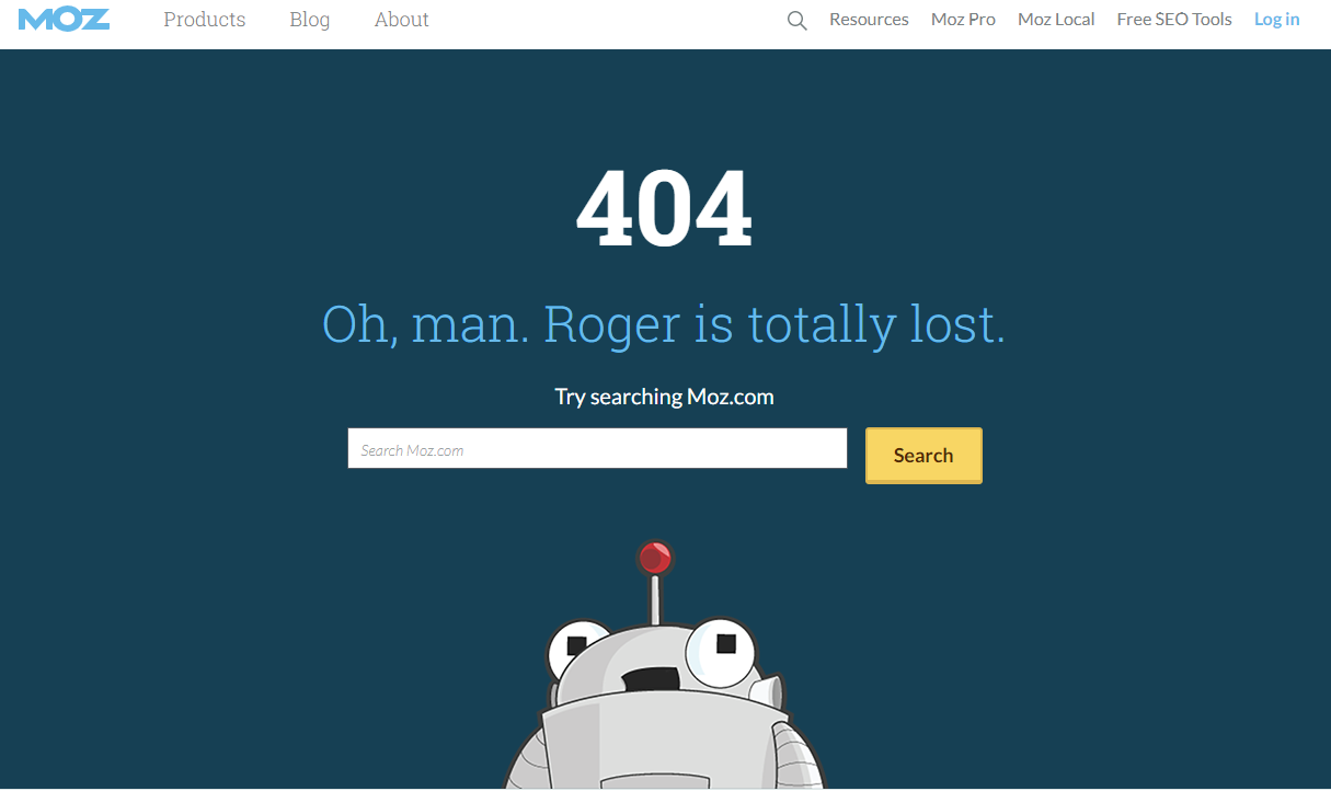
8. Moz
Moz’ cute brand mascot Roger Mozbat makes a cameo to make people smile. Like Disney, their 404 page design also gives you a search bar.
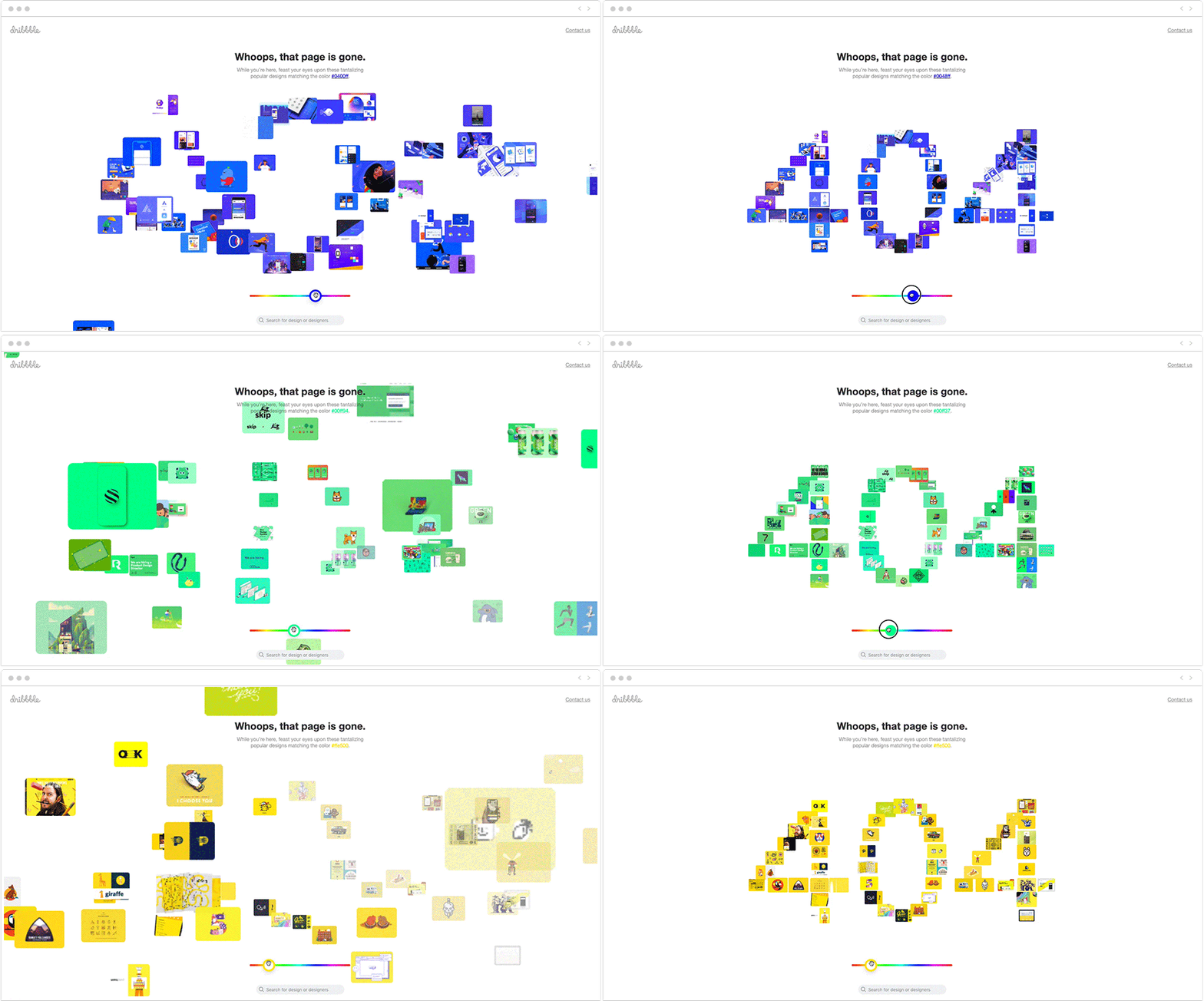
9. Dribbble
Dribbble’s creative and interactive 404 page design is textbook distraction. It also serves as a form of navigation; clicking on any of the images will lead you to the creator’s profile. They’ve also added a search bar and link to their homepage.
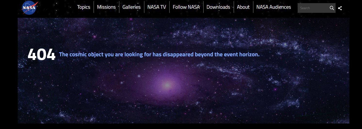
10. NASA
Cosmic humor, navigational links, and on-brand messaging- NASA’s 404 page is exactly what you expect.
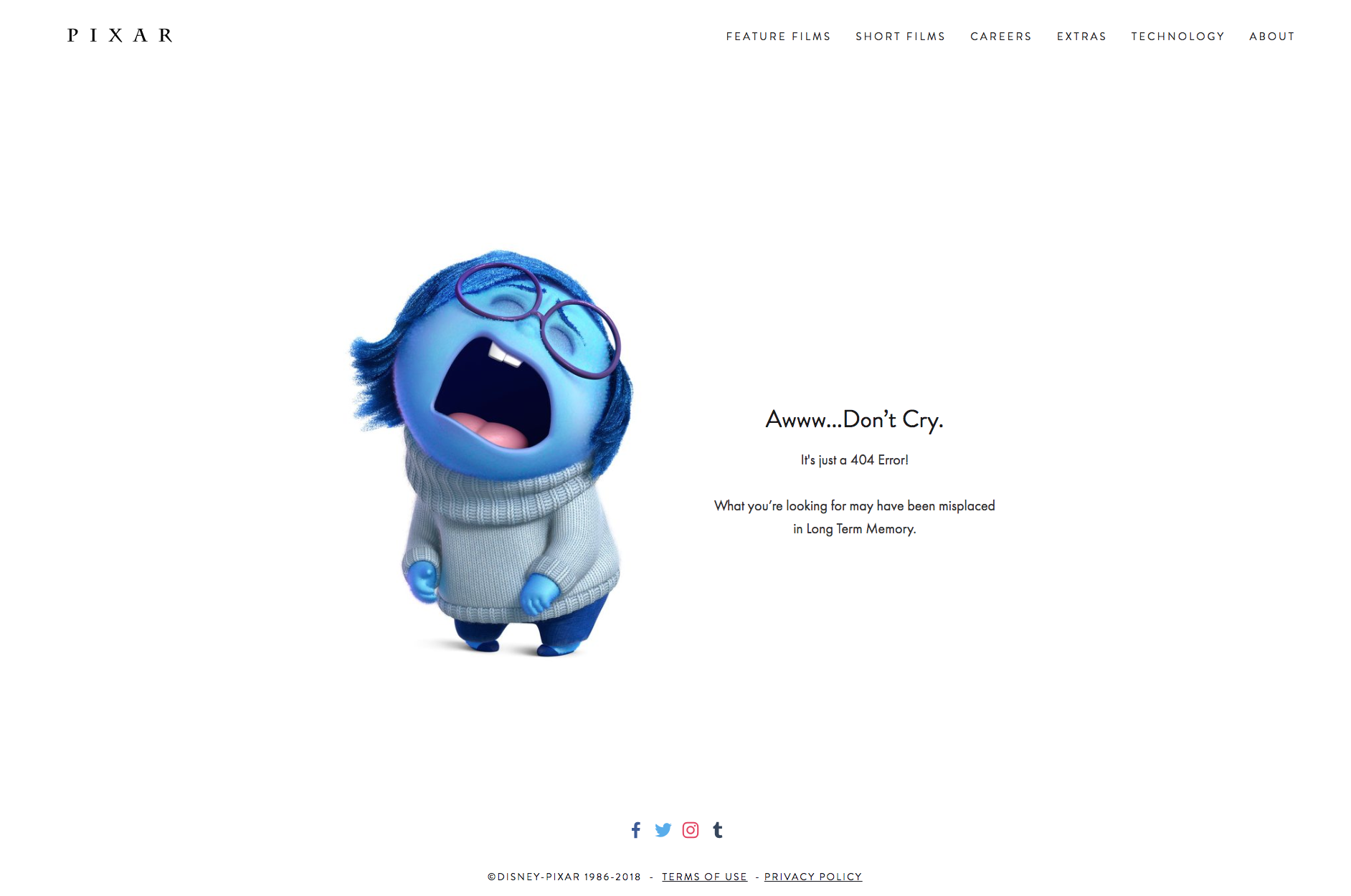
11. PIXAR
PIXAR’s 404 page features Sadness, a character from the much-loved movie, Inside Out. Their use of a familiar character, movie puns, and colloquial language makes the page feel more human.
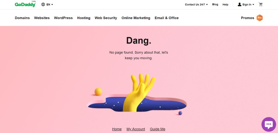
12. GoDaddy
GoDaddy’s 404 page is ingenious. First, they have navigational links. Second, they notify the users that they’re lost without using the 404 error message! Dang! Now that’s good!
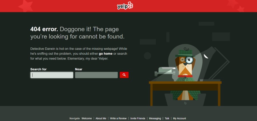
13. Yelp
Yelp has hired a detective dog to solve the mystery behind their lost page and he’s cute as a button! Not to mention, they have added search bars if their users want to redirect to another page.
Other Honorable Mentions
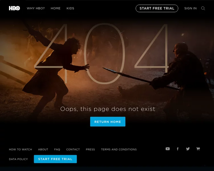
1. HBO
Bonus: 15 Examples of Awesome About Us Pages (and a Free Generator)
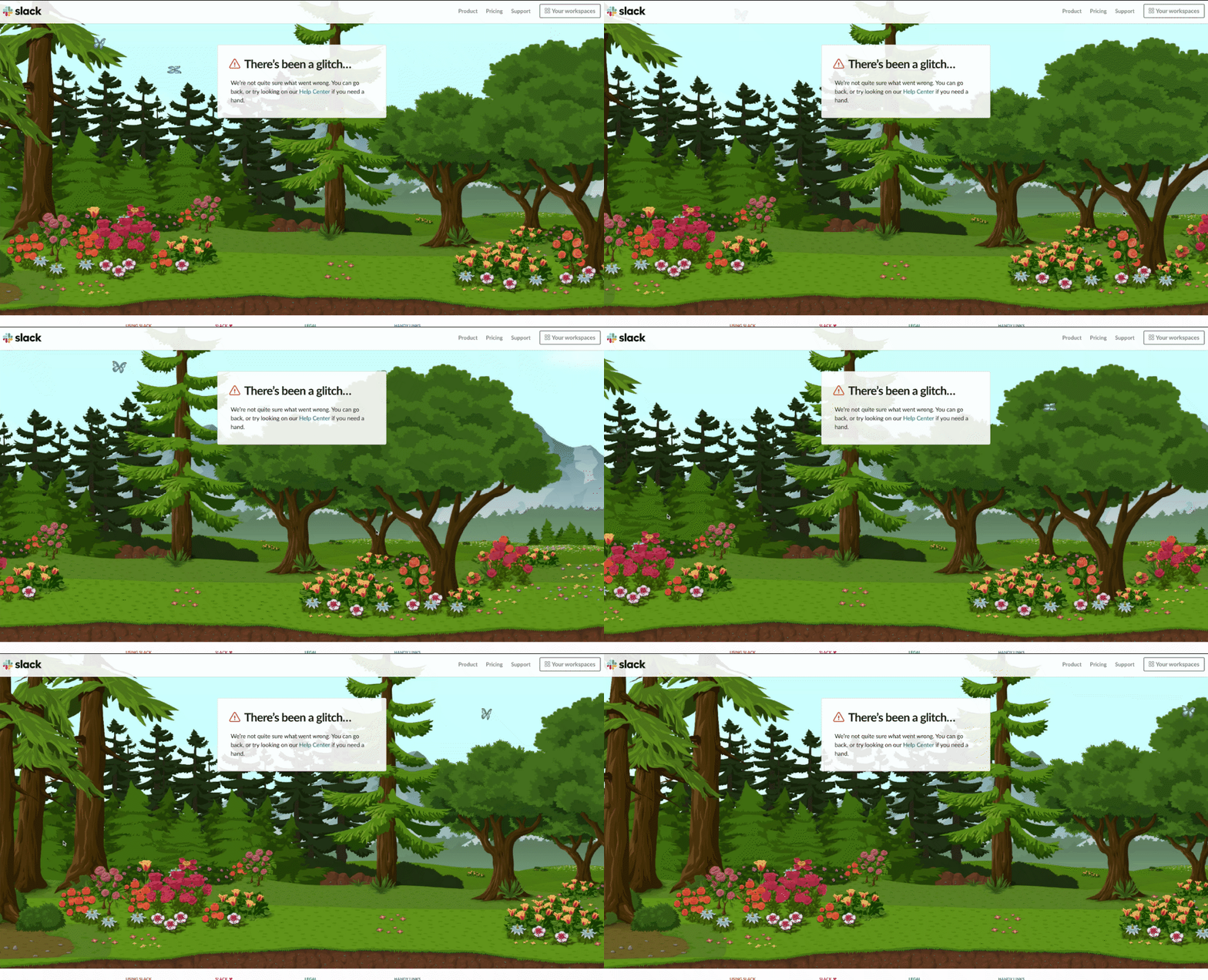
2. Slack
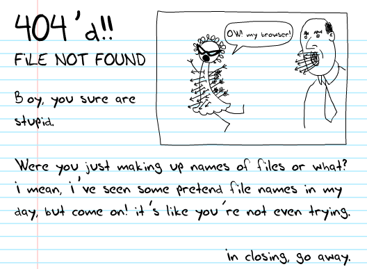
3. HomeStarRunner.com
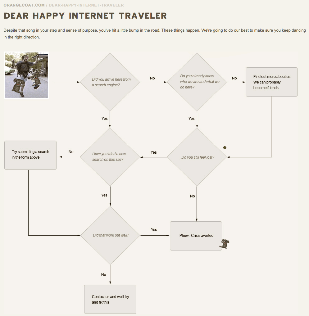
4. OrangeCoat
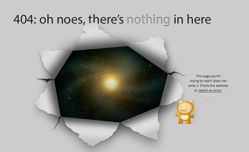
5. Good Old Games (GOG)
It takes time to create 404 pages that draw users in and make them laugh. We hope these examples will inspire you to create your own authentic, funny 404 pages.

![10 Best AI Image Restoration Tools to Try in 2025 [Free & Paid] 10 Best AI Image Restoration Tools to Try in 2025 [Free & Paid]](https://siteimages.simplified.com/blog/Best-AI-Image-Restoration-Tools-01.png?auto=compress&fit=crop&fm=png&h=400&w=400)
![How to Use Photoshop AI Generative Fill Feature [2025] How to Use Photoshop AI Generative Fill Feature [2025]](https://siteimages.simplified.com/blog/How-to-Use-Photoshop-AI-Generative-Fill-01-1.png?auto=compress&fit=crop&fm=png&h=400&w=400)
![20 Podcast Thumbnail Ideas to Boost Your Show’s Visual Appeal + Best Practices [2025] 20 Podcast Thumbnail Ideas to Boost Your Show’s Visual Appeal + Best Practices [2025]](https://siteimages.simplified.com/blog/Podcast-Thumbnail-Ideas-to-Boost-Your-Show-02-1.png?auto=compress&fit=crop&fm=png&h=400&w=400)


