![30+ Examples of Exciting 404 Error Pages [PART 2] 30+ Examples of Exciting 404 Error Pages [PART 2]](https://blog.simplified.com/wp-content/uploads/2021/05/Examples-of-Exciting-404-Error-Pages-800x400.jpg)
While coming across a 404 page may be a dreadful experience for most webmasters, it does not have to be! Imagine your 404 page as your blank canvas. Depending on your approach, you can either make it an entirely functional space or you can turn it into a creative space.
In our previous blog, we saw some brilliant 404 pages, discussed what 404 pages are and what they should include. For instance, your 404 page design should have a link to your homepage, some of your most popular pages, and an HTML sitemap. You can also help your users by adding a search bar.
In this blog we’ve simplified the anatomy of some more creative 404 pages for your inspiration.
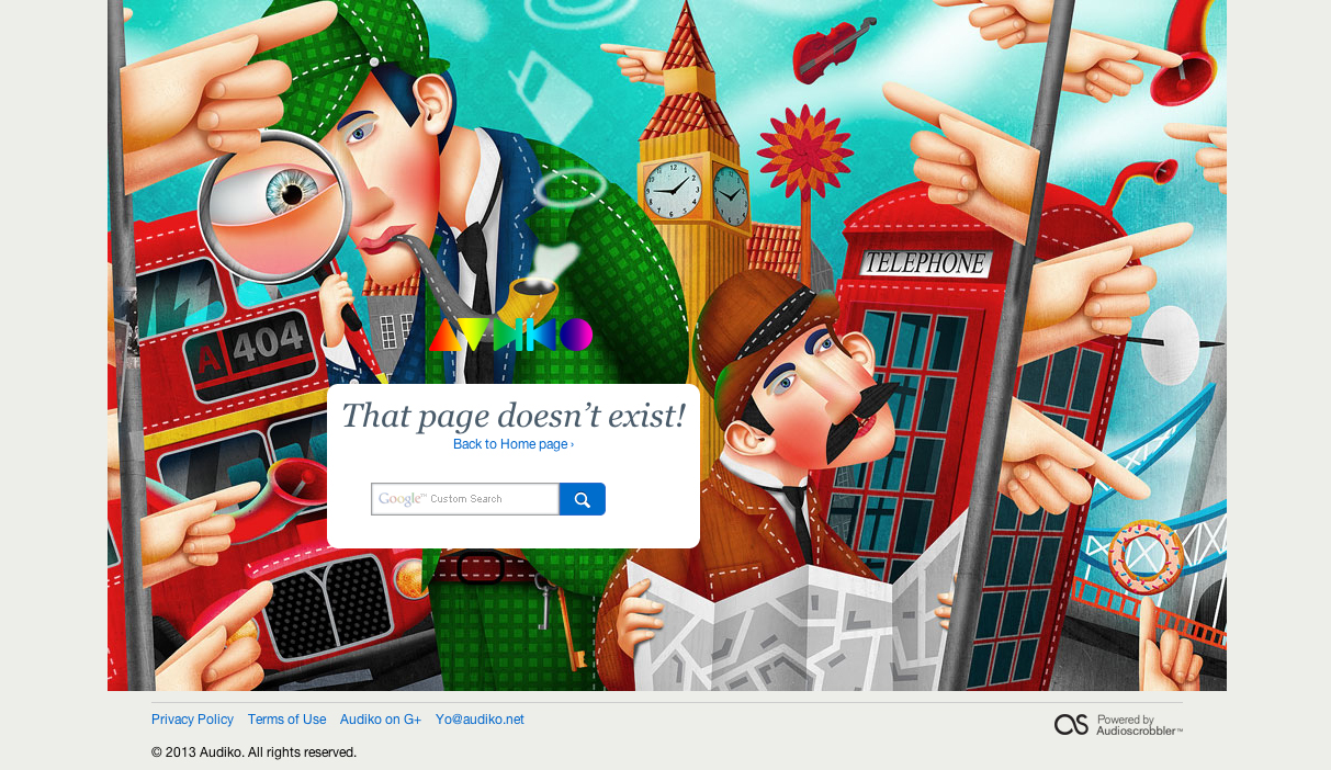
1. Audiko
Audiko has coupled their CTA (return to the homepage) with the coolest illustration we have seen thus far. The artwork on this 404 page is so compelling that you simply can’t help but keep looking at it with amazement; maybe even come back to it later.
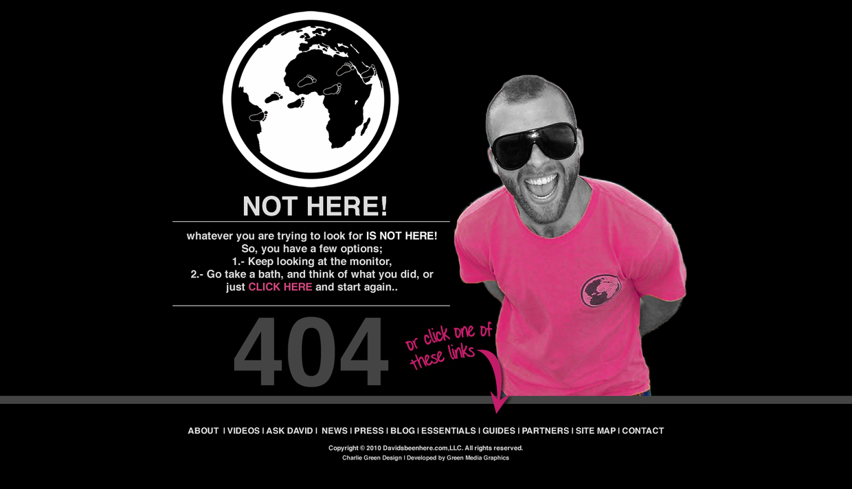
2. David’s Been Here
A ground rule in creating a 404 page design is that it must showcase the brand’s personality. For example, David’s Been Here’s 404 page is cool, and reflects the rest of the website design in a simple and creative manner.
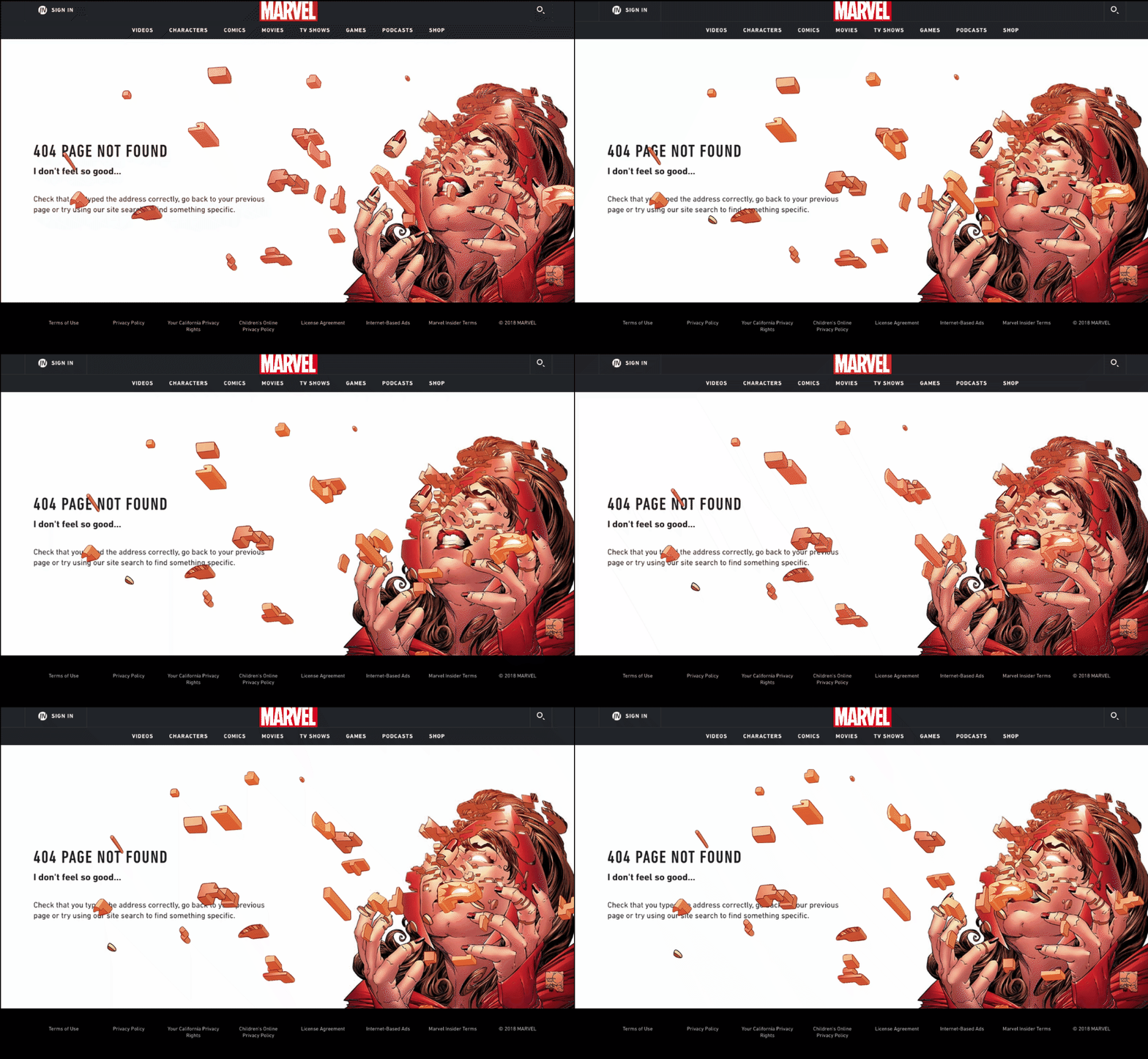
3. Marvel
Marvel’s 404 page is epic. Whether it’s the animation or the copy, everything screams Marvel. That’s not all! There are a few variations that show up randomly on refreshing. We love it, 3000.
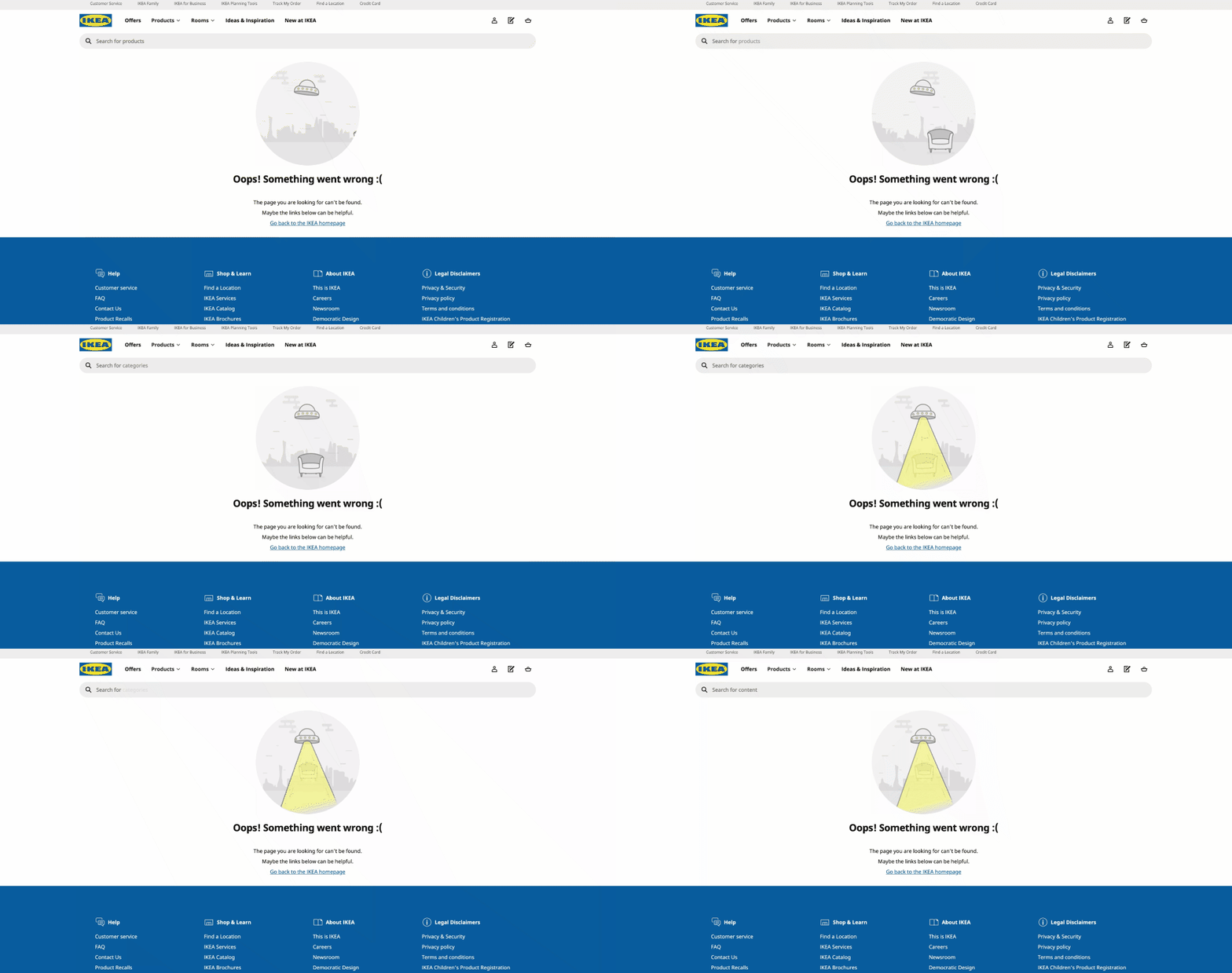
4. IKEA
Even though your furniture has been abducted by a UFO, you have a Search Bar to go back to what you were looking for. For this reason, we rate IKEA’s 404 page creative, adorable, and useful.
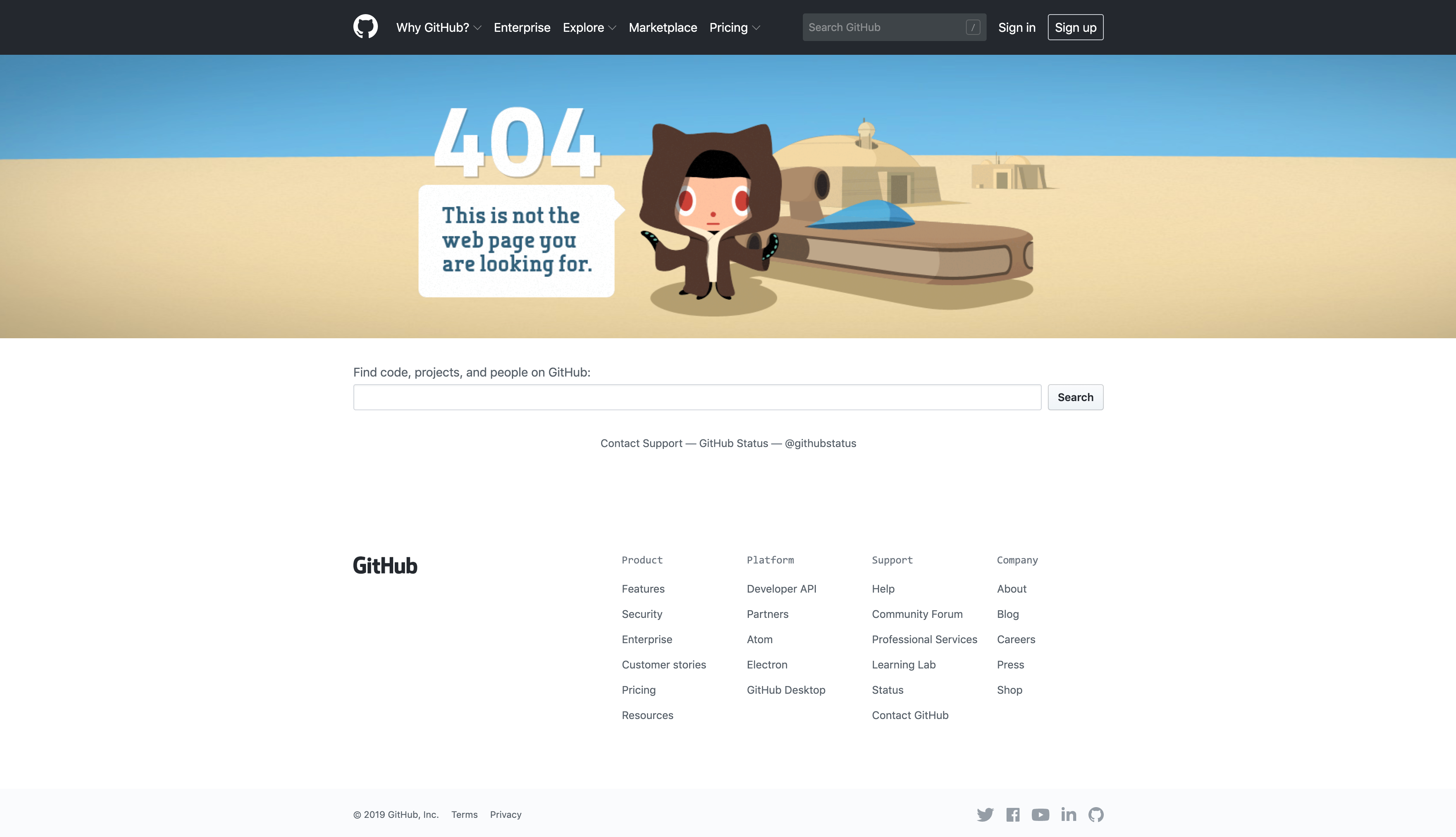
5. Github
Github’s 404 page is absolutely on-brand. The nerd in us loves the nod to Star Wars. The page is also easily navigable for the user.
Bonus: Creative Design Ideas To Make A Vintage & Retro Website
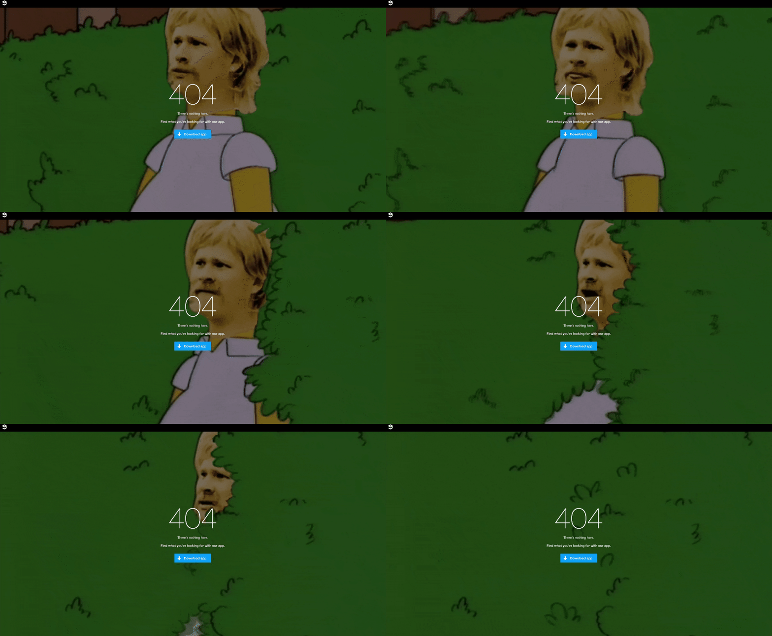
6. 9GAG
9GAG’s 404 page’s sole purpose is to get you to download the app. It only has one CTA, which drives the traffic to convert. The 404 page also has a quirky GIF that resonates well with the brand.
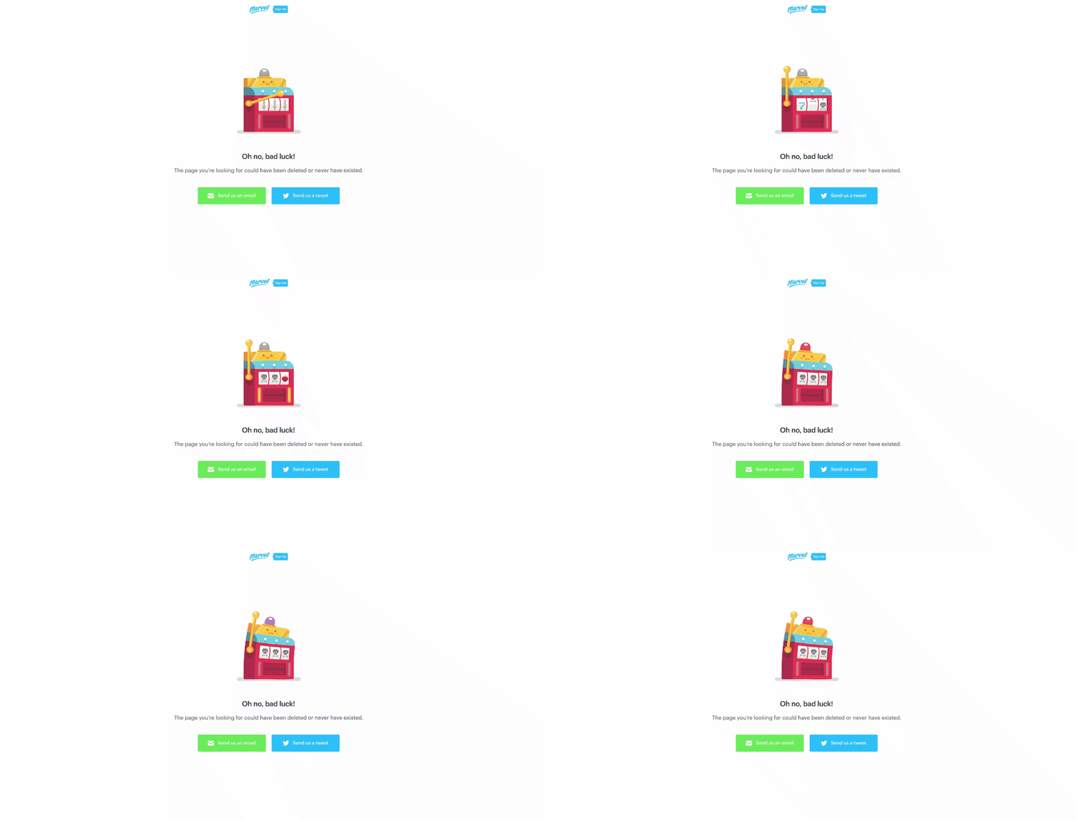
7. Marvel
This isn’t the Marvel you’re thinking of! Marvel is an app for prototyping. The cute slot machine is a play on bad luck and tells the user they’ve landed on a 404 page.
8. ShipDaddy
ShipDaddy’s 404 page design features a funny animation of their brand mascot. The page also provides a navigational link to the viewers.
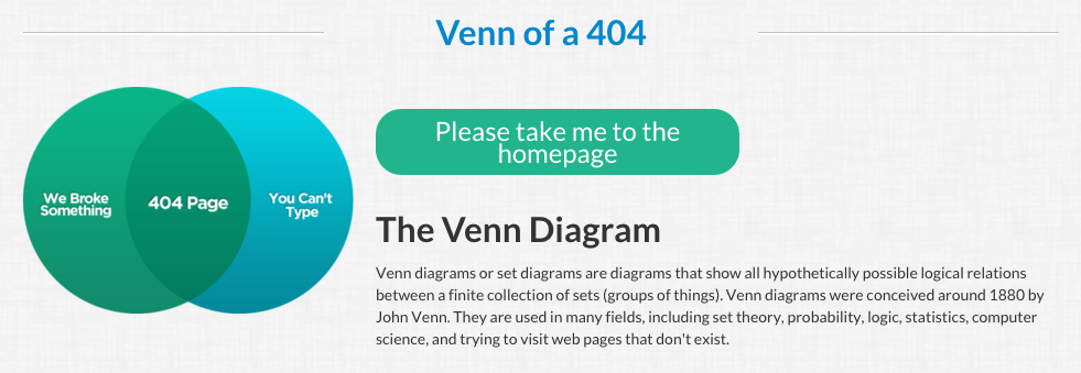
9. Magnt
Magnt shares the responsibility of landing on a 404 page with its users. The error message is funny and the visual serves as a quick way to illustrate their point.
10. Bitly
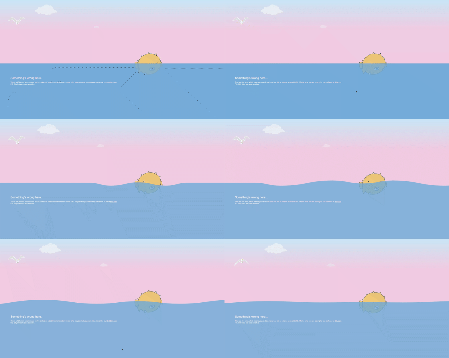
Bitly’s page is another interactive and creative 404 design that incorporates a cute pufferfish that has lost its way. Whenever you scroll your cursor on the water, it creates a ripple! The page also includes links to popular blogs.
11. EveryDollar
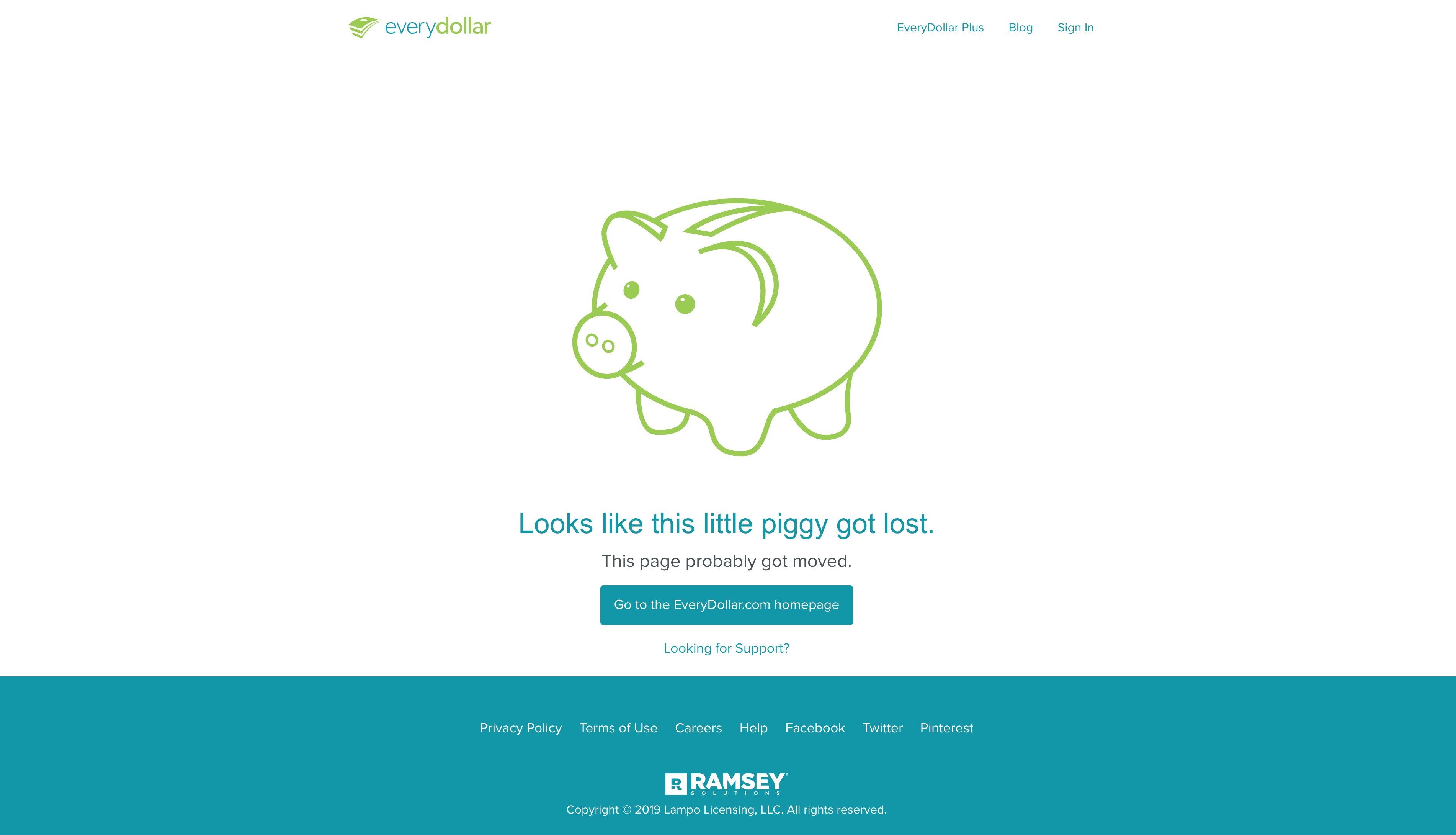
EveryDollar is a budgeting app that helps users take control of their money. Their 404 page is minimalist in design and features a cute piggybank. It also includes top and footer navigations to help users easily find the content they need.
12. Postmates
Postmates has a minimal, on-brand 404 page design. The clever imagery of an empty plate in the 404 is delightful. Postmates also provides a clear CTA for users to head back to the home page.

13. Lyft
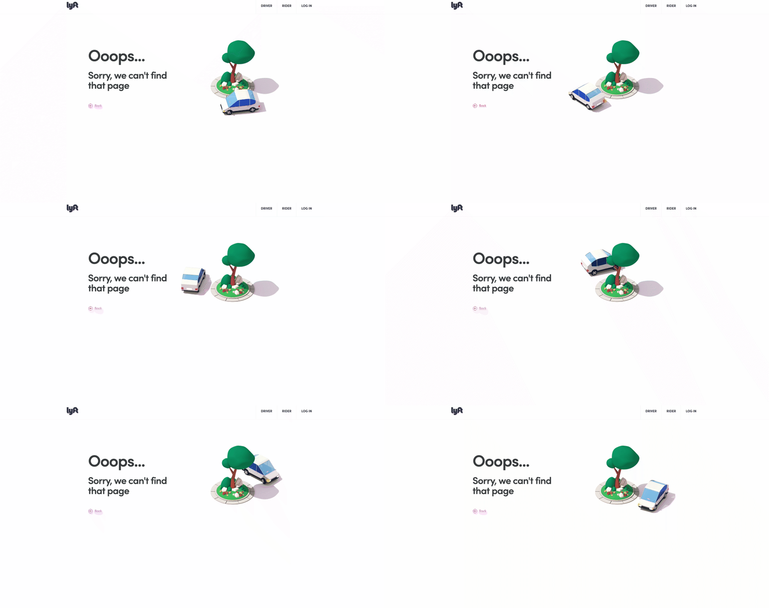
We love Lyft’s 404 page! If you’re feeling a little lost like the driver going around the tree, Lyft features a clear menu at the top. It also provides a link to go back to where you were before getting lost.
14. Hootsuite
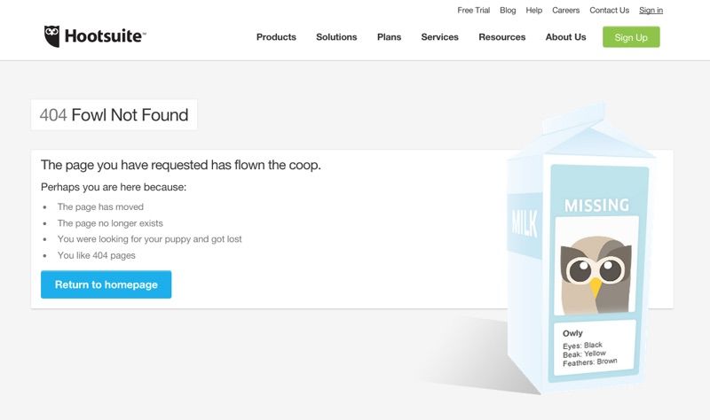
Hootsuite’s 404 page consists of a quirky headline, and props to them for the funny content. The illustration is a missing poster describing what the Hootsuite mascot looks like. The 404 page design also provides a CTA to return to the homepage.
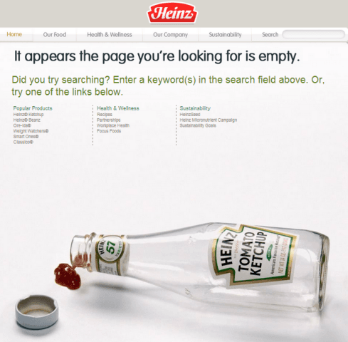
15. Heinz
Say hello to the smartest use of company product! Heinz’ 404 page features an empty bottle of the iconic Heinz tomato ketchup. The page also contains links to popular pages.
Having 404 pages is a part of having a website. They can be frightening, but you can turn these missed opportunities around with a little bit of creativity, authenticity, and humor. We hope these examples will help you take control of your 404 pages today!


![10 Best AI Image Restoration Tools to Try in 2025 [Free & Paid] 10 Best AI Image Restoration Tools to Try in 2025 [Free & Paid]](https://siteimages.simplified.com/blog/Best-AI-Image-Restoration-Tools-01.png?auto=compress&fit=crop&fm=png&h=400&w=400)
![How to Use Photoshop AI Generative Fill Feature [2025] How to Use Photoshop AI Generative Fill Feature [2025]](https://siteimages.simplified.com/blog/How-to-Use-Photoshop-AI-Generative-Fill-01-1.png?auto=compress&fit=crop&fm=png&h=400&w=400)
![20 Podcast Thumbnail Ideas to Boost Your Show’s Visual Appeal + Best Practices [2025] 20 Podcast Thumbnail Ideas to Boost Your Show’s Visual Appeal + Best Practices [2025]](https://siteimages.simplified.com/blog/Podcast-Thumbnail-Ideas-to-Boost-Your-Show-02-1.png?auto=compress&fit=crop&fm=png&h=400&w=400)
