Table of contents
- The basics of color theory
- How do we perceive digital color?
- What are hues, tints, tones, and shades?
- Understanding the Color Wheel: Basics and Beyond
- Primary Colors
- Secondary Colors
- Intermediate Colors
- Monochromatic Colors
- Tertiary Colors
- Tetradic Colors
- What’s the relationship between Colors and Brand Awareness?
- Color Schemes: Creating Beautiful Color Combinations
- Complementary Colors
- Analogous Colors
- Triadic Colors
- How do color techniques help in creating color combinations?
- Color Psychology: How Can Using Specific Colors Help?
- How are color and branding related?
- One Free app to design, collaborate, and scale your work – try Simplified today!
Who knew that using something as fun as colors had a science and a set of rules behind it? Color theory helps you understand the art of using color; though logos and design ideas may seem like a bunch of colors thrown around to most, there’s a method to the madness. If you’re in the branding or content marketing space, you’ve probably been nodding your head as you read this blog. But, if you’re still unsure of what color theory is (or just need a refresher!) and why you should care about it, keep reading.
Color theory is not just for artists and designers but for branding experts as well. It sets forth a set of guidelines that explain the visual effects of specific combinations, color harmony and how well colors can mix and match. With the help of these rules, brands are able to create iconic color combinations which not only help create brand awareness but increase brand recognition as well.

Related: Hues, Tints, Tones, and Shades: What’s the Difference?
But, what role does color theory play in branding?
Colors are the basis of your customer’s first impression of your brand. They’re more than just pretty colors to decorate your website or logo, when used correctly, different colors can express various emotions and messages.
I mean, think about it, when you think of Coca-Cola, aren’t your thoughts just flooded with red and white? Ultimately, color theory is more than creating aesthetic color combinations, it’s about inducing different thoughts and feelings with the strategic use of color.
The basics of color theory
Welcome to Color 101! Let’s talk about the different types of colors that we see in everyday life are, namely: print color and digital color. That’s right, we mainly deal with two types of color to understand color theory in the designing world.
Digital color refers to the way colors are recorded, represented, and manipulated using computers. Essentially, it is the way that you see colors on a screen.
Print color is the way colors are reproduced on paper; it’s what you see in books, flyers, and cards.
Understanding the different types of colors we see every day helps us understand how we should leverage color theory to our advantage. When using a specific medium to showcase design and logo ideas, it is important to remember models which are associated with it. After all, what works for digital colors, may not work with print colors.
How do we perceive digital color?
Being able to differentiate between various colors refers to color perception, whether it is print or digital color. Colors have varying wavelengths, and this data is sent to the brain when we look at them. Once the brain processes this information, it tells us what color we’re seeing leading to color perception. Understanding color perception is, thus, crucial to harness the true power of color theory.
When perceiving digital color, we’re perceiving light waves, and mixing red, green, and blue lights in varying combinations allows us to create different additive colors.
Mixing varying intensities of red, green, and blue lights to create bright or dull hues refers to the additive model of mixing colors or the RGB model. For businesses, especially those in the designing team, it is vital to understand how digital colors are perceived to ensure that they’re able to successfully translate their vision to the screen. What use is color theory, if you can’t envision what the final product will look like?
In print, the subtractive model of mixing colors is used, also known as the CMYB model. When mixing colors using this model, you’re subtracting light from the paper, hence, it’s known as the subtractive model which uses Cyan, Magenta, Yellow, and Black.
When printing a brochure, you need to keep the CMYB model in mind to know how accurate the colors will be.
But…how did we get to an almost unlimited number of colors from just red, yellow, and blue? Well, this is where hue, shade, tint, and tone come in!
What are hues, tints, tones, and shades?

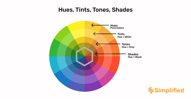
Tints, tones, and shades are nothing but the variation of hues, that is, colors on the color wheel. Variations in hues can be created by making them lighter (adding white to the color) or making them darker (adding black to the color).
When white is added to a color, it is referred to as a tint, while shade refers to the addition of black to any hue or color. Manipulating the tone or the shade of color leads to the creation of different colors on the color wheel. For example, you get pink when you add white to red, and you get a greenish shade when mixing black with yellow.
Adding black and white to a color is referred to as manipulating the tone of the color. Changing the tone of the color manipulates the original hue to make it dull and less intense.
When talking about hues, it is also important to differentiate between chromatic and achromatic colors, which are vital to color theory. Black, white, and grey are known as achromatic colors as they have lightness but no saturation. Achromatic colors are created by mixing complementary colors. However, chromatic colors refer to colors that have even the slightest amount of hue. So, it includes even the lightest of pinks and yellows as well.
Related: All You Need To Know About Complementary Colors On The Color Wheel
Understanding the Color Wheel: Basics and Beyond

Before Sir Isaac Newton started wondering why a bright red apple fell on his head, he used to deal with colors; how exciting is that? The first color wheel was described by him in 1666, which designers and artists continue to use today.
To understand color theory, color schemes and color harmony, it is important to get the basics right. So, roll up your sleeves and take out your Crayola pack cause we’re ready to talk about the Color Wheel.
The color wheel is exactly what it says on the tin, it is a representation of three primary colors, three secondary colors and six tertiary colors. You’ll find the colors arranged in spectral order, and forming a rainbow as they bend into a circle.
When you draw a line through the middle of the color wheel, you can differentiate the warm-toned colors (reds and oranges) from the blue-toned ones (the blues and purples).
Warm colors are usually associated with brightness and energy (think summer holidays and outdoor festivals, what colors come to mind?), while the cool-toned ones are associated with calm and peace (ideal for selecting a color scheme depicting winter mornings).
Understanding the color wheel basics unlocks new ideas and color combinations that you can use for your brand illustrations, and helps you understand the color theory better as well.
Before you can force two colors to be friends, it’s important to see how they interact with each other, isn’t it? The color wheel, along with color theory, helps you understand which colors work well together, and which don’t.
Primary Colors

Most would be familiar with the primary colors: red, blue, and yellow. As the name suggests, these are the three main colors that can be used to create secondary colors and give rise to various new shades. Though they may not look like much, primary colors are the basis of all other colors, giving rise to the colorful world around us. They’re the building blocks to understanding color theory.
🖍Fun fact: TVs, projectors, and other screens use primary colors, which are later mixed together to create new colors depicted on the screen.
Secondary Colors

Basically, the new kids on the block; secondary colors are what you get when you mix primary colors together, mainly, orange, green and purple.
Intermediate Colors

We’ve all used the words ‘yellow-y orange’ or ‘blue-y green’ at least once. Well, color theory is here to the rescue. You’ll be happy to note that it’s not because you can barely differentiate between colors, but rather because these are intermediate colors. These colors are situated between primary and secondary colors, and generally, when naming them you’d name the primary color, followed by the secondary one.
Monochromatic Colors
In color theory, a single color with various tints, shades, and tones is called a monochromatic color. Monochromatic colors depict the dark to light hues of a single shade and look great when paired with a single complementary color.
Tertiary Colors

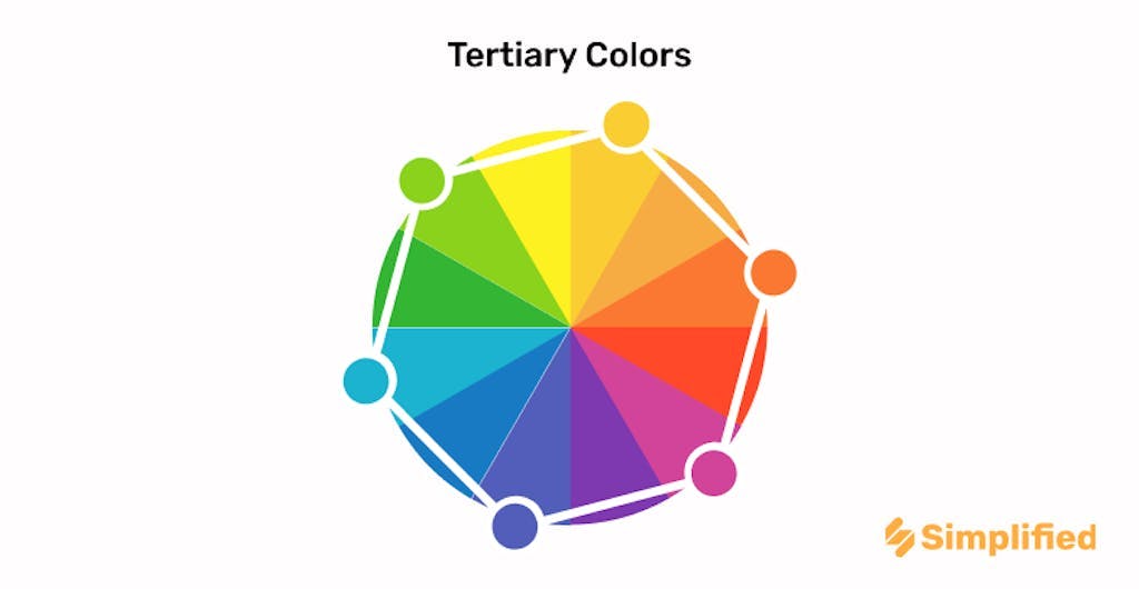
What happens when you combine primary colors with secondary ones? Or if you combine two secondary colors with each other? Color theory says that it’s how you get interesting tertiary colors.
Now, many may confuse intermediate and tertiary colors; after all, both are derived from primary and secondary colors. However, tertiary colors are not as bright as intermediate colors, and can be made by combining two secondary colors as well.
Tetradic Colors

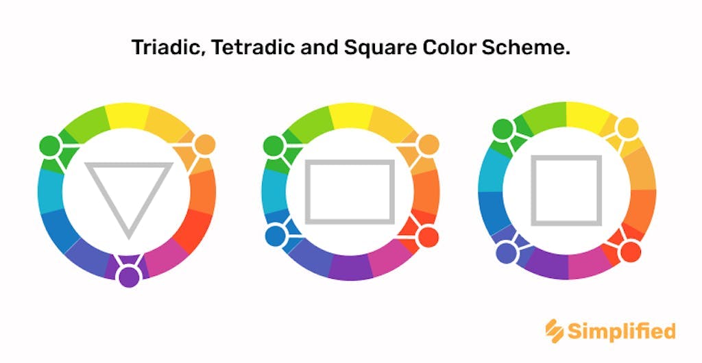
Tetradic colors are created by combining two sets of complementary colors. Don’t know which ones to pick? Color theory suggests selecting four colors that form a rectangle on the color to create a tetradic color scheme.
What’s the relationship between Colors and Brand Awareness?
Color psychology refers to the psychological and emotional connotations that different colors hold; it is an important aspect of color theory. Mostly, these relations are universal in nature, though cultural context can sometimes come into play. Brands use color psychology to help in communicating nonverbal messages which influence snap decisions regarding various products. After all, haven’t you picked something off a shelf because you thought it was a pretty color?
When testing new color combinations for logos or your brand, it is important to understand brand color psychology and how it affects brand awareness. In most cases, a characteristic color will help you recognize a brand much faster, such as recognizing the green straws used for Starbucks drinks or the bright red cans of Coca-Cola.
Want to experiment with color combinations for your Instagram or Facebook that exude #goodvibesonly? Simplified makes it easier for you to test out your coloring and design ideas with easy-to-use templates. Our handy Facebook size guide helps you get your dimensions right and helps you meet all your designing needs (we also have it for Instagram, YouTube, and more!).
Color Schemes: Creating Beautiful Color Combinations
What makes certain color trends more popular than others? From pastel colors for easter to orange and black as Halloween colors, why are some color combinations so iconic? Understanding the techniques behind different color schemes helps you understand the various branding and logo color combination decisions that brands have made. Once you understand color theory a little better, you’ll be seeing logo and design ideas in a new light.
Want to test out your color schemes? Simplified can help you create everything, from logos to billboard ads and more.
Complementary Colors

Color combinations that are derived by selecting colors on the opposite sides of the color wheel are complementary colors. Generally, a warm color will paired with a cool one to give rise to a contrasting yet complementary color scheme. However, color theory suggests that when creating complementary color schemes for your branding, it’s important to pick one color which will be the focus of your design.
Keeping both colors in high saturation may lead them to clash and look harsh as a color combination.
Analogous Colors

Analogous color schemes are quite popular and are created by using three or four colors that are located quite close to each other on the color wheel. According to color theory, Analogous colors are created by using colors that closely resemble one another but do not have the same trait. Though there are no specific rules when creating analogous color schemes, usually, there’s one dominant or ‘mother’ color within the color scheme, and others are selected to complement this color.
Triadic Colors

When you want to incorporate bright, vibrant colors into your design, triadic color schemes are the way to go. Triadic colors are derived by selecting colors from the color wheel which form a triangle. Hence, in color theory, triadic color schemes are usually composed of highly contrasting colors.
Related: Hues, Tints, Tones, and Shades: What’s the Difference?
How do color techniques help in creating color combinations?

Understanding the color wheel, and how the colors are placed in it helps us understand color harmony, a crucial aspect of color theory. When you look at the color wheel, it’s easy to find color combinations which will be aesthetically pleasing, and look harmonious when used together.
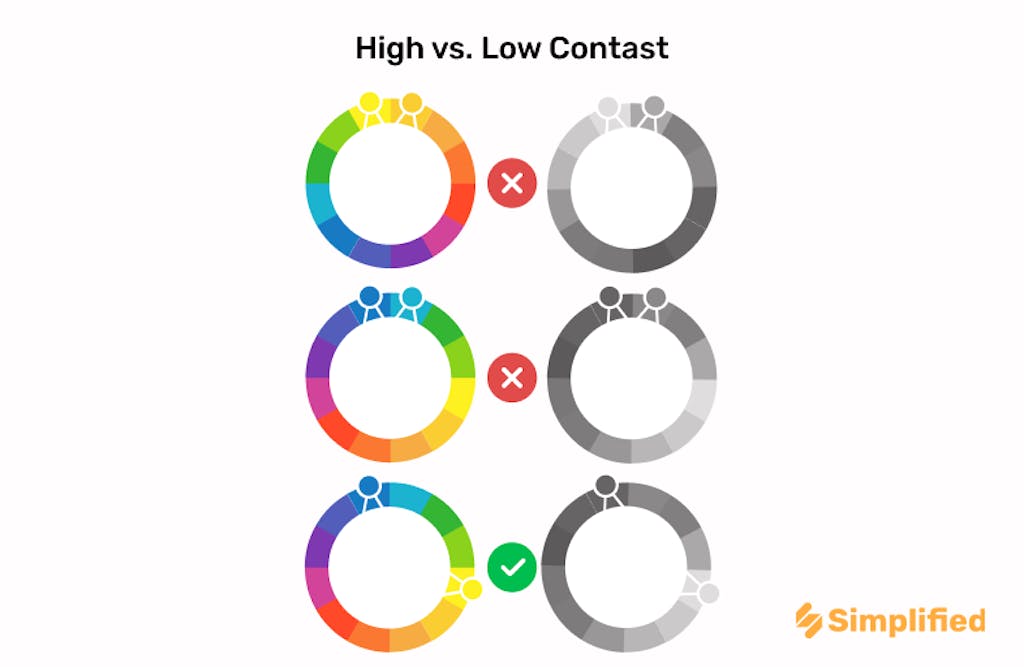
When it comes to finding the right color balance, it is crucial to understand how light and contrast work. Contrast refers to the difference between two colors, and how they stand apart. It is not just the aspect of colors being in different color families, but striking a balance between light and dark.
Tip: To know whether you have a contrasting color combination, convert it into greyscale to see the difference!
At Simplified, we know how difficult finding an evergreen color combination can be. Ensure you never lose the perfect match with Simplified’s Brand Kit! We’ve made it easier for you, and your designing team to store all your branding necessities, such as logos, fonts and more, in one place for easier collaboration.
Color Psychology: How Can Using Specific Colors Help?
It’s not just warm or cool-toned colors that can affect your perception, but various hues across the spectrum as well. Understanding what emotions various colors evoke is worthwhile when making branding decisions; it’s why brands geared towards women are so keen to learn the pink color theory to help their branding efforts. Looking at examples of various brand color palettes, you can not only create an aesthetic color combination but one which has positive emotions attached to it as well.
Green


When you’re looking at a product with a green label, it is natural for you to associate it with being natural or organic. Hence, before you’re even processed what’s written on the label, the colors associated with the product have already influenced your perception.
Yellow (and Red!)


Brands are well aware of this and use it to their advantage to create enticing color palette combos. For example, McDonald’s logo uses red and yellow which are associated with positivity and passion. Moreover, the characteristic yellow of the McDonalds logo also gets you thinking about their signature fries and amps up your craving. Think about it, how many times have you skipped on ordering the fries?
Blue


Blue is often associated with dependability and serenity; you’ll find many corporate companies using blue and it’s complementary colors in their logo to give off an air of dependability and trust. It helps bring a sense of stability to your brand, attracting more customers and helping them feel assured.
Ultimately, understanding color theory and color psychology is crucial to creating logos that not only look good but feel good as well. A brand logo is vital, and you want to make an informed choice when selecting various designs. It not only helps you express your brand identity but also narrows down your choices when making branding and marketing decisions.
Get a head start in building your brand with a custom-made professional logo! Wondering how? Well, head to Simplified’s Logo Maker to see how easy it is!
How are color and branding related?
Understanding the basics of color theory helps guide your brand identity design; should you go for a black and yellow branding for your fitness store, or are there better choices out there? Using color theory, you’re able to evoke different emotions and convey different messages. It not only guides your branding and logo making decisions, but also helps you understand your competition, and how they may be using specific color combinations.
All marketing tactics use emotions to drive actions, what could be an easier way to accomplish this, than with the use of color? Brands have successfully used color theory to drive brand recognition, and some have even trademarked the iconic colors which represent their brand.
From Tiffany Blue (which was once selected as the Pantone Color of the Year) to Barbie Pink, brands successfully leverage color psychology to build a stronger presence and awareness.
Every color carries its own meaning, Pink is associated with femininity and you’ll see brands use it for packaging products that are created for women. Luxury brands often use black to evoke a sense of power and mystery; it’s seen as a sophisticated color that pairs well with most other hues on the color wheel.
It’s best to be as creative as possible when deciding your brand colors, but also to keep the inherent associations of different colors in mind. By combining Color Theory and Color Psychology, you can convey your brand’s message inexpensively.
Evidently, creating color combinations is not easy; you can’t just materialize them from thin air. To come up with interesting, unique, and attractive color schemes, it is important to not only understand the meanings that different colors convey but follow a specific set of guidelines, that is, color theory, as well. Sounds complicated, doesn’t it?
Allow Simplified to, well, make it simple for you and your team. You don’t have to run back forth with designs when you can collaborate virtually! Creating everything, from social media posts to ads and even Instagram stories haven’t been as easy as Simplified’s templates make them. Don’t believe us? Try it for yourself, it’s a free forever app that’s just begging you to let your creativity shine.


