By
By - 2026 design trends blend AI-powered efficiency with human creativity and bold visual choices
- Key movements include bold minimalism, textured grains, maximalist illustration, and nostalgic elements
- Marketers without design backgrounds can now create professional trending designs using AI tools
- Gothic badges, metallic finishes, and retro serifs are dominating branding and social media
- Tools like Simplified make these complex trends accessible to non-designers in minutes
Table of Contents
- Why Graphic Design Trends Matter for Marketers
- The 8 Graphic Design Trends Dominating 2026
- How to Create Trending Designs Using Simplified
- Choosing the Right Trends for Your Brand
- Common Design Mistakes to Avoid
- FAQ
Why Graphic Design Trends Matter for Marketers
Design trends aren’t just aesthetics. They’re visual language that communicates whether your brand feels current, trustworthy, and relevant.
When your designs look dated, audiences make instant judgments: outdated design equals outdated products, services, or thinking. Fair or not, that’s the reality. A brand using 2018 gradient styles in 2026 signals the same way a restaurant with a 2010 website does.
The business impact of good design:
- 75% of consumers judge a company’s credibility based on website design (Stanford Web Credibility Research)
- Posts with compelling visuals get 94% more views than text-only content (HubSpot)
- Consistent brand presentation increases revenue by 23% (Lucidpress)
- 67% of consumers say image quality is very important in product selection (MDG Advertising)
The challenge for marketers: Design trends evolve faster than most teams can keep up. What worked in 2023 feels stale by late 2024. Hiring designers for every social post, ad, or email header isn’t realistic for most budgets.
This guide breaks down the graphic design trends actually dominating 2026, not just predictions from trend forecasters. More importantly, you’ll learn how to execute these trends yourself using accessible tools, no design degree required.
The 8 Graphic Design Trends Dominating 2026
1. Bold Minimalism (Not Your Quiet Minimalism)
Minimalism isn’t new, but 2026’s version has teeth.
What’s different: The whisper-quiet minimal aesthetic is gone. Bold minimalism uses aggressive color contrast, oversized typography, and unexpected graphic elements. Think Apple’s minimalism but with electric colors and stronger personality.
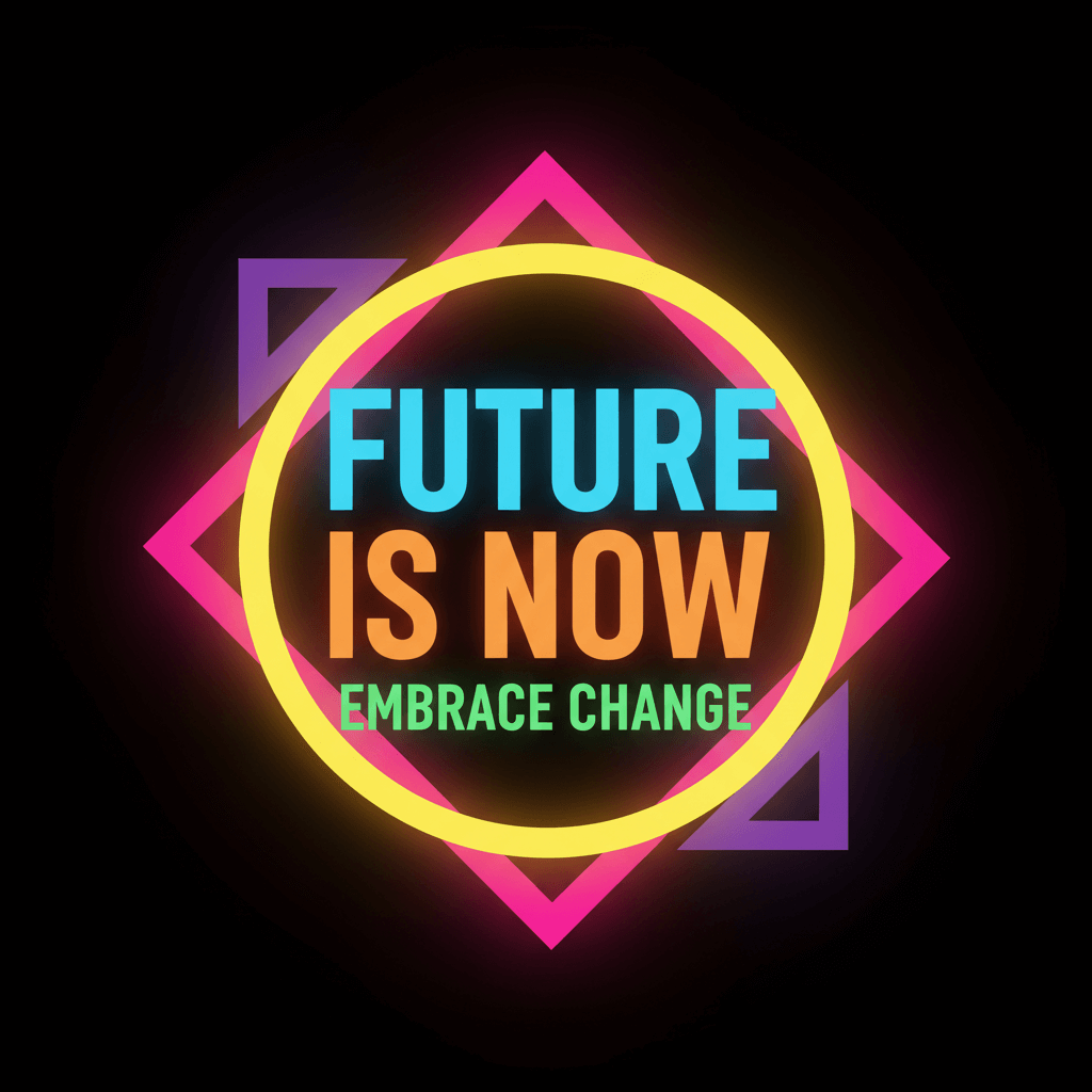
Visual characteristics:
- High contrast color combinations (black and neon, white and deep jewel tones)
- Massive, assertive typography as the primary design element
- Strategic use of empty space to direct attention forcefully
- Geometric shapes as bold focal points, not subtle accents
Where you see it: Tech brands, fashion e-commerce, premium service providers, SaaS companies wanting to feel modern without being cold.
Why it works: Cuts through noisy feeds immediately. Says “confident” without saying anything. Mobile-friendly since it relies on simple elements that load fast and read clearly on small screens.
2. AI-Powered Design (No Longer Optional)
AI design tools moved from experimental to mainstream. Not using AI in 2026 is like not using spell-check in 2015.
What’s happening: AI now handles ideation, layout generation, asset creation, and variation testing. Designers focus on strategy and refinement while AI handles execution speed and options generation.
The shift: Two years ago, AI-generated designs looked generic. Now they’re sophisticated enough that the human-AI collaboration produces work indistinguishable from traditional methods, just 5-10x faster.
Impact on marketers: Non-designers can now produce professional-quality work. The skill shifts from “can you use Photoshop” to “can you give good creative direction and recognize quality.”
Where you see it: Everywhere. Social media posts, ad creative, email headers, website banners. AI touches most digital design now, whether brands admit it or not.
3. Textured Grains and Organic Overlays
Digital design is embracing imperfection and texture to feel more human and less sterile.
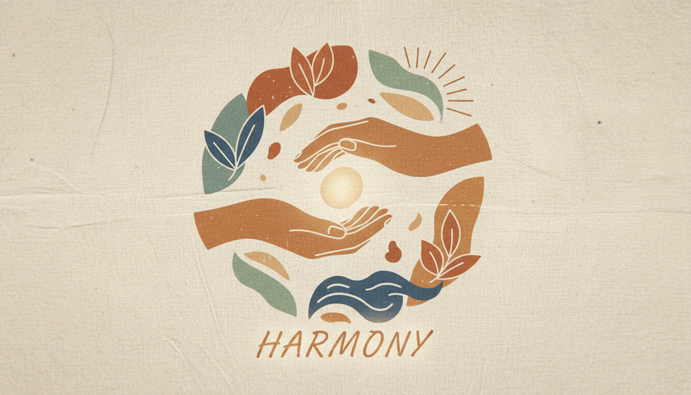
Visual characteristics:
- Grain overlays giving digital art a film photography feel
- Soft glows and halos around elements
- Paper textures and canvas-like backgrounds
- Intentional “imperfections” like subtle distortions or noise
Why it’s trending: Reaction against AI-perfect renders. Audiences crave authenticity. Texture adds warmth and tactility to digital spaces that feel increasingly artificial.
Where you see it: Lifestyle brands, wellness companies, food and beverage, creative agencies, anyone positioning as authentic or handcrafted.
The psychology: Grain and texture trigger nostalgia for analog media. Makes digital content feel more trustworthy and less manufactured.
Bonus: Top Instagram Reels Trends in 2026: What’s Hot Right Now?
4. Maximalist Illustration
If bold minimalism is one end of the spectrum, maximalist illustration is the opposite extreme.
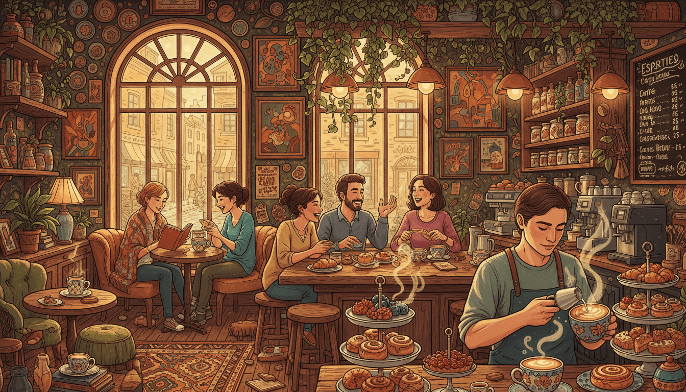
What it looks like: Richly detailed, expressive illustrations bursting with color, movement, and complexity. Dense compositions where every corner tells part of the story. Example: “Create vibrant, detailed illustration of coffee shop scene, maximalist style, rich colors, layered composition.”
Visual elements:
- Layered illustrations with multiple focal points
- Vibrant, often clashing color combinations
- Hand-drawn quality (even if digitally created)
- Narrative complexity and visual storytelling
- Cultural and global influences mixed freely
Where you see it: Entertainment brands, creative industries, cultural organizations, youth-focused products, anyone wanting to feel energetic and inclusive.
Why it works: Stands out in minimal-heavy environments. Feels human, optimistic, and inclusive. Gives audiences something to explore rather than quick-scan content.
5. Retro Serif Typography and Nostalgic Elements
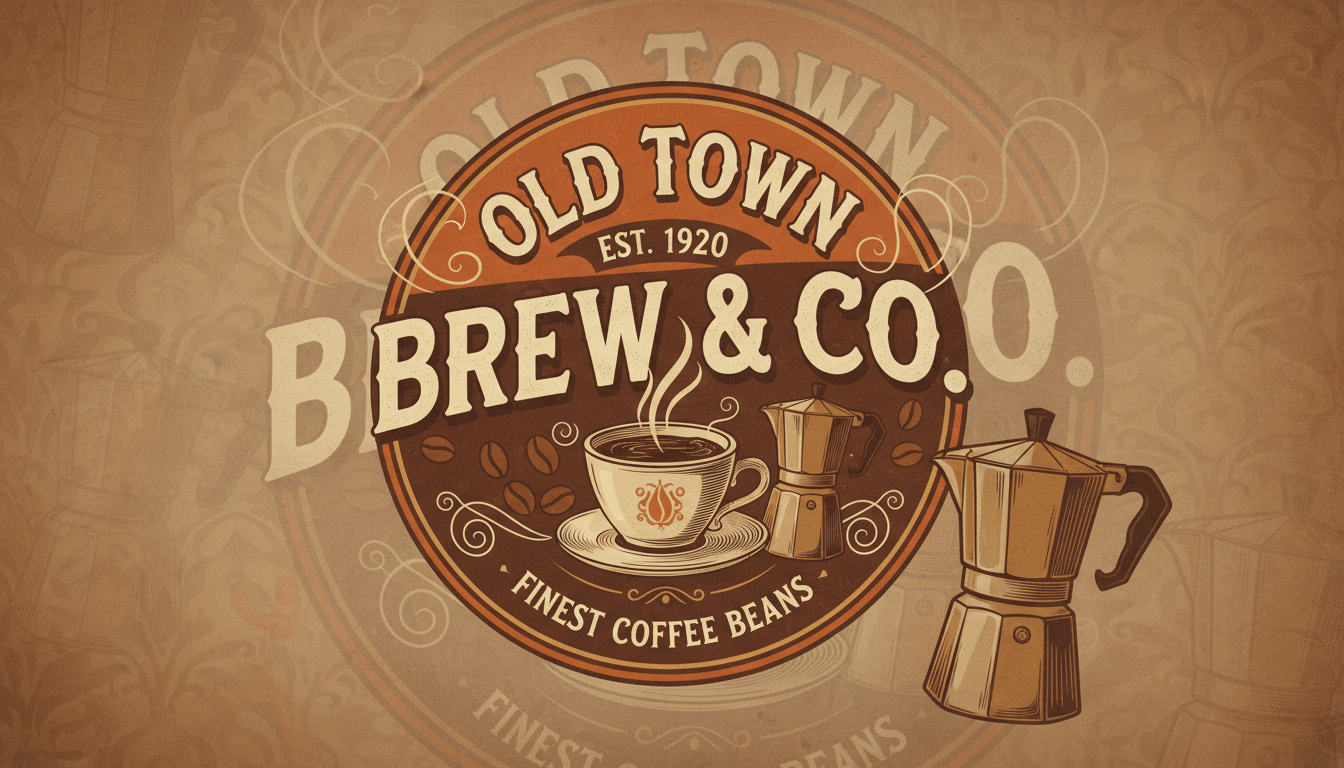
Classic serif fonts are everywhere, paired with vintage color palettes but modern layouts.
The aesthetic: 1970s typography meets 2026 composition. Warm, earthy color schemes (burnt orange, olive green, mustard yellow) combined with contemporary layouts and clean hierarchy.
Typography specifics:
- Bold, rounded serifs with personality
- Variable weight fonts creating visual rhythm
- Generous letter spacing for readability
- Mixing serif headlines with modern sans-serif body text
Where you see it: Coffee brands, bookstores, sustainable products, wellness companies, anyone positioning as thoughtful or craft-focused.
The appeal: Nostalgia for pre-digital eras while maintaining contemporary functionality. Feels warm and established without feeling outdated.
6. Gothic Badges, Crests, and Heraldic Design
Ornate badges, crests, and gothic styling communicate heritage, quality, and gravitas.

Visual elements:
- Shield shapes and crest-style compositions
- Gothic lettering and blackletter fonts
- Ornamental borders and flourishes
- Monochromatic or limited color palettes
- Symmetrical, balanced layouts
Where you see it: Craft beverages, premium products, sports branding, gaming, heavy metal aesthetic brands, anything emphasizing tradition or intensity.
Why it’s trending: Creates instant sense of establishment and quality. Appeals to desire for authenticity in mass-produced world. Works particularly well for masculine-coded products but increasingly adopted broadly.
7. Metallic Finishes and Futuristic Shimmer
Metallic effects, chrome finishes, and iridescent elements add luxury and tech-forward feelings.

The technique: Digital recreation of reflective, shifting metal surfaces. Chrome text, holographic backgrounds, liquid metal textures, prismatic color shifts.
Where you see it: Tech products, luxury goods, beauty brands, automotive, gaming, cryptocurrency and Web3 brands.
The psychology: Metallics signal premium quality and future-facing innovation. The reflective, shifting nature creates visual interest and sophistication.
Execution challenge: Metallics can look cheap if poorly executed. Requires subtlety and high-quality rendering to avoid appearing tacky.
8. Pixel Art and 8-Bit Revival
Retro pixel aesthetics from early video games are having a serious moment.
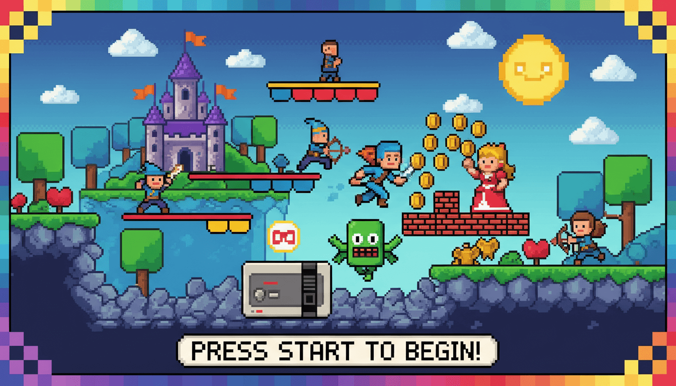
The look: Deliberately low-resolution, pixelated graphics. 8-bit color palettes. Chunky, blocky forms. Animations that feel like classic arcade games.
Where you see it: Gaming companies (obviously), tech startups embracing nostalgia, music festivals, streetwear brands, anything targeting millennials who grew up with Nintendo.
Why it resonates: Pure nostalgia. Also stands out as intentionally lo-fi in a world of 4K everything. Feels playful and accessible rather than intimidating or overly polished.
Bonus: Holiday Marketing Ideas: 30 Campaigns That Actually Work
How to Create Trending Designs Using Simplified
Here’s the part most marketers struggle with: knowing trends is one thing, executing them without a design background is another.
Simplified bridges this gap by making professional design accessible to non-designers. The platform combines AI-powered tools with templates based on current trends.
Getting Started with Trend-Based Design
Step 1: Browse Templates by Trend
Open Simplified and navigate to the template library. Instead of starting with a blank canvas, filter templates by the trend you want to execute.

Search keywords like “minimalism,” “retro,” “textured,” or “maximalist” to find templates already built around these aesthetics. Each template shows the style applied to different formats: Instagram posts, Facebook ads, email headers, presentations.
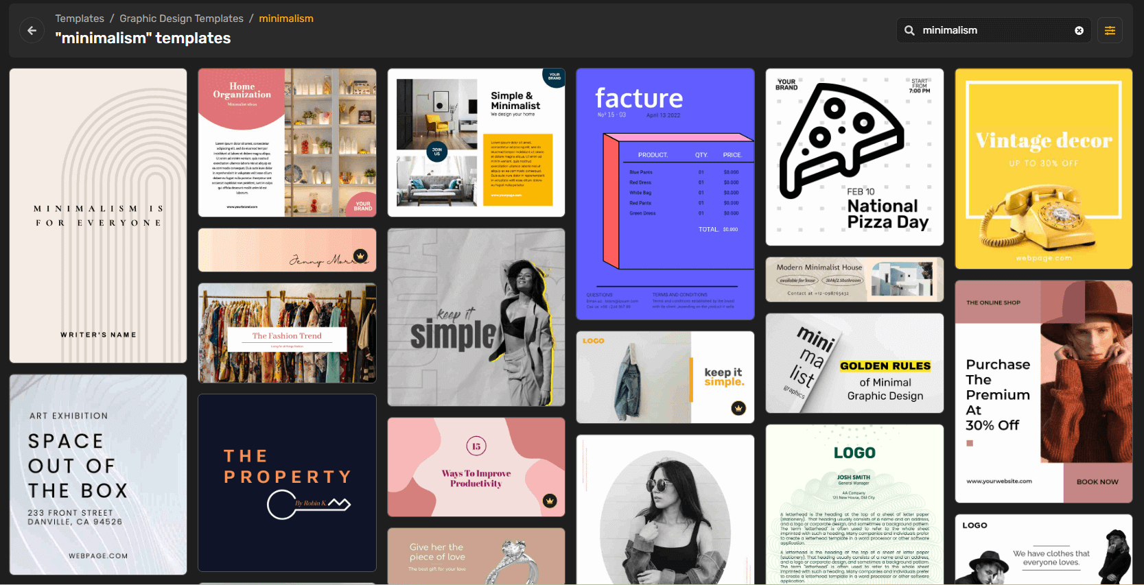
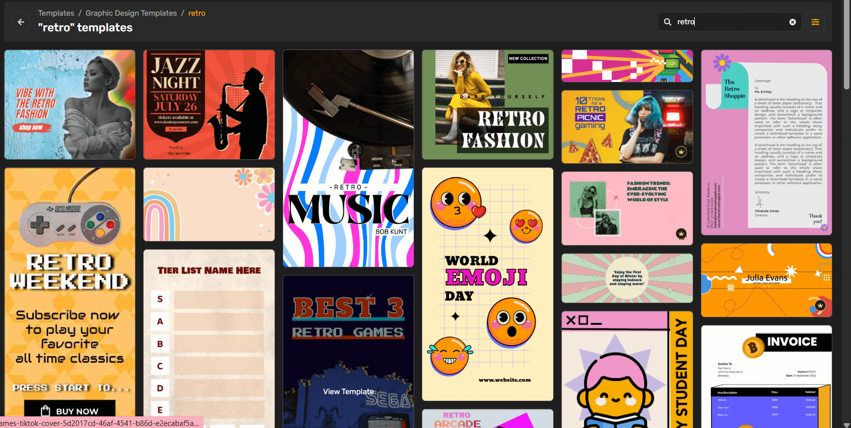
Select a template that matches both your trend choice and content type. The design framework is already built, you’re customizing for your specific brand and message.
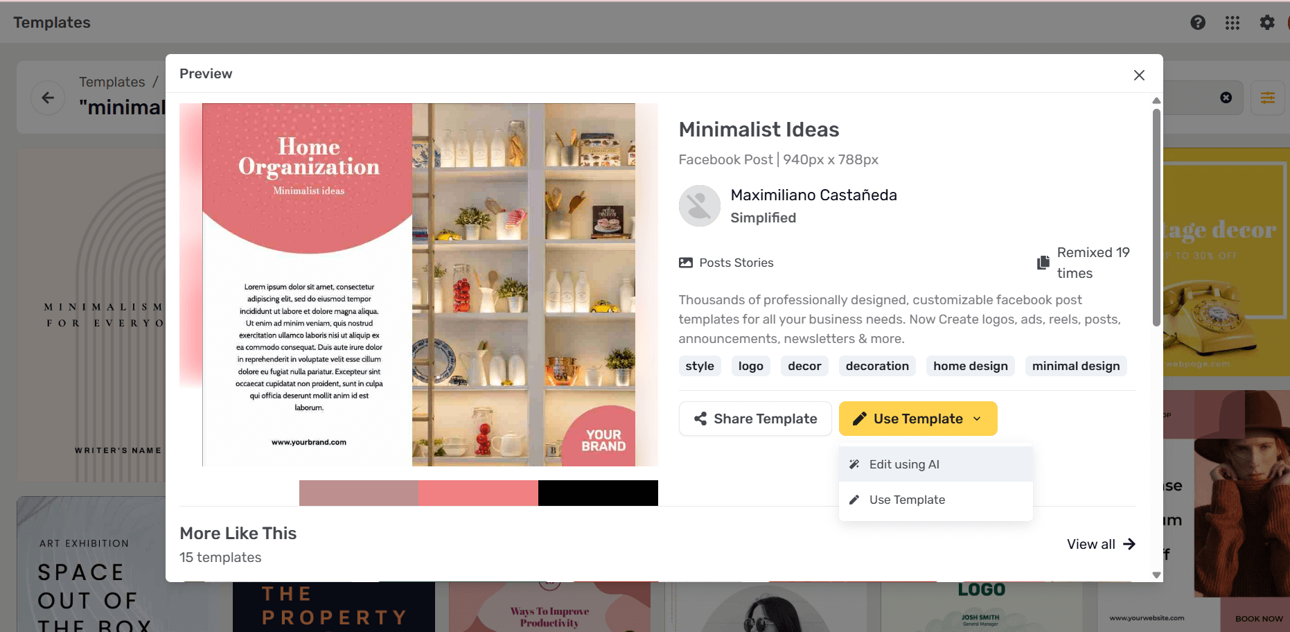
Step 2: Apply Your Brand Kit
Upload your logo, brand colors, and fonts to Simplified’s Brand Kit feature. This is a one-time setup that saves massive time later.
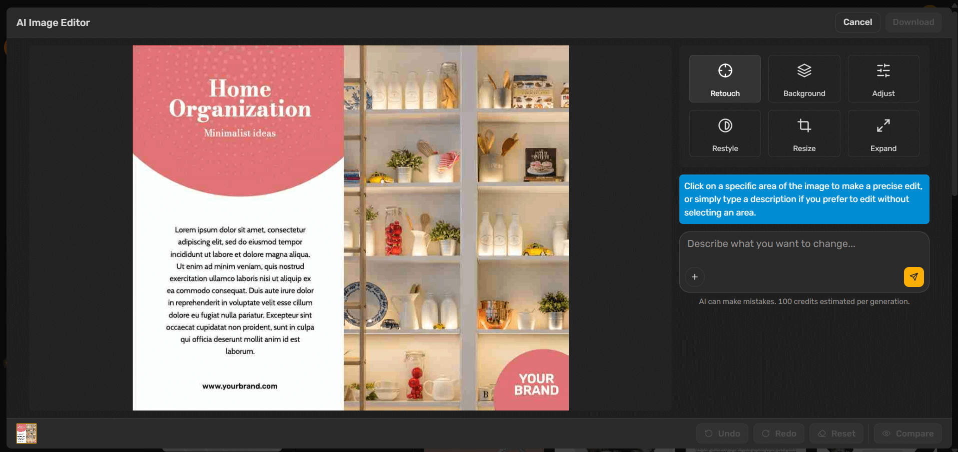
When you select any template, click “Apply Brand Kit” and Simplified automatically swaps template colors for your brand palette, replaces fonts with your typography, and positions your logo appropriately.
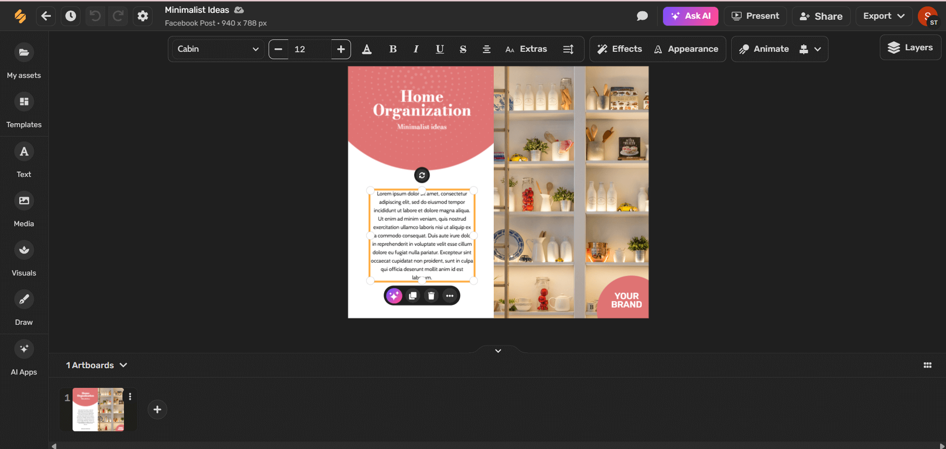
The template maintains its trendy structure (bold minimalism, textured overlays, etc.) but now looks distinctly like your brand.
Step 3: Customize with AI-Powered Tools
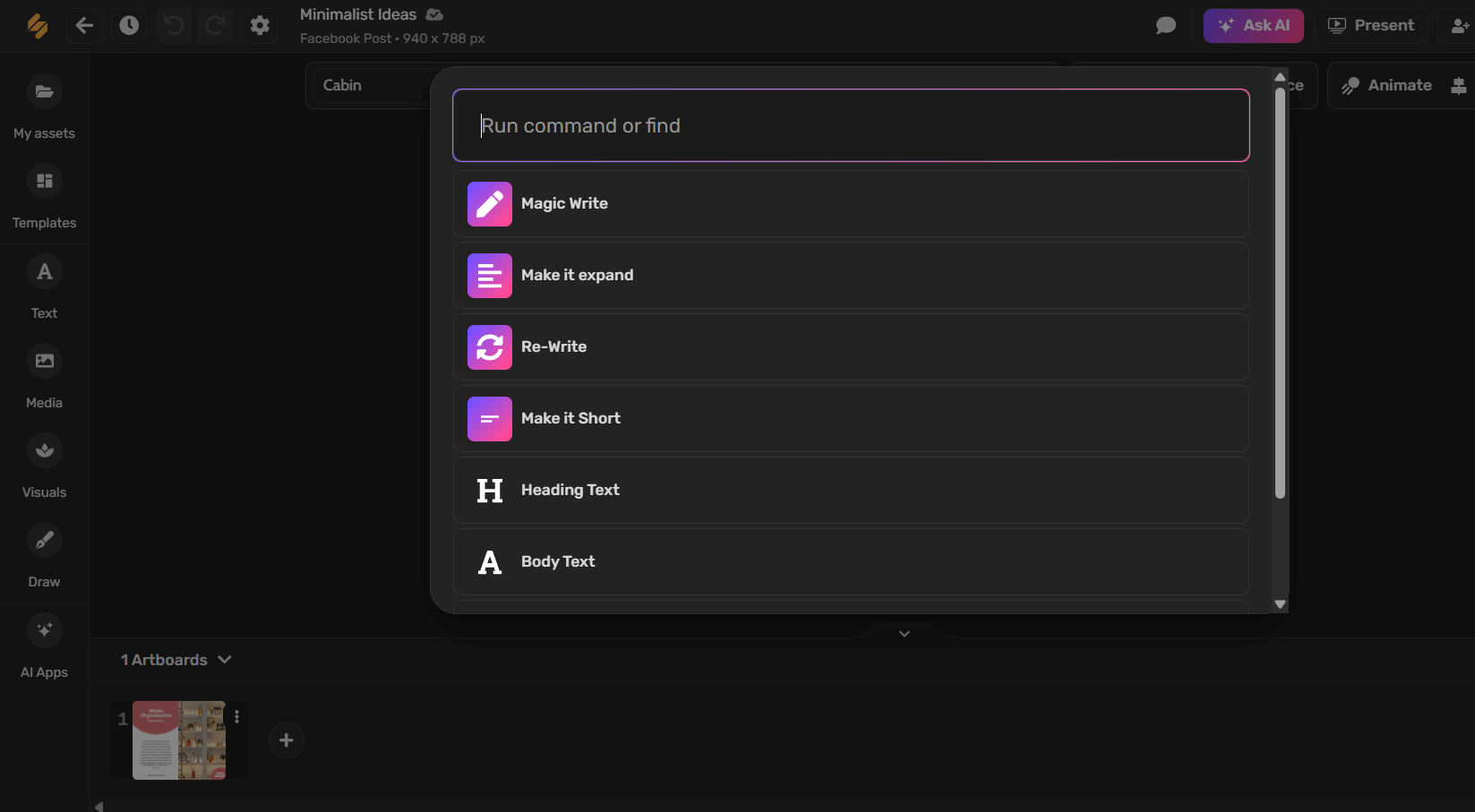
For bold minimalism: Use AI to suggest high-contrast color combinations from your palette. The tool recommends which colors create maximum impact together. Simplify the template by removing elements until only the most powerful remain.
For textured grains: Access the effects library. Apply grain overlays with adjustable intensity. Add subtle glows or vintage film effects. Layer textures without overwhelming the core design.
For maximalist illustration: Use AI Image Generator to create detailed illustrations from text prompts. Example: “Create vibrant, detailed illustration of coffee shop scene, maximalist style, rich colors, layered composition.” Generate multiple options, select the best, place in your design.
For retro typography: Browse the font library filtered by “serif” or “vintage.” Simplified includes 100+ trending fonts. Apply retro serif to headlines while keeping body text clean and readable. Adjust letter spacing for that classic 70s feel.
For gothic crests: Search templates for “badge,” “crest,” or “emblem.” Customize the ornamental elements, change text, adjust symmetry. The complex structure is pre-built, you’re personalizing it.
For metallic finishes: Apply metallic effects from the effects library. Adjust reflection intensity, choose metal type (chrome, gold, copper), and add subtle animations for the shifting light effect.
For pixel art: Use the pixel art filter on uploaded images or start with pixel art templates. Simplified converts high-res images to intentional low-res pixel aesthetic with adjustable grid size.
Step 4: Use AI for Layout and Composition
Unsure how to arrange elements? Simplified’s AI Layout Assistant suggests compositions based on design principles.
Upload your content (text, images, logo) and ask for layout suggestions. The AI generates 5-10 layout options following current trends and design best practices. Pick your favorite, customize further if needed.
Step 5: Create Variations Quickly
Need this design across 5 platforms? Use the resize feature. Your Instagram post automatically adapts to Story size, Facebook post dimensions, LinkedIn banner specs, and email header format.
The AI adjusts element positions, scales typography, and maintains visual hierarchy for each format. What used to require recreating designs manually now takes one click.
Step 6: Add Animation for Social
Static designs work fine, but animated designs get higher engagement on social media.

Select elements to animate (text appearing, images sliding in, background effects). Choose from pre-built animation styles or customize timing and movement. Export as video or GIF.
Total time: 30 seconds to add professional animation.
Common Design Mistakes to Avoid
Chasing Every Trend
Jumping from bold minimalism to maximalist illustration to gothic crests across different posts creates brand confusion. Pick trends aligned with your identity and stick with them long enough to build recognition.
Ignoring Brand Guidelines
Trends should enhance your brand, not replace it. Maintain your core colors, fonts, and visual identity while incorporating trendy techniques and compositions.
Overusing Effects
Texture is great. Ten texture layers is muddy. Metallic finishes add sophistication. Metallic everything looks like a bad video game. Apply trends with restraint.
Forgetting Readability
Bold minimalism with tiny text fails. Maximalist illustrations where typography gets lost don’t work. Trends should enhance communication, not hinder it. Test designs on mobile where most audiences see them.
Not Testing on Actual Devices
Designs that look stunning on your 27-inch monitor might be illegible on a phone. Always preview on actual mobile devices before publishing.
Copying Competitors Too Closely
Using the same trends as competitors is fine. Using the exact same color schemes, layouts, and styles makes you look like a copycat. Add your unique spin.
Ignoring Your Audience
Gen Z loves maximalist illustration and pixel art. Baby Boomers often prefer cleaner, more traditional designs. Design for your actual audience, not trends forecasters.
Bonus: Top Trend Tracking Tools for Social Media and Marketing
Frequently Asked Questions
Do I need to follow design trends or should I stick with timeless design?
Balance both. Your core brand identity (logo, primary colors, overall personality) should be relatively timeless. Execution of marketing materials can incorporate current trends to feel fresh and relevant. Think of it like fashion: your personal style is consistent, but you update clothing choices to stay current.
How long do graphic design trends typically last?
Major trends evolve over 2-3 years. Specific executions within trends shift annually. Bold minimalism as a concept has staying power, but the exact color combinations or typography treatments popular now will refresh next year. Plan to update marketing assets annually while brand foundations stay stable 3-5 years.
Can non-designers really create professional-looking designs?
Yes, with modern tools like Simplified. AI handles technical execution while you provide creative direction. The skill shifts from knowing software to recognizing good design and giving clear instructions. Most marketers become proficient creating social posts, ads, and email graphics within a few hours of practice.
Should B2B brands follow the same design trends as B2C?
Largely yes, though execution differs. B2B typically applies trends more conservatively. A B2B tech company might use bold minimalism but with more restrained colors than B2C fashion. Professional service firms might incorporate texture subtly rather than heavily. The trends work across sectors, but intensity varies by audience expectations.
How do I know which trends work for my specific brand?
Test multiple directions with small audiences. Create social posts using different trending styles and monitor engagement. Survey customers on visual preferences. Analyze competitor designs resonating with shared audiences. Trust data over personal preferences. What you think looks best might not be what actually performs.
Are these trends appropriate for established brands with existing design systems?
Established brands should incorporate trends thoughtfully rather than completely redesigning. Add texture overlays to existing photography style. Introduce retro typography in specific campaign elements while maintaining core fonts. Use trends in marketing materials while keeping product packaging and logos stable. Evolution, not revolution.
How often should I update my brand’s design to follow trends?
Marketing materials (social posts, ads, email headers): quarterly adjustments to stay current. Website design: annual reviews with updates every 1-2 years. Logo and core brand identity: 3-5 year cycles, only when genuinely necessary. Trend-chasing at the brand foundation level creates confusion and expense.
Start Creating Trend-Forward Designs Today
Graphic design trends in 2026 offer more creative possibilities than ever, and crucially, those possibilities are now accessible to marketers without traditional design training.
The democratization of design through AI-powered tools means small teams can produce work that rivals agency output. The constraint isn’t talent anymore, it’s time and knowledge of what’s current.
This guide gave you the knowledge. Tools like Simplified give you the time efficiency.
Your next steps:
- Identify which 1-2 trends align with your brand positioning
- Set up free Simplified account and upload your Brand Kit
- Browse templates in your chosen trend categories
- Create your first trend-based design (aim for one Instagram post)
- Test with your audience and refine based on response
Design trends aren’t just about looking current. They’re about communicating effectively using the visual language your audience expects and responds to right now.
The brands winning attention in 2026 aren’t the ones with the biggest design budgets. They’re the ones moving fastest, testing boldly, and leveraging modern tools to execute professional design at the speed of culture.