What do McDonald’s, Ferrari, and YouTube have in common? You guessed it – the color red! From food packaging to cars to streaming platforms, it isn’t a coincidence that giant companies utilize red branding. Why not go for another color? Well, because red creates a sense of urgency and these companies want you to buy their products now. Graphic design is a visual language, and red is one of its most powerful communicators.
Red color psychology
Why do matadors flash red flags at bulls in Spain? The warmth of the color red is more exciting and triggers bodily responses instantly. Therefore, companies that use red branding want to appeal to our most basic biological triggers. For instance, red is the color of the Devil, but also of love. Red even signifies danger, which has a lot to do with the color of blood. Then, think about your own body. When you’re embarrassed, guilty or even feeling flirtatious, the blood flow to your face increases, giving you a soft red tinge.

Furthermore, red has important cultural significance across the world. In China, brides wear red on their wedding day for good luck. Similarly in India, red is the symbol of fertility and beauty, making it especially popular at weddings. So, when companies use red branding, they tap into our evolutionary systems and the color’s many connotations that are known around the world.
Why popular brands use red branding
Did you know that we spend less than two minutes making judgments about people and objects? And of those precious seconds, 90% of that judgment is based on color alone! Below are several key reasons why brands choose red branding in their strategy.
- The color red is associated with an increased heart rate. This is why a lot of clearance sales signs are red – because the urge to buy the item on offer is instantaneous.
- Red is one of the three primary colors – the others being blue and yellow. Bevil Convay, a neuroscientist at the National Eye Institute, posits that red is the most visible color to the human eye. In the fierce competition of fighting for viewers’ attention, red logos make for a strong first impression.
- Red captures attention, conveys confidence, and evokes urgent emotions. Brands of the world, from entertainment to fashion, use red branding to inspire action in their viewers.
We all know the siren song of Coca-Cola and McDonald’s with their iconic red branding. In addition to these, Netflix, Canon, H&M, and Target – to name a few, are also loyal to the psychology of red branding. The brand logo for Ferrari also features a horse icon set in a yellow shape on a red car. This inspires the message of performance, speed, and energy.
Related: The Best Ways to Use Triadic Colors in Design
How to use red branding: a beginner’s guide
Now that you know that the color red is powerful, let’s look at some ways to harness its potential. When considering red branding for your company or your profile, keep these tips in mind:
1. Use sparingly:
Red is a communicator of Valentine’s Day love as well as the color of demons. To use red effectively, make sure to use it sparingly – where it matters the most! For example, YouTube’s red logo incorporates a white background and a solid, minimal shape to bring our attention to the ‘play button’ icon.
2. Pair red with neutral colors:
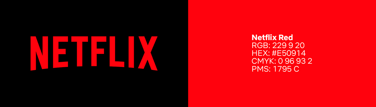
In order to communicate your brand’s personality without overwhelming your viewers, pair red with neutral colors. Some examples of neutral colors are black, white, and gray. For instance, the brand logo for Netflix cleverly uses a bold red typeface on a plain black background. This helps to balance out the bold color and remove any negative connotations associated with red, such as ‘DANGER’, while ensuring greater legibility.
3. Experiment with shades of red:
When we say that red branding is effective, we don’t mean to consistently use only the boldest shade of red! Giving your brand a lighter, pinker red, for instance, communicates femininity and belonging. In 2014, Airbnb debuted a lighter, pinkish shade of red for their brand. The revamped red and white logo is consistent with its mission of connecting homeowners with travelers.
To red or not to red?
The psychology of red branding is well-researched and scientifically proven to be visually attractive and attention-grabbing. It’s no surprise then that major brands of the world are using the color red to communicate their brand identity!


")