
Have you ever been mesmerized by a design that pops with color? The secret behind many visually arresting creations lies in the strategic use of color schemes.
It is why designers carefully create color schemes by pairing multiple color families from the color wheel. It usually works best when they follow patterns that create harmony.
Among these schemes, triad colors hold a special place. This blog post will be your one-stop guide to triad colors, empowering you to create stunning designs that resonate with your audience.
Bonus: Learn How To Create A Brand Identity Using Complementary Colors
What is Color Wheel: A Foundation for Triad Colors
Source: Pinterest
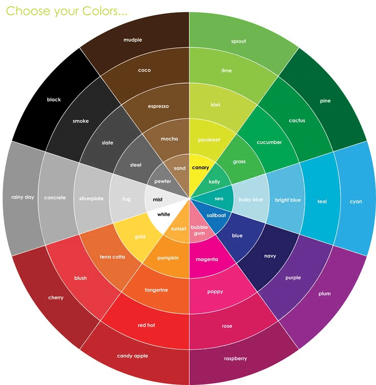
Before we delve into triad colors, let’s establish a common ground: the color wheel. It is essential in any designer’s tools. It visually organizes colors based on their relationships. It’s like a map for navigating the world of color. Understanding the color wheel is crucial for understanding triad colors.
Bonus: The Fundamentals of Understanding Color Theory
Understanding Color Harmony and Contrast
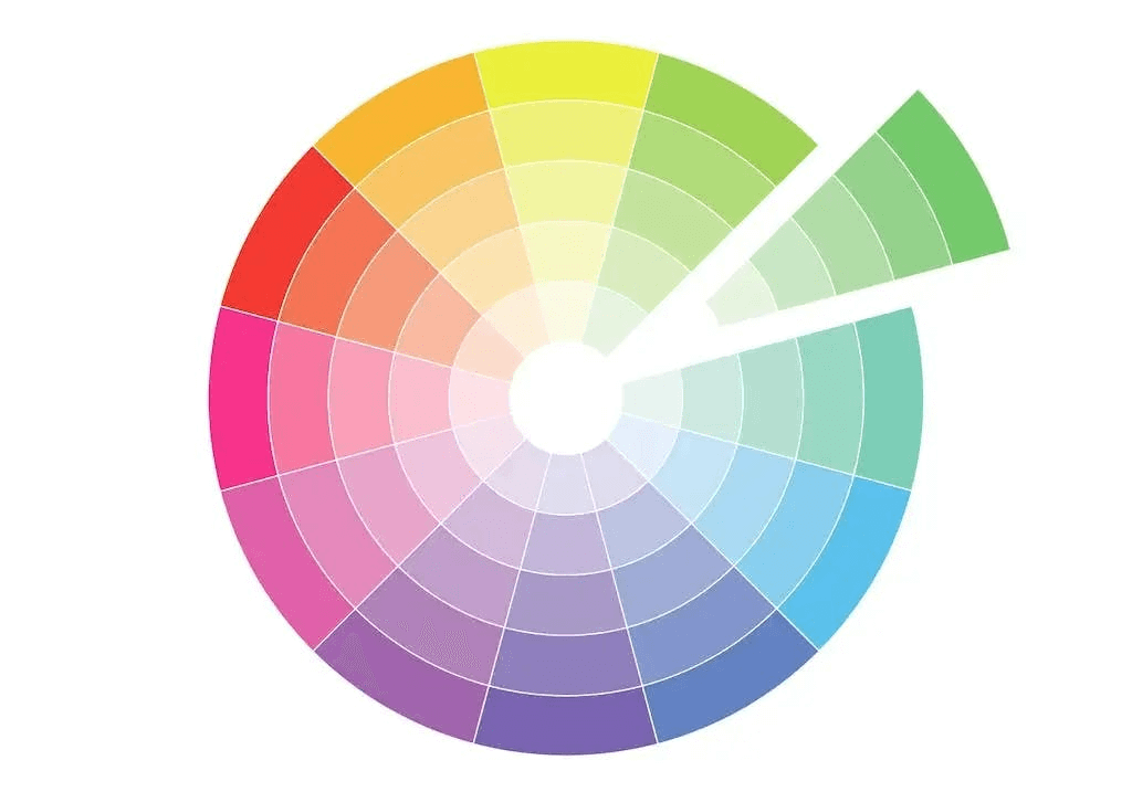
Color harmony refers to pleasing color combinations that create a sense of balance and unity in a design. Triadic color schemes inherently provide harmony because the colors are evenly spaced on the wheel.
Source: Simplified
However, harmony doesn’t always equate to a bland design. Color contrast is equally important, as it creates visual interest and hierarchy. Triad colors offer a good balance between harmony and contrast, ensuring your design is both aesthetically pleasing and impactful.
Bonus: Color Psychology: How Colors Affect Mood & Behaviors In Marketing?
What are triadic colors?

Source: Pinterest
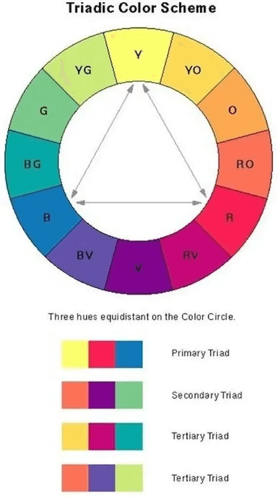
A triadic color scheme is easier to understand than it may sound. This color scheme uses three colors equally spaced around the color wheel. Triadic color combinations are easier on the eye compared to complementary color schemes. It works well if you want more than one hue to play with, but don’t want to make quite as much of a splash as a complementary pair would.
Here are perfect examples of triadic color combinations:
- Red, Yellow, and Blue
- Purple, Green, and Orange
- Blue-violet, Red-Orange, and Yellow-Green
- Red-violet, Yellow-Orange, and Blue-Green
Bonus: A Beginner’s Guide to Additive and Subtractive Colors
How to choose a Triadic Color Scheme for your design?
Whether you’re a photographer, designer, or creative of any kind, understanding what triadic color schemes are and when to use them will help you create better, more cohesive color palettes. Triadic color schemes tend to be quite vibrant, even if you use pale or unsaturated versions of your hues. By learning how to choose triadic color schemes, you will be able to achieve triadic harmony successfully.
Here is a handy guide to help you choose:
- Start by asking what sort of emotional response you want your color palette to elicit. Make your selection of colors with your end goal in mind.
- It’s important to choose one color to be the lead color and let the other two function as supporting players. This keeps the design from being too frenzied and helps create pathways for directing attention where you want it.
- Lower the saturation in the accent colors for a more cohesive blend with your dominant color.
- A triad of secondary colors will look more neutral.
- A triad of primary colors will create a vibrant and lively color scheme.
- Pastel variations will give your color scheme a more unified, calming appearance.
Source: Pinterest
Pro Tip: For digital graphics, tertiary and secondary triads might not be a good idea. They are way too dark and moody and are more suited for fine artists. Stick to the primary triads in varying shades and tints.
Bonus: Understanding Chromatic and Achromatic Colors for Your Next Project!
How to Use Triadic Color Schemes
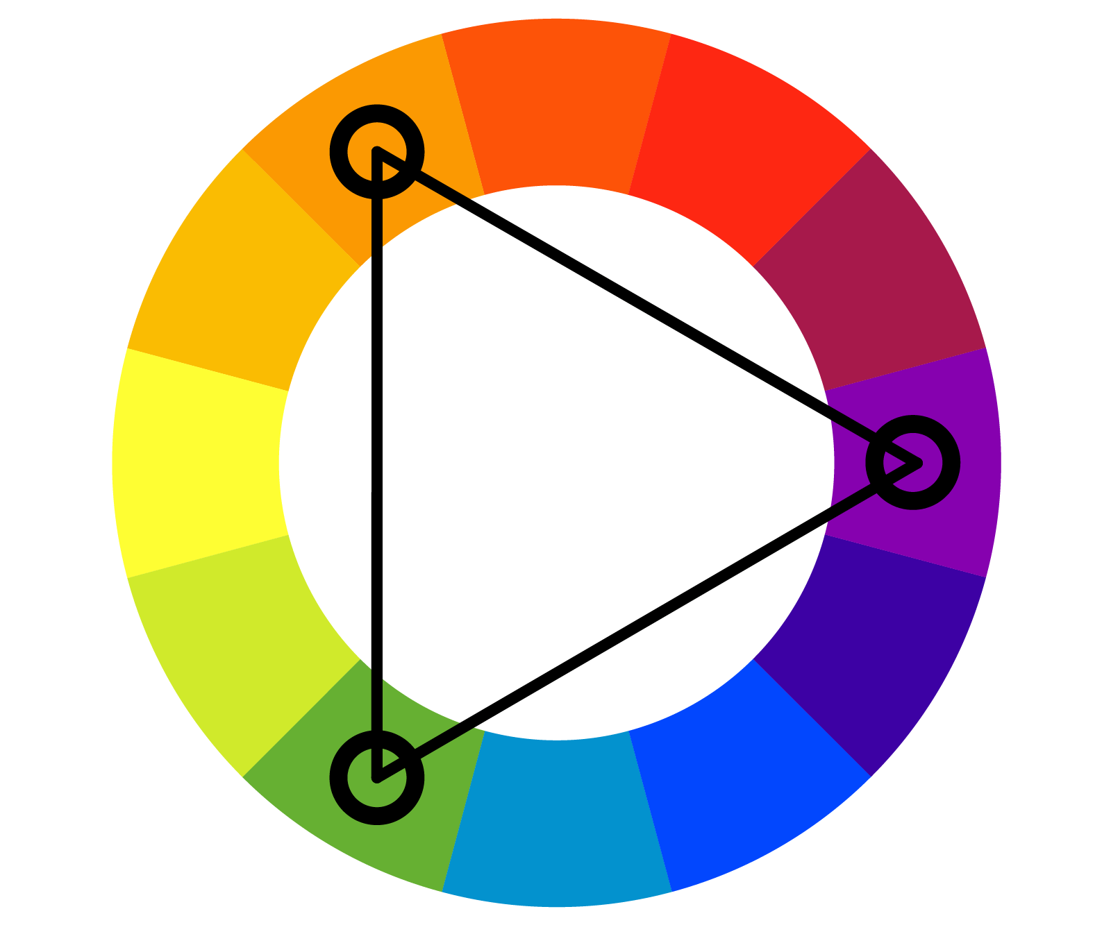
Most of the color schemes are self-explanatory and simple to use. All you need to do is identify them and get to work. The triadic color scheme requires a little more thought and care, but it can be very powerful. This color scheme involves selecting three colors on the wheel that are of equal distance from each other.

Source: Pinterest
A typical example is red-blue-yellow. This triad color scheme can evoke similar feelings to complementary colors but with three shades, providing more options for different aspects of your design. Using a triad color scheme correctly will allow you to create cheerful and lively results.
Bonus: 7 Tips For Creating The Perfect Cohesive Color Palette
A Step-by-Step Guide to Creating a Winning Triadic Color Scheme
Source: Color Meanings
Now that you have grasped the basics, let’s explore how to create a triad color scheme. Here’s a step-by-step guide:
- Pick Your Dominant Color: This is the focal point of your design and is used most prominently. Consider the message you want to convey and the emotions you want to evoke when selecting your dominant color. For example, blue is associated with trust and calmness, while red exudes energy and excitement.
- Locate the Complementary Colors: Using the color wheel, identify the two colors directly opposite your dominant color on either side. These are your secondary colors and should be used sparingly as accents to complement the dominant color.
- Adjust for Harmony: While triad colors inherently create harmony, you can further refine your scheme. Consider using tints (lighter shades) or shades (darker shades) of your triad colors for more subtle variations.
Bonus: The Ultimate Guide To Analogous Colors & How To Use Them
The Power of Triad Colors in Design
Triadic color schemes can be incredibly versatile and can be applied to various design projects, including:
- Websites and Apps: A triadic color scheme can create a visually engaging and dynamic user interface.
- Logos and Branding: Triad colors can make your brand logo stand out and leave a lasting impression.
- Marketing Materials: Eye-catching brochures, flyers, and presentations can be achieved with a well-executed triad color scheme.
Famous brands that use Triadic Color Schemes
1. Firefox

Source: Wikipedia
The red, blue, and mustard of the Firefox logo is a classic triadic example. This color scheme evokes a feeling of contrast, competition, daring, and dash, yet presents a harmonious and appealing look. It is completely in alignment with its brand name, signifying the fire of competition and leadership.
2. Burger King
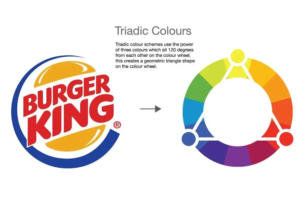
Source: Pinterest
The famous Burger King logo design uses another triadic color scheme of the primary colors red, blue, and yellow.
Although Burger King announced early in 2021 it has a new logo, the new logo is similar to what they had in 1969 with some slight changes to the color and shape.
3. Fanta

Source: Pinterest
The current look of the drink introduced in 2016 uses orange, blue, green, and white. It is as colorful as before, but bolder. It is more in line with the expectations of young audiences ‒ modern, decisive, and full of fun. Just what young people strive for.
Bonus: Understanding The Color Theory Behind Pink and Its Uses
Can Triadic Colors be toned down?
If you’re concerned about your design or project being extremely vibrant – you’re in luck. Triadic color schemes can be toned down easily. Here are a few ways:
- Tone down your triadic color scheme by using one of the three colors as a dominant color and the other two as secondary colors.
- You can tone down the drama to a manageable level by choosing subdued shades or tertiary colors. For example, bright magenta can be switched out for a calming mauve. Iridescent turquoise becomes an oceanic teal, and golden yellow takes on a softer honey glow.
- Whether painting, designing, or choosing a color for your logo, make sure the main color covers the largest area. The other two should be used in smaller portions. This lowers the saturation of two of the triadic colors in your scheme for the most cohesive blend.
Simplified: Your Triad Color Scheme Generator
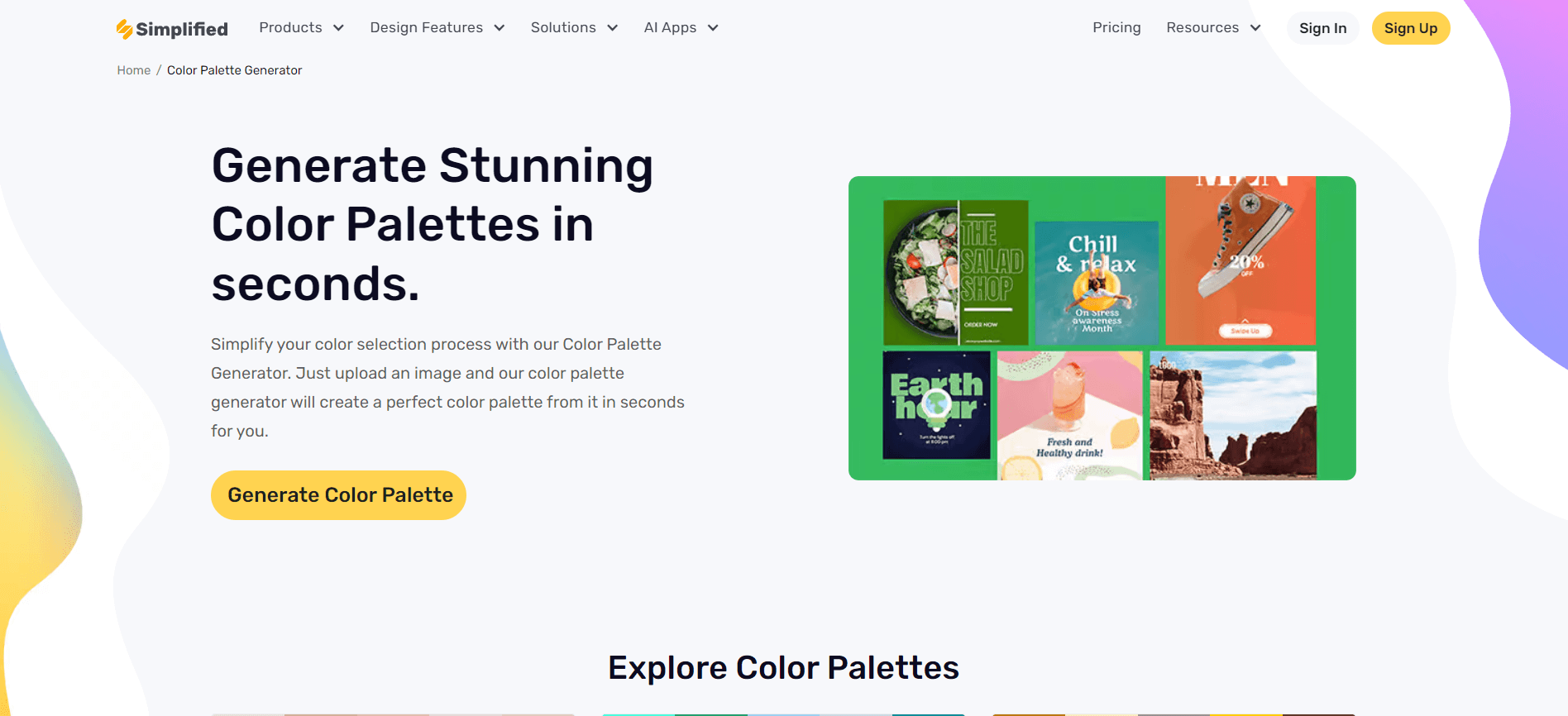
Source: Simplified
Throughout the design process, you might need a helping hand in generating or extracting color palettes. This is where Simplified comes in. Simplified color palette generator is an essential tool for designers. It allows you to generate stunning triad color schemes and extract color palettes from any existing design for inspiration.
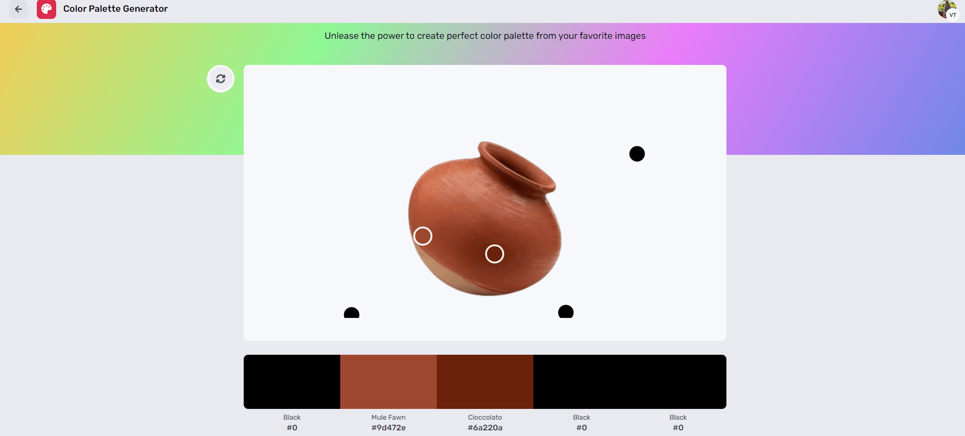
Source: Simplified
Simplified goes beyond color palettes. Explore its extensive design capabilities, including creating mockups, generating design elements, and removing backgrounds from images.
Simplified Design Templates
Feeling inspired? Simplified AI offers a vast library of design templates you can leverage to jumpstart your creative process. These high-quality templates are built with well-considered color schemes, including triad palettes, to give your designs a professional touch.


Frequently Asked Questions
1. What are some examples of triad color schemes?
- Red, yellow, and blue
- Orange, green, and purple
- Teal, yellow-orange, and violet
2. Can triadic color schemes be overwhelming?
Yes, using all three colors in equal proportions can be visually overpowering. It’s best to designate one color as dominant and use the others as accents.
3. What are the primary benefits of using triad colors in design?
Triad colors offer excellent balance, harmony, and contrast, making designs visually appealing and dynamic.
Bottomline
Mastering triad colors is a game-changer for any designer. Understand triad colors and utilize tools like Simplified to elevate your design game. With their inherent harmony and potential for contrast, triad color schemes help to create visually stunning and impactful designs. Generate pleasing designs effortlessly with Simplified.


