
 By
By For any beginner, speaking the language is half of the job in entering a new arena. Additionally, in the world of graphic design, understanding technical terms and jargon can make the actual design process way more Simplified! And now that you have some foundational vocabulary from Part One, it’s time to introduce you to a set of 20 more design terms. Moreover, with a functional knowledge of these visual aspects in your design dictionary, you can easily take your skills to the next level.
So, let’s get going!
1. Composition
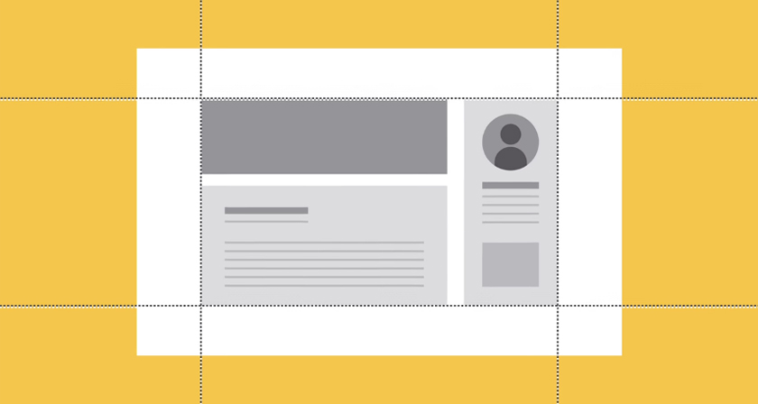
Also known as layout and form, the composition is an arrangement of visual elements to achieve the best final image design. These graphic elements include alignment, negative space, and most importantly, balance.
2. Body Copy
One of the most common design terms in typography, body copy refers to the textual content of any design. For example, headings, subheadings, body text, and callouts.
3. Leading

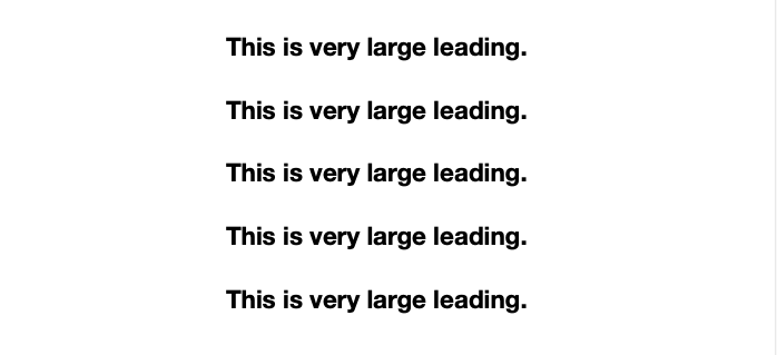
Leading (which is pronounced “ledding”) is the amount of spacing between the lines in your body of text. If it’s spaced too closely together, your type may end up looking squashed, which can compromise its readability. Additionally, if the gaps are too large, it can increase the size of your graphic unnecessarily.
4. Palette
The first of our five important design terms on color, palette refers to the range and choice of colors you can use in your graphics.
Related: Color Palette Combos to Amp Up Your Design Game in 2021
5. Monochromatic
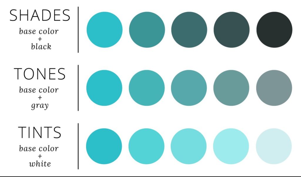
Monochrome refers to design/photography limited to one (mono) color (chroma). Furthermore, this also applies to the use of different shades of the same color.
6. Tint
Adding white to any hue on the color wheel and desaturating it gives it its tint form.
7. Complementary
Further, we come to color design terms relative to their position on the color wheel. First, we have opposites, or complementary colors, as they are more commonly called. For example, red and green are complementary colors, because they appear opposite one another on the color wheel.
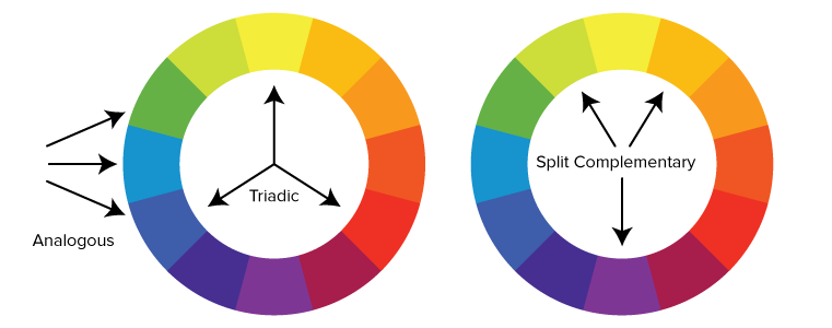
8. Triadic
Any three colors separated with a balanced distance on the color wheel can be called triadic colors, e.g. red, blue, and yellow.
9. Analogous
Analogous refers to any three colors placed adjacent to one other on the color wheel, e.g. green, yellow, and orange.
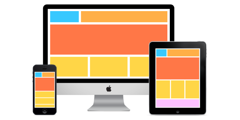
10. UI
Next, a popularly used web design term, the User Interface (UI) of any website or device determines the appearance and stability of an application for a better experience.
11. Landing Page
The first webpage that shows up when a user clicks on a single search engine result is known as its landing page.
12. Breadcrumb Trail
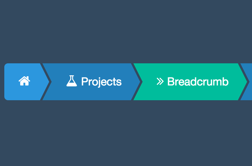
In web design terms, a ‘breadcrumb trail’ consists of any website’s navigation tools, including links, body text, sidebar, footer, etc. Moreover, they are pretty helpful in tracking your way around the section hierarchy!
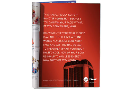
13. Lorem Ipsum
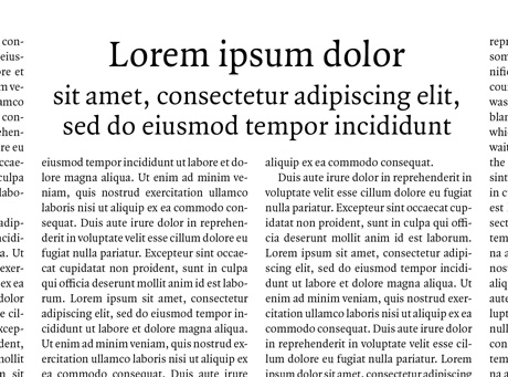
Lorem Ipsum, or ‘dummy text’, is a placeholder/filler in place of the actual body copy used to determine how the finished design will look. Plus, the Latin words look way better than just, “Add Text Here“!
14. Serif

Serif refers to the authoritative-looking lines and hooks at the ends of horizontal and vertical lines on letters.
Related: Picking The Right Fonts For Your Website: Simplified Guide
15. Sans Serif

Subsequently, Sans Serif (sans: a French word that means ‘without’) describes the sharp and modern-looking typefaces that lack a serif at their ends.
16. Script
Script typefaces resemble handwriting styles and are calligraphic to give an elegant feel to the reader.
17. Slab Serif

Slab typefaces are generally thicker, block-like, and bolder than their other serif counterparts.
18. X-Height
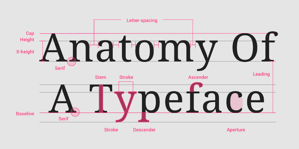
The first of three important typeface design terms, X-Height refers to the median height of lowercase letters in any font.
19. Ascender
An ascender is any part of a lowercase letter that extends above its main body, in addition to its x-height.
20. Descender
The descender is the part of a lowercase letter that reaches below its main body and baseline.
Simplified Design Tip: Feeling more confident about your knowledge? Try testing out some of these social media design terms and concepts on your Simplified workspace!


![10 Best AI Image Restoration Tools to Try in 2025 [Free & Paid]](https://siteimages.simplified.com/blog/Best-AI-Image-Restoration-Tools-01.png?auto=compress&fit=crop&fm=png&h=400&w=400 "10 Best AI Image Restoration Tools to Try in 2025 [Free & Paid]")
![How to Use Photoshop AI Generative Fill Feature [2025]](https://siteimages.simplified.com/blog/How-to-Use-Photoshop-AI-Generative-Fill-01-1.png?auto=compress&fit=crop&fm=png&h=400&w=400 "How to Use Photoshop AI Generative Fill Feature [2025]")
![20 Podcast Thumbnail Ideas to Boost Your Show’s Visual Appeal + Best Practices [2025]](https://siteimages.simplified.com/blog/Podcast-Thumbnail-Ideas-to-Boost-Your-Show-02-1.png?auto=compress&fit=crop&fm=png&h=400&w=400 "20 Podcast Thumbnail Ideas to Boost Your Show’s Visual Appeal + Best Practices [2025]")


