All typefaces have their own unique features and serve different purposes. Today, we are going to compare arguably the two most popular fonts: Arial vs Helvetica. While these fonts are often confused with each other, we’re putting on our detective hats and magnifying the subtle distinguishing features between the two.
Arial vs Helvetica: The History and Origins
Helvetica History
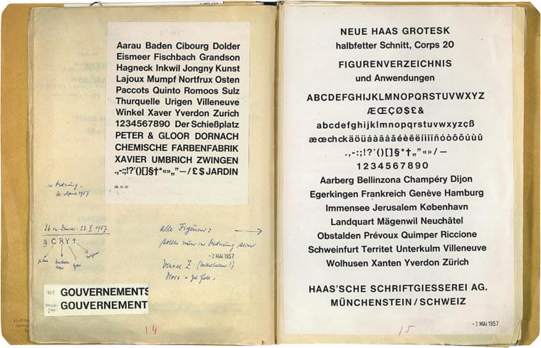
As the name suggests (‘Helvetia’, the Latin word for ‘Switzerland’), Helvetica was created in Switzerland. Eduard Hoffman, director of the Haus Foundry in Münchenstein, had commissioned freelance designer Max Alfons Miedinger to create a new font. He designed the font with the intention to counter the success of Akzidenz Grotesk, a typeface launched by their competitors, the H. Berthold AG foundry.
In 1957, Miedinger came up with a new set of characters, which he named Neue Haas Grotesk. It was a sans serif font with a linear, simple, and legible design.
In 1959, Mike Parker, the newly appointed director of the American firm, Mergenthaler Lintotype Company, hired Arthur Rizel to redesign and develop the family of fonts. He wanted to alter the fonts to fit the technical needs of the Linotype machines.
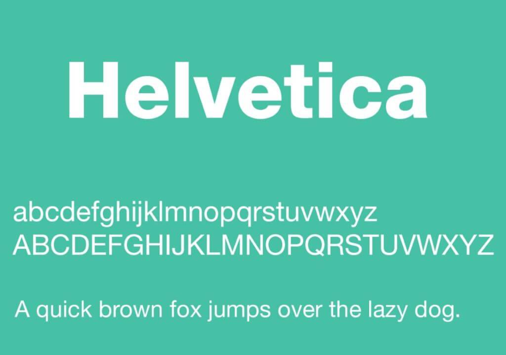
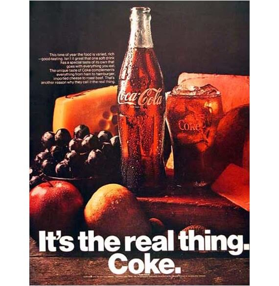
The new font birthed from this redesign is Helvetica. And what do you know? The font took the industry by storm. It struck the perfect balance between elegance and functionality, and throughout the 1960s and 1970s, it appeared on numerous advertising posters and billboards across Europe and the USA.
However, the Helvetica that we know today is Neue Helvetica. Released in 1983, it was an updated version of Linotype’s Helvetica with extra spacing between the numbers and heavier punctuation marks to further improve legibility.
The following year, Steve Jobs included it in the fonts available on the first Macintosh, paving the way for the spread of the digital version of the typeface.
Related: 20 Best Fonts For Logos That Tell A Story
Arial History

(Source: designworkplan) Reproduction of the Arial font
The wildly popular Microsoft Office font Arial was once called Sonoran San Serif. In fact, it was originally designed in 1982 for the Monotype foundry by Robin Nicholas and Patricia Saunders.
In 1982, Monotype had the contract to produce bitmap fonts for IBM’s first in-office printing machines: the 240-DPI 3800–3 laser xerographic printer, and the 600-DPI 4250 electro-erosion laminate typesetter. While Monotype sub-licensed Helvetica from the Linotype foundry, it created Arial and replaced Helvetica in the 3800-3.
Later, in 1990, Robin Nicholas, Patricia Saunders, and Steve Matteson developed a TrueType outline version of Arial, which they licensed to Microsoft. Subsequently, in 1992, Microsoft chose Arial to be one of the four core TrueType fonts in Windows 3.1, announcing the font as an “alternative to Helvetica.”
Arial vs Helvetica also records one of the first rivalry instances between Microsoft and Apple. Microsoft chose Arial as a way to save money and license fees, while Apple, with the better design sense, provided Helvetica to its users by default.
Helvetica Neue vs Arial: The Hobson’s Choice for Designers
After reading the history, it’s evident that the two fonts aren’t all that different from each other. However, even though subtle, there are some fundamental design differences visible only to a designer’s eye.
| Arial | Helvetica | |
|---|---|---|
| Designed By | Robin Nicholas and Patricia Saunders in 1982 | Max Miedinger and Eduard Hoffmannin 1957 |
| Based On | Schelter-Grotesk | Akzidenz Grotesk |
| Originally Called | Sonoran San Serif | Die Neue Haas Grotesk |
| Classified As | Neo Grotesk | Grotesk or Transitional |
| Variables | Arial Bold, Black, Extra Bold, Rounded, Special, Narrow, Light, Condensed, Italic, Medium, Monospaced | Helvetica Neue, Swiss 721 BT, Helvetica World |
Arial vs Helvetica: At First Glance
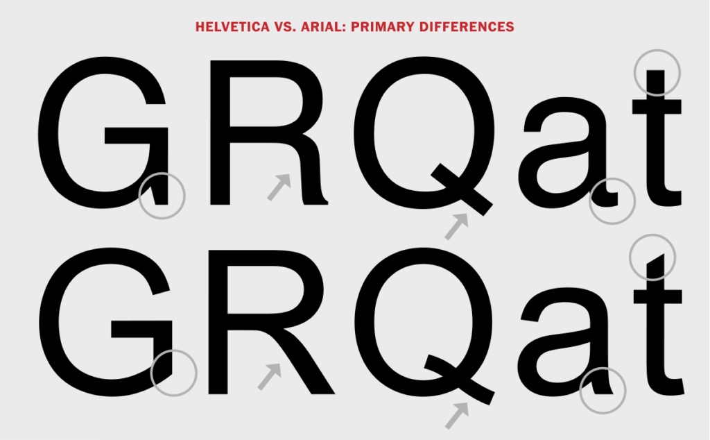
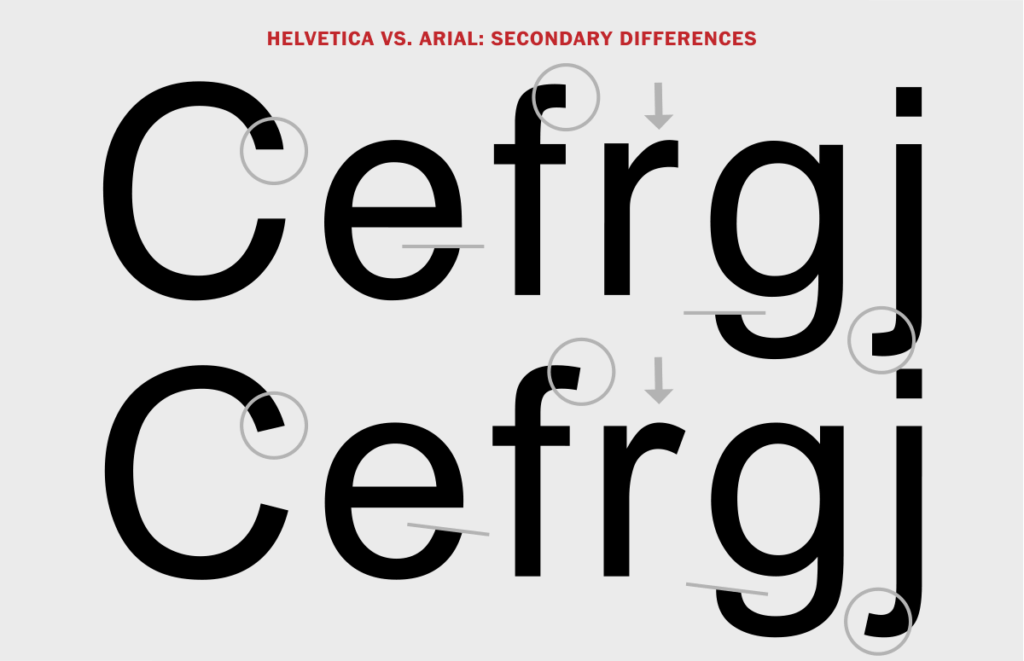
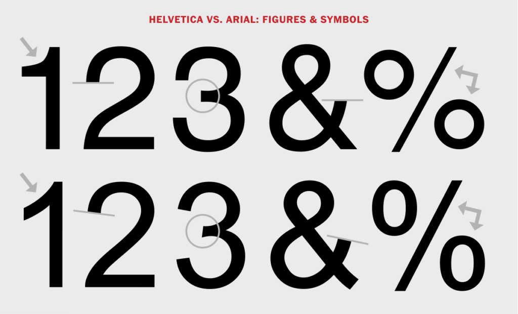
Helvetica is a sharper, crisper typeface with more embellishments and a slightly more rectangular appearance. These features are easily identifiable in the legs of capital alphabets R or K. Similarly, the diagonal of the numeral 2 is more curved. The alphabets also have more accentuated stroke endings and blunt horizontal or vertical end strokes on many characters.
Arial is the more rounded typeface of the two, with softer, fuller curves and open counters. In contrast to the Helvetica typeface, Arial has an overall less elegant feel and a blander appearance. It also has a diagonal terminal on the t as well as the numeral 1, and a curved tail on the capital Q.
Related: Secrets Behind Famous Brand Logos You Didn’t Know
Helvetica Neue vs Arial: Legibility
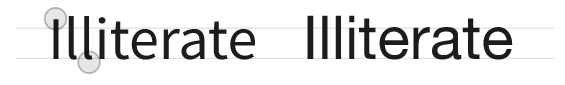
The comparison of Helvetica Neue vs Arial based on legibility isn’t very fruitful. Both these sans serif typefaces have an indistinguishable lowercase ‘L’ and capital ‘i’. One example cited by designer Viljami Salminen in his article Typography for User Interfaces is the word “illiterate.”
Salminen writes:
Some people would also agree that Helvetica sucks for any type of UI work since it wasn’t really developed for use on screen displays. When Apple “momentarily” switched to using Helvetica as their main interface typeface, it caused real usability and readability issues for certain users.
Arial vs Helvetica: Usage
It is known that Arial was developed for laser printers when comparing Arial vs Helvetica. On the other hand, Helvetica is a typeface designed especially for traditional printing works.
Both of these are still extremely popular, but if you had to pick between Helvetica Neue vs Arial – Arial tops the list. This is primarily due to its widespread availability on computers using Windows. However, for graphic design, there is only one font to rule them all… and it’s Helvetica!
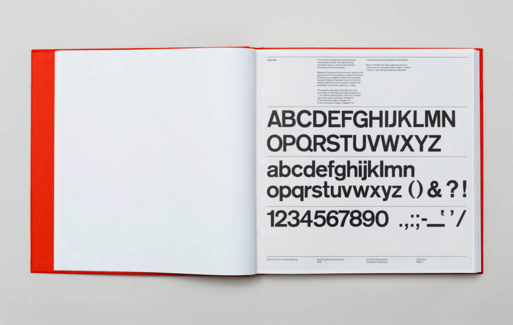
Arial is identifiable in Microsoft Windows, other Microsoft Applications, Apple Mac OS, hyper terminals, and more. However, Helvetica can be spotted in commercial advertisements and logos from BMW, Lufthansa, Toyota, etc. Further examples of its use include federal income tax forms by the U.S. government, and by NASA, on its Space Shuttle orbiters. Also, used for subway signs, it was adopted as the official font signage since 1989.
Conclusion
When you compare Arial vs Helvetica, Helvetica is the more beautifully designed of the two in spite of Arial being very popular. It is also worth noting that Helvetica is wildly popular amongst designers. So, we hope that we have provided you with enough differences between these two typefaces and helped you pick one for your next project!


![10 Best AI Image Restoration Tools to Try in 2025 [Free & Paid]](https://siteimages.simplified.com/blog/Best-AI-Image-Restoration-Tools-01.png?auto=compress&fit=crop&fm=png&h=400&w=400 "10 Best AI Image Restoration Tools to Try in 2025 [Free & Paid]")
![How to Use Photoshop AI Generative Fill Feature [2025]](https://siteimages.simplified.com/blog/How-to-Use-Photoshop-AI-Generative-Fill-01-1.png?auto=compress&fit=crop&fm=png&h=400&w=400 "How to Use Photoshop AI Generative Fill Feature [2025]")
![20 Podcast Thumbnail Ideas to Boost Your Show’s Visual Appeal + Best Practices [2025]](https://siteimages.simplified.com/blog/Podcast-Thumbnail-Ideas-to-Boost-Your-Show-02-1.png?auto=compress&fit=crop&fm=png&h=400&w=400 "20 Podcast Thumbnail Ideas to Boost Your Show’s Visual Appeal + Best Practices [2025]")


