A logo is often the first impression your business gets to make on the world. It’s the face of your brand, the symbol that people instantly associate with your products or services. Choosing the right type of logo for your brand becomes an important decision to make.
Why is having a good logo so important?
First and foremost, your logo serves as the initial impression of your brand’s identity and the services or products it offers. It’s your brand’s calling card, and it should make a lasting impression. In a world of ever-increasing competition and marketing noise, your logo is your beacon of recognition.
Most importantly, a well-crafted logo establishes a visual connection with your audience. It’s like a friendly handshake or a familiar face in a crowd, making your brand easily recognizable and memorable.

Source: Unsplash
Think of the Starbucks logo, with its iconic two-tailed mermaid siren. It’s so effective that it has become synonymous with their coffee. That’s the level of recognition you’re aiming for. And here’s a valuable tip: A great logo is one that’s not just aesthetically pleasing but also highly readable, distinct, and effortlessly adaptable for various applications.
There’s no one-size-fits-all solution when it comes to logos; the key is finding the type that best represents your brand’s identity. In this blog, we’ll take you through 9 logo types and help you choose the one that suits your brand’s vision.
Related: The Ultimate Logo Design Checklist to Help Your Brand Stand Out
Let’s look at these 9 different types of logos:
#1: Wordmarks/logotypes
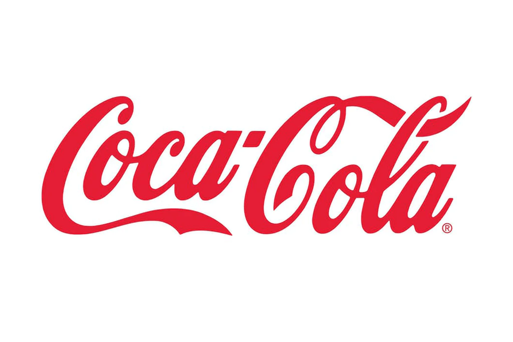
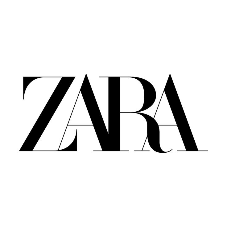
A wordmark or logotype focuses on the business name alone written in a certain typeface or font.
Now, some brands go all out and create a custom typeface just for their logo, just like Coca-Cola did. But, realistically, if you’re a budding business owner, then reaching that point will be a bit of a journey! It takes time and a pro designer’s magic touch, plus a lot of patience in the graphic design department.
Source: Kreafolk
Instead, there’s a more straightforward path too. You can choose a font that matches your brand’s personality. For a modern feel, go for a sleek sans serif font, while trendier designs might want something a bit fancier. Think about whether you want ALL CAPS, a mix of upper and lower, or maybe even some special characters or a pop of color in there.
Since the focus will be on your name, you’ll want to pick a font—or create a font—that captures the essence of what your business does.
Source: Brandlogos
When to use them:
A wordmark is a great choice for brands with catchy names, this is the perfect way to highlight and use it to your branding advantage.
#2: Letterforms
These are the logos that go with just a single letter, usually the initial of your company’s name.
These tiny logos are like the Jacks-of-all-trades – they can be scaled down to teeny-tiny sizes and still pack a punch in recognition, especially if they’re kept nice and simple without too many fussy details.
This makes them ideal for app icons, favicons, social media profile pictures, and more.
Source: Netflix
When to use them:
- Ideal for brands that are already reasonably well-known. Otherwise, it can be tricky getting people to know and remember your company’s name.
- Practical for brands with long names, as they simplify the logo design.
- Suitable for large companies with high visibility, especially when used as part of rebranding efforts.
- A great choice for brands that embrace minimalism, as letterform logos offer simplicity and elegance.
Related: 7 Common Logo Design Mistakes & How To Fix Them
#3: Lettermarks/ Monogram Logos
These are basically logo types made up of your brand’s initials.
Lettermarks can be made using a custom typeface, or by finding a font that successfully conveys your brand identity. Make sure to take into account various typography parameters, like kerning (the spacing between letters), width, weight and style (such as bold or italic).

Source: IBM
When to use them:
It’s relatively easy to get this type of logo up and running – after all, there’s not much detail to think about
- Monograms work well for new or small businesses aiming to boost their brand recognition.
- They’re a popular choice for brands with lengthy names looking to create a more memorable and shortened version.
#4: Logo Symbols/ Brandmarks/ Pictorial Marks
Logo Symbols are like visual storytellers, using graphics, icons, or images to mirror a brand’s identity or mission. Some of the best logos using symbols are the kind when you see one and instantly think, “I know that brand!”
It can be tempting to go for a trendy and “in-the-moment” pictorial logo, but trust us, you don’t want to be redoing your logo every few months just to keep up with the trends. So an important logo design tip is to ensure that your design will always remain timeless.

Source: Designboom
When to use them:
- These types of logos are best for brands and companies that want to create a visually appealing and memorable logo.
- Another plus to using these types of logos is that they help set a strong tone of voice and brand identity.
Related: Test Your Logo With This Quick Exercise
#5: Abstract Logo Marks
Abstract logo marks are all about using images to convey a company’s brand identity, but with a twist. Unlike pictorial marks that depict real things, abstract logos are more like visual metaphors.

Source: Icons-Icons
If you go for this type of logo, pinpoint your brand’s core values. Experiment with reflecting them in a simple, geometric form that will evoke the right emotions and messages.
When to use them:
- Before diving into creating an abstract logo mark, ensure your brand identity is crystal clear and you’ve nailed down the message you want to convey to your audience.
- Abstract logo marks are a smart option for global brands, particularly when their names don’t translate smoothly across various languages, meaning – their logos speak for them.
Related: Secrets Behind Famous Brand Logos You Didn’t Know
#6: Mascots:
Mascot logos are like a brand’s official ambassadors, brought to life in illustrations. These characters can be anything, from mythical creatures to real folks, as long as they embody the brand’s personality.
One of the best things about mascot logos is the fun they bring to the table. They can create a playful, light-hearted atmosphere that really connects with the audience. That’s why you often see companies targeting kids and families using these logos

Source: 1000 Logos
When to use them:
- Mascots, with their inherently friendly and engaging vibe, are a great choice for social media and marketing campaigns.
- These lovable characters are a perfect fit for animation and other dynamic effects, adding a fun and captivating dimension to your branding efforts.
#7: Emblems
Emblem logos are a fusion of text and symbolic imagery, resulting in intricate and timeless designs. While there are no hard and fast rules, emblems tend to be particularly favored by universities, sports teams, and coffee brands. A modern twist on emblem logos is gaining popularity, featuring a minimalist approach characterized by sleek vector illustrations and clean lines.
Source: StickPNG
When to use them:
- Emblems are a go-to choice for those in the food and beverage industry, like craft beer labels or coffee cups (think Starbucks!). Nevertheless, always keep an eye on the details. Your logo design should remain printable and clear across all your marketing materials.
Related: Logo Design 101: How To Create A Logo That Captures Your Brand Essence
#8: Combination Marks
Combination marks, as the name suggests, bring together both images and text in one dynamic package. These logos are well-known amongst brands from all industries.
With Combination marks, you can whip up multiple versions of your logo and use them for different purposes.
For example, Lacoste uses their combination mark on their website design, but you’ll mostly spot their beloved and instantly recognizable green crocodile on their products.
Source: 1000 Logos
When to use them:
- Combination marks are an excellent choice for companies that are just starting out, offering a strong starting point for establishing brand recognition.
- By incorporating icons, symbols, and various forms of imagery alongside text, you help potential customers grasp the essence and identity of your brand more effectively.
#9: Dynamic Marks
Dynamic logos are like the chameleons of the logo world – they can change and adapt in the coolest ways! Surprisingly, they follow the consistency rule rather than breaking it. There’s always a core motif that stays true in every version.
Google is a pro at this; they tweak their wordmark to celebrate holidays or historical figures, and yet, it’s always that trusty Google logo we know and love. It’s like a fun surprise every time we open the browser.
When to use them:
- Dynamic logos work best for brands that are lively and active. If you work in a creative industry and want to stay fresh and innovative, this type of logo may be just the right fit.
- The best part of a dynamic logo treatment for your brand is that you don’t necessarily need to start there. As your brand grows and your logo becomes more recognizable, then you can start adding dynamism to it.
Create your own logo with Simplified
Now that you might know what type of logo you would want for your brand, it’s time to bring it to life. And the good news is, it’s easier than ever with Simplified logo maker!
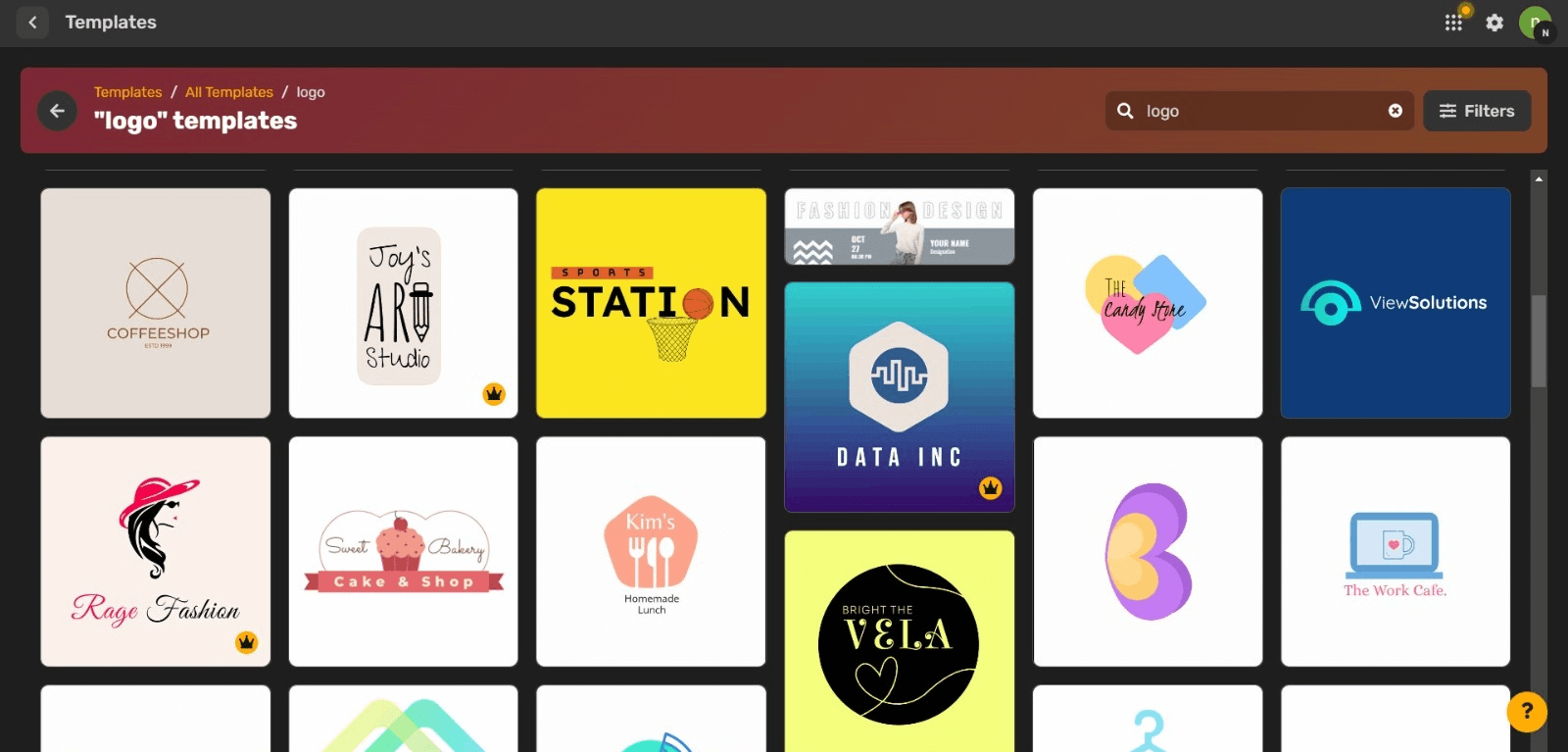
With its user-friendly tool, you can tailor your logo to your exact specifications, customizing text, typography, colors, shapes, and so much more. Additionally, Simplified’s AI-powered image generator is at your service to assist you in crafting logo designs that align perfectly with your creative vision.
So, as you dive into this creative adventure, keep in mind that your logo isn’t just a design; it’s like the friendly face of your brand, the symbol that the whole world will get to know and love.

![10 Best AI Image Restoration Tools to Try in 2025 [Free & Paid] 10 Best AI Image Restoration Tools to Try in 2025 [Free & Paid]](https://siteimages.simplified.com/blog/Best-AI-Image-Restoration-Tools-01.png?auto=compress&fit=crop&fm=png&h=400&w=400)
![How to Use Photoshop AI Generative Fill Feature [2025] How to Use Photoshop AI Generative Fill Feature [2025]](https://siteimages.simplified.com/blog/How-to-Use-Photoshop-AI-Generative-Fill-01-1.png?auto=compress&fit=crop&fm=png&h=400&w=400)
![20 Podcast Thumbnail Ideas to Boost Your Show’s Visual Appeal + Best Practices [2025] 20 Podcast Thumbnail Ideas to Boost Your Show’s Visual Appeal + Best Practices [2025]](https://siteimages.simplified.com/blog/Podcast-Thumbnail-Ideas-to-Boost-Your-Show-02-1.png?auto=compress&fit=crop&fm=png&h=400&w=400)
