If you think that a black and white design is boring and monotonous, think again. This perfect contrasting duo always has something fresh to offer compared to its colorful counterparts. Just look at Cruella De Vil’s timeless, elegant, and powerful design. By employing cool black and white designs, you can increase the impact of your key visuals by giving them a sophisticated and high-end aura.
Are you ready to see how striking a black and white graphic design can be? Take a look at the following examples and find inspiration for your next project.
10 Black and White Design Examples To Inspire You
1. Chalkboard + Typography
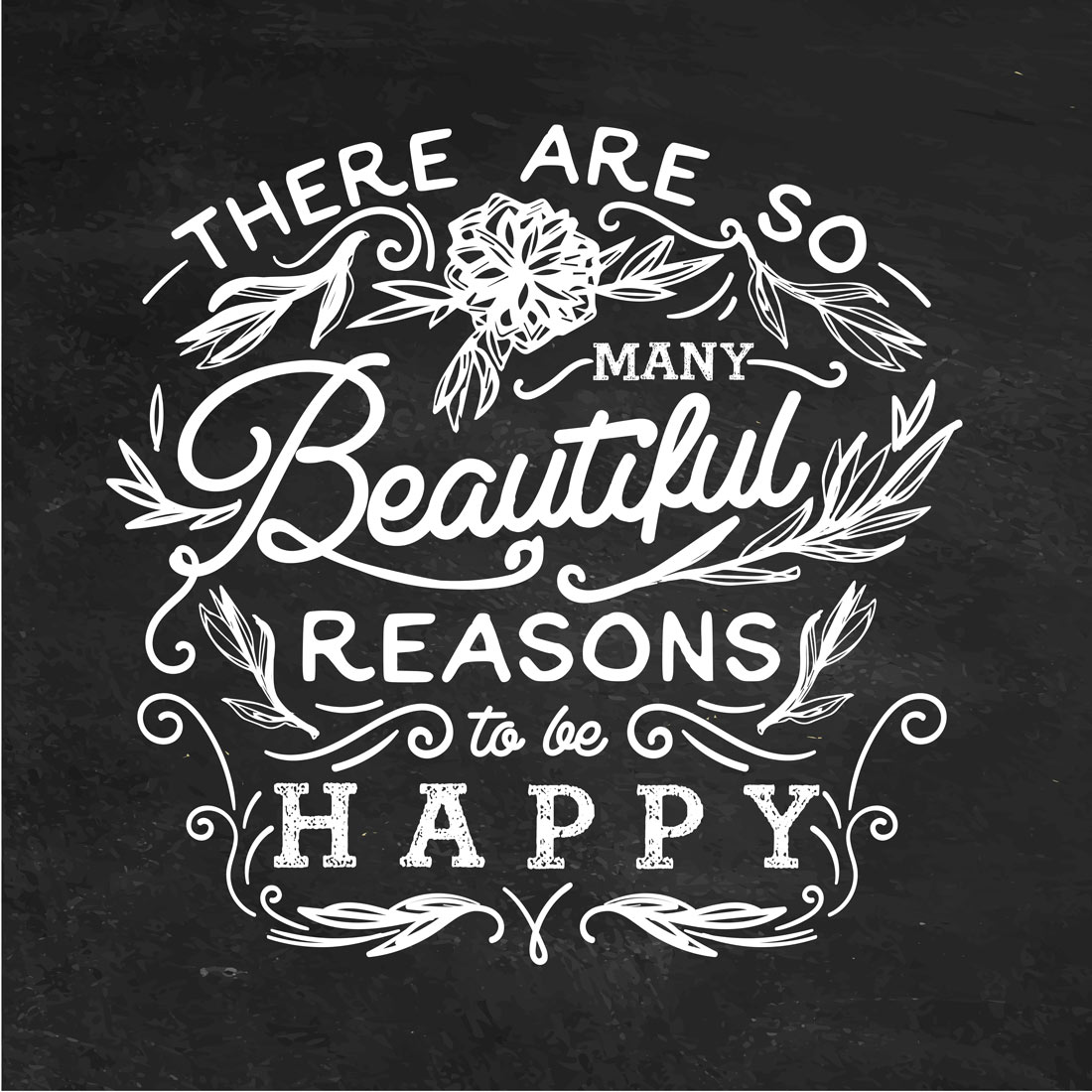
You often see these cool black and white designs in shops that have chalkboard menus. This design plus a mix of typography is a powerful visual. You can use this template design for motivational quotes. Typography is also considered a texture in graphic design so that’s a plus.
2. Optical Illusion
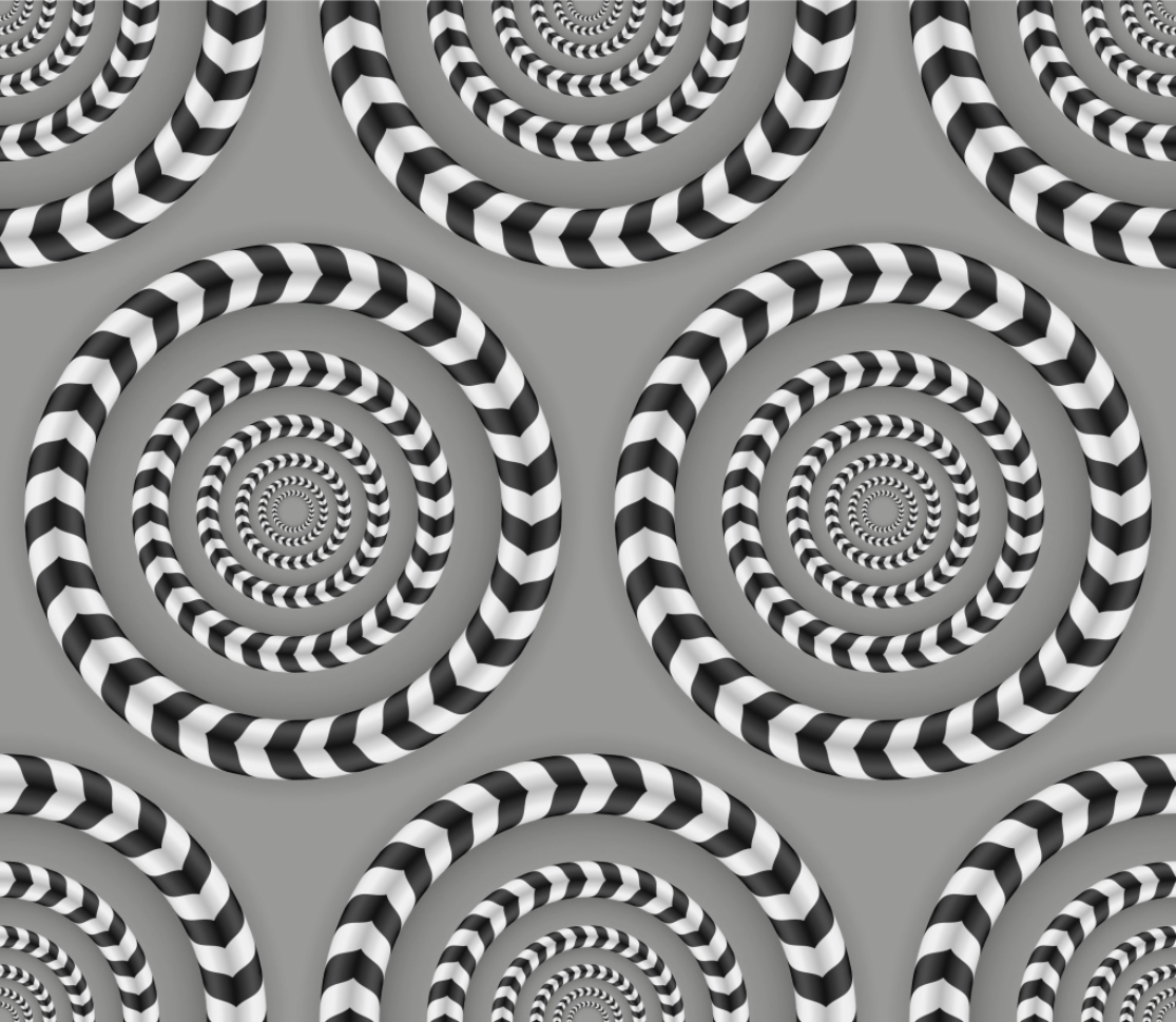
Most optical illusions only use a black and white design. It’s amazing how a simple color combination can already play tricks on you. Creating illusions is a work of art and it will definitely catch the attention of your audience.
3. Watercolor Effect
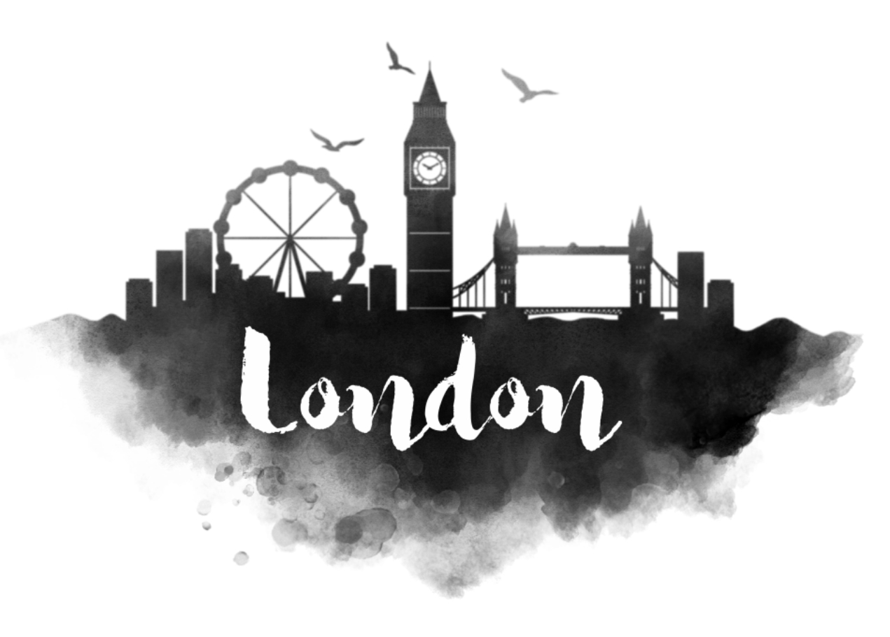
You can add some texture to a black and white design through the use of watercolor effects. The smoky, gray areas look elegant, like artwork in itself.
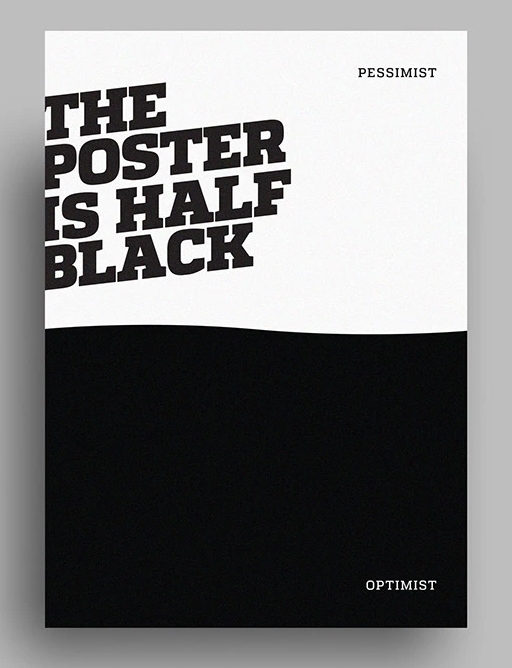
4. Maximum Contrast
Related: How to Use Geometric Patterns Creatively in Graphic Design
5. Intricate Symmetry
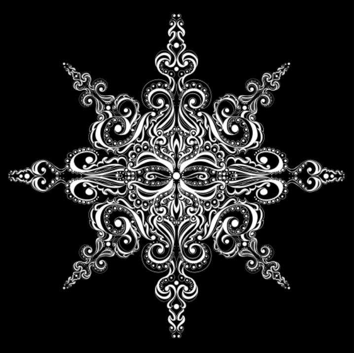
A simple black and white graphic design looks artistic if you play with lines to create a symmetrical image. Symbols, logos, and illustrations look more stunning using this color scheme.
6. Playful Negative Space

A negative space is a space around the design that has a shape of its own. In this example of a simple black and white logo, you can see an image within an image. There’s a wolf and a deer, and the circle is made out of a crescent moon and an antler.
7. Bold Stripes
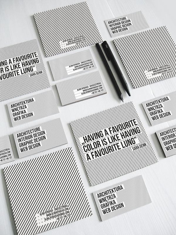
Of course, a black and white design will not be complete without stripes! A combination of lines and stripes always looks strong and serious. It’s a classic and it will never go out of style.
8. Black and White Photography

Ever wonder why a black and white photograph is an effective image to go with a message? The lack of color does not mean that it’s something from the past. It gives depth and drama.
9. Angles + Shadows
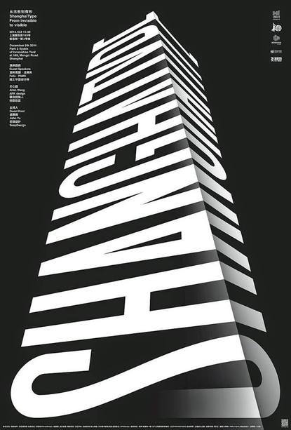
Another cool black and white design that you can do is to play around with angles and shadows. This can create the illusion of a 3D image.
10. Lines + Shapes + Geometric Patterns
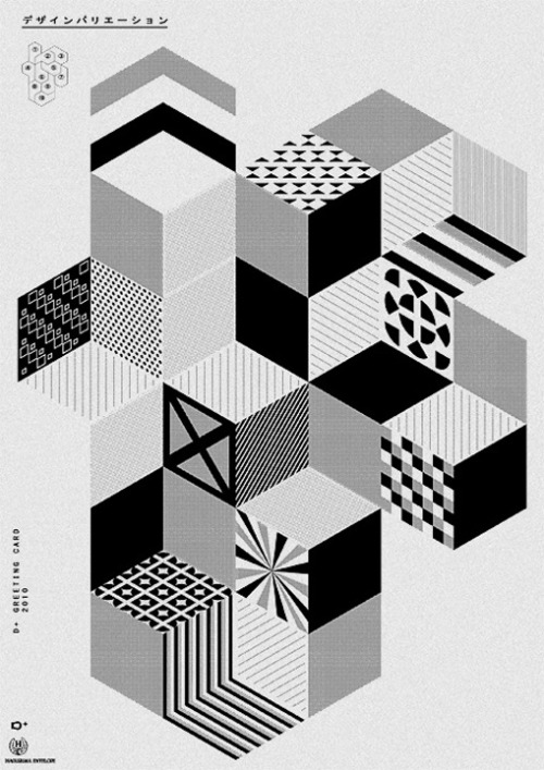
A mix of lines, shapes and geometric patterns is visually appealing. The black and white drawing designs pop out even more.
Final Thoughts
These are just a few of the many iterations of cool black and white designs. They are considered classic, but definitely not a thing of the past. While most people think it’s minimalist, that does not have to be the case. With just two monochromatic colors, you can already create a variety of designs depending on your needs. Whether for branding kits, social media assets, marketing collaterals, or key visuals, you can never go wrong with a black and white color scheme. Just head on to Simplified, a free design tool where you can create invitations, ads, social media posts, videos, and more. All in one place. Absolutely free!


![10 Best AI Image Restoration Tools to Try in 2025 [Free & Paid] 10 Best AI Image Restoration Tools to Try in 2025 [Free & Paid]](https://siteimages.simplified.com/blog/Best-AI-Image-Restoration-Tools-01.png?auto=compress&fit=crop&fm=png&h=400&w=400)
![How to Use Photoshop AI Generative Fill Feature [2025] How to Use Photoshop AI Generative Fill Feature [2025]](https://siteimages.simplified.com/blog/How-to-Use-Photoshop-AI-Generative-Fill-01-1.png?auto=compress&fit=crop&fm=png&h=400&w=400)
![20 Podcast Thumbnail Ideas to Boost Your Show’s Visual Appeal + Best Practices [2025] 20 Podcast Thumbnail Ideas to Boost Your Show’s Visual Appeal + Best Practices [2025]](https://siteimages.simplified.com/blog/Podcast-Thumbnail-Ideas-to-Boost-Your-Show-02-1.png?auto=compress&fit=crop&fm=png&h=400&w=400)


