While typography may look simple at first glance, it is actually deceptively tricky. The plain, toned-down nature of typography makes it very hard for imperfections to hide anywhere. However, this is an easy fix because we at Simplified have created the only guide you will need to understand, identify and use minimalist fonts in your design!
Try Simplified AI Font Generator!
What are minimalist fonts?
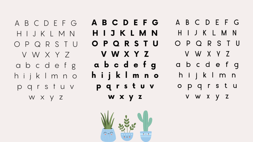
Minimalism began around the 1950s and 60s, inspired by the Bauhaus movement in architecture. At its core, minimalism is about designers expressing the most essential characteristics of a product or subject.
Minimalist Fonts are clean, simple, and elegant typefaces that provide high readability. They are characterized by clean strokes and a minimal number of shapes. Below are some qualities that you should look for in a minimalist font:
- Clean lines and crisp edges;
- Very few geometric shapes within the letters;
- Whitespaces to give a modern and airy look;
- Design details with significance or purpose;
- Legibility: this means letters with large apertures and distinct shapes.
Using Minimalist Fonts in Your Design
Minimal Fonts are modern typefaces that are efficient and forward-thinking.
There is an excellent infographic by Crazy Egg that illustrates what feelings, emotions, and associations font types evoke.
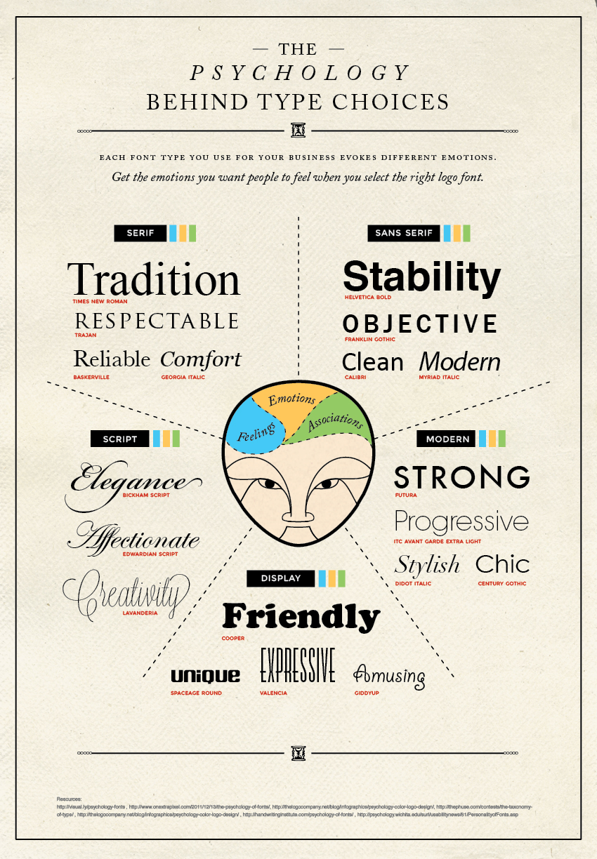
There are simple tips—never use all caps and keep the number of fonts to a minimum—but a lot of formatting decisions rely on trial and error.
Grid Lover lets users customize type formatting for the best readability. CSS is generated to the side for easy implementation.
Pairing Minimalist Fonts Like A Pro
Clean lines with sleek lettering. Rough edges and maybe some brush strokes. Elegant and classy. Whatever aesthetic you’re aiming for, make sure you pick a font to match.
Pair fonts that have some differentiators. Whether it’s thick and thin, tall and short, serif and sans serif. This will help create better hierarchies.
Tip #1: Pair a romantic serif (header) with a modern minimalist font (sub-header), usually sans serif. You can use small-size serif + italic for the body text.
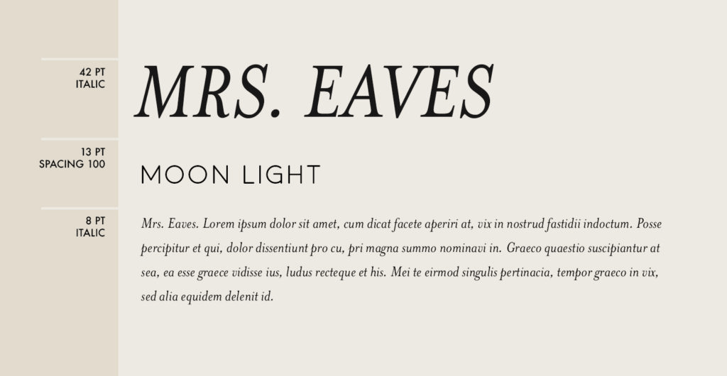
Bonus: 17 Modern Fonts To Use To Help Your Design Stand Out
Tip #2: You can use the same minimalist font for the header and sub-header but switch it up a little! You can keep the header uppercase and make the subheader italics. To make it look clean, use a minimalist sans serif font for the body.

Tip #3: Play with the thickness within a minimalist font family. Pair a modern sans serif with a classic serif for the header + subheader. However, use a thinner version of the header font for the body text.
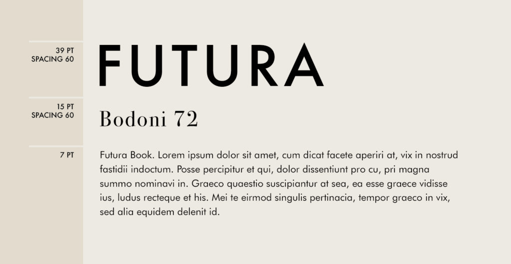
Tip #4: Similar to the aforementioned tip, play with thickness. For a modern minimalist design, use only sans serif fonts.
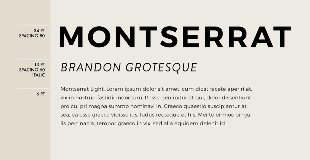
Famous Logos That Scream Minimalist Design
Bold, simple shapes, minimalist fonts, and single-color designs characterize minimal logos. They’re without the extra pizzazz and focus solely on the core design concept.
These logos stand out even in the most crowded places and resonate with your brand’s identity with your target audience. Below are some of the most iconic minimalist logo designs.
1. Uber
Uber’s wordmark logo is an amazing example of minimalist design. Unlike their contemporaries that use monograms or symbols, Uber opted for this clean, simplistic font.
The logo was so iconic that the MCKL Type family is now synonymous with the brand.
2. Airbnb
On the company’s 10th anniversary, Airbnb rolled out its new logo with the minimalist font – Cereal. The rebrand to this new modern font was done keeping in mind the company’s personality.
Cereal – a geometric sans serif, was designed with an overall roundness that feels friendly and approachable.
3. Nike
To not include Nike in this list of minimalist design logos, is to err. The logo, also known as “Swoosh” was designed by a graphic student Carolyn Davidson in 1971.
The Swoosh was emblematic of the company name, that is, the winged Greek goddess of victory. The minimalist font appearing above the swoosh is italicized Impact, a sans serif typeface created by Geoffrey Ley in 1965.
Top Minimalist Fonts Across the Internet
Here are some of the most popular minimalist fonts you can use in your next design!
1. Poppins
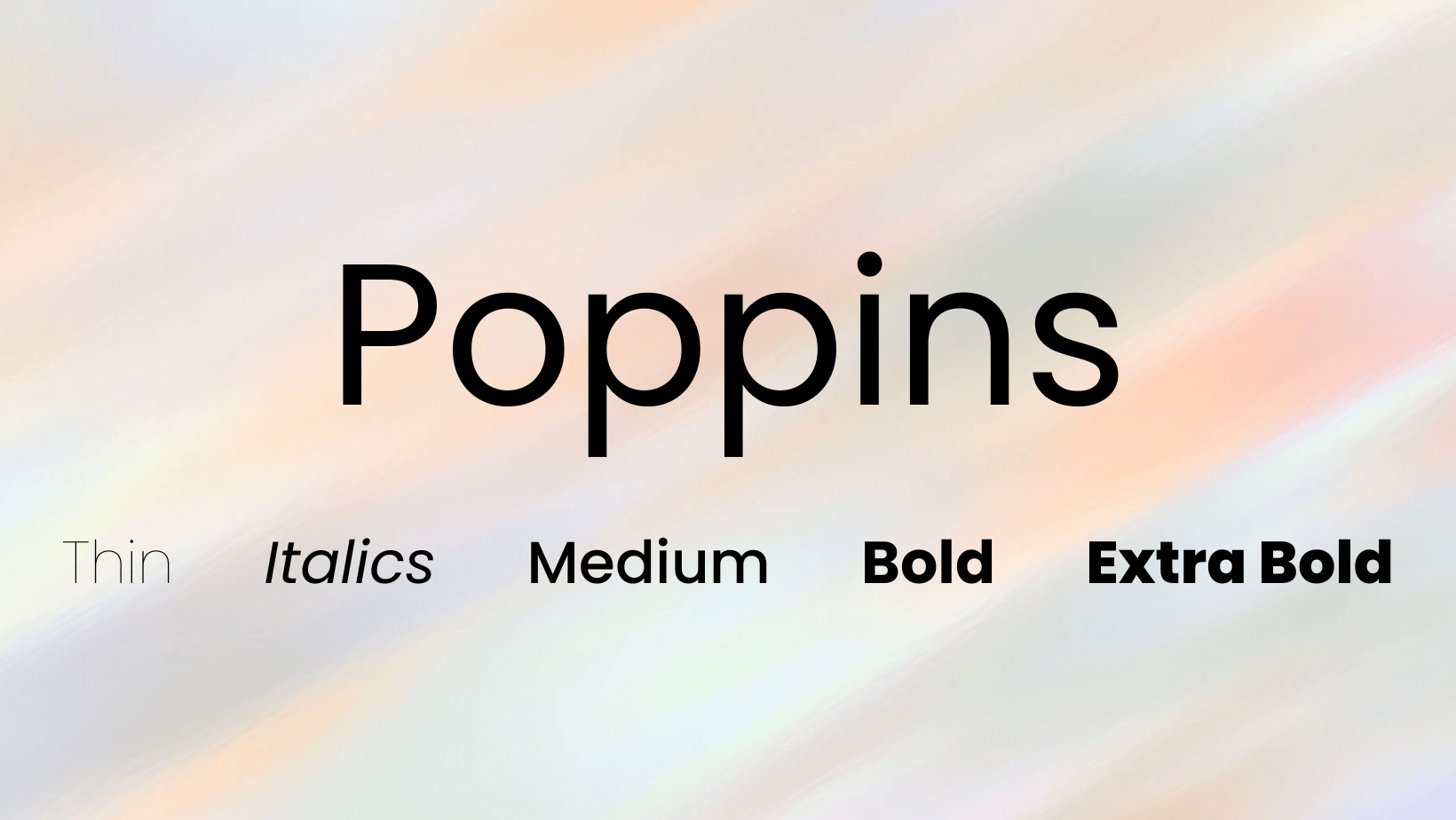
Poppins features a geometric sans-serif design, with nearly monolinear letterforms. It applies optical corrections to stroke joints where necessary, ensuring a uniform typographic color.
2. Lato
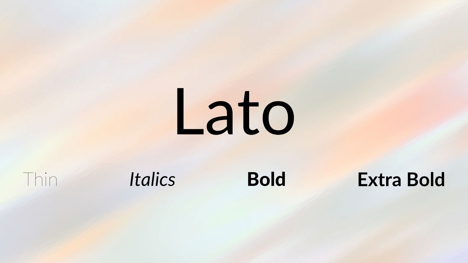
Lato, a sans serif typeface family, brings a unique blend of warmth and stability to your designs. Its semi-rounded letter details infuse a sense of coziness while maintaining a strong and serious structure.
3. Montserrat
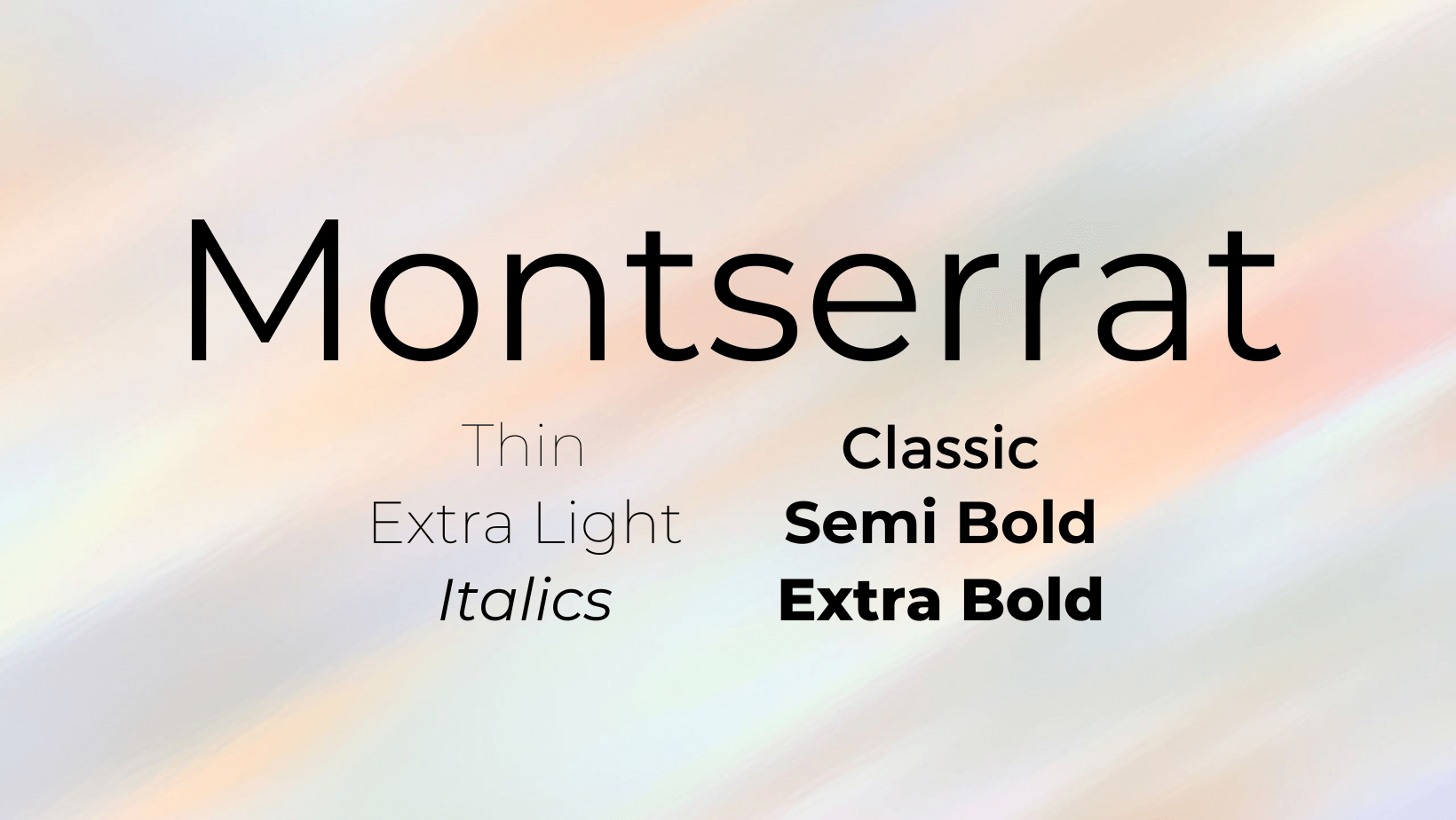
Montserrat is a visually appealing sans-serif typeface that pays homage to the urban typography of Buenos Aires’ Montserrat neighborhood. It strikes a harmonious balance between modern simplicity and the nostalgic charm of early 20th-century signage.
4. BW Quinta Pro

Bw Quinta Pro is a fresh typeface that immediately evokes a sense of familiarity. This contemporary humanist sans serif strikes the perfect balance between approachability and stability, exuding a smart and professional aesthetic.
5. Raleway
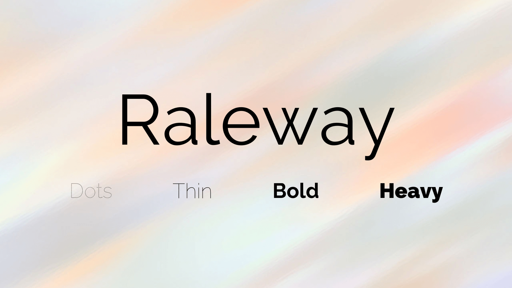
Raleway is a sophisticated geometric sans-serif font family that adds an elegant touch to your design endeavors. This versatile font is your go-to choice, offering both boldness and delicacy to suit any project.
6. Panton
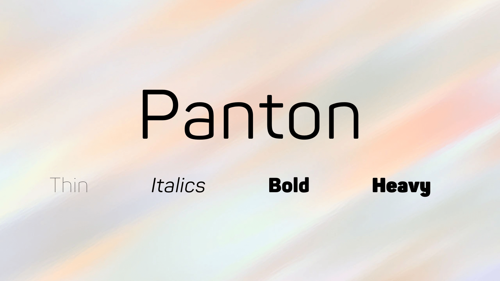
Panton is a contemporary geometric sans serif, that ensures excellent legibility across both print and web platforms. This versatile provides a balanced and modern typographic solution for all your design needs.
7. Quicksand

Quicksand is a sans-serif typeface that embraces simplicity and geometric proportions, offering ample spacing between letters. Its clean and contemporary design makes it a valuable asset for a wide range of professional projects.
8. Helvetica
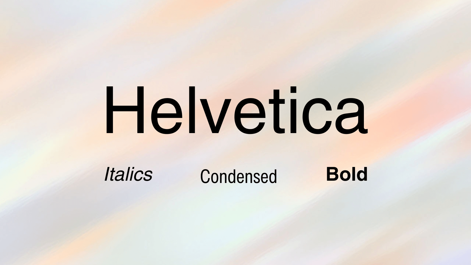
Helvetica is a timeless and widely used sans-serif typeface known for its clean, legible, and neutral design. With its balanced proportions, clear lines, and versatility, Helvetica has become a staple choice for a diverse range of design applications across various industries.
9. Nunito
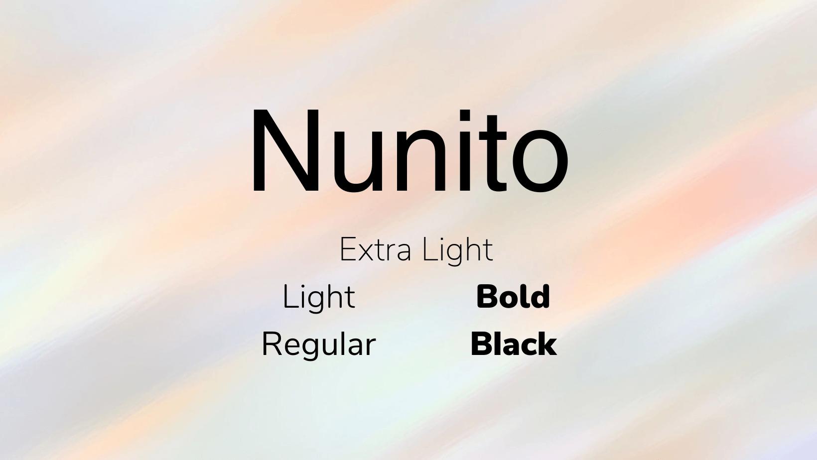
Nunito is a modern sans-serif font with a friendly and balanced appearance. Its gentle curves and open letterforms create a harmonious and approachable vibe. Nunito is a great choice for various design projects, delivering both readability and visual appeal.
10. Blogger Sans
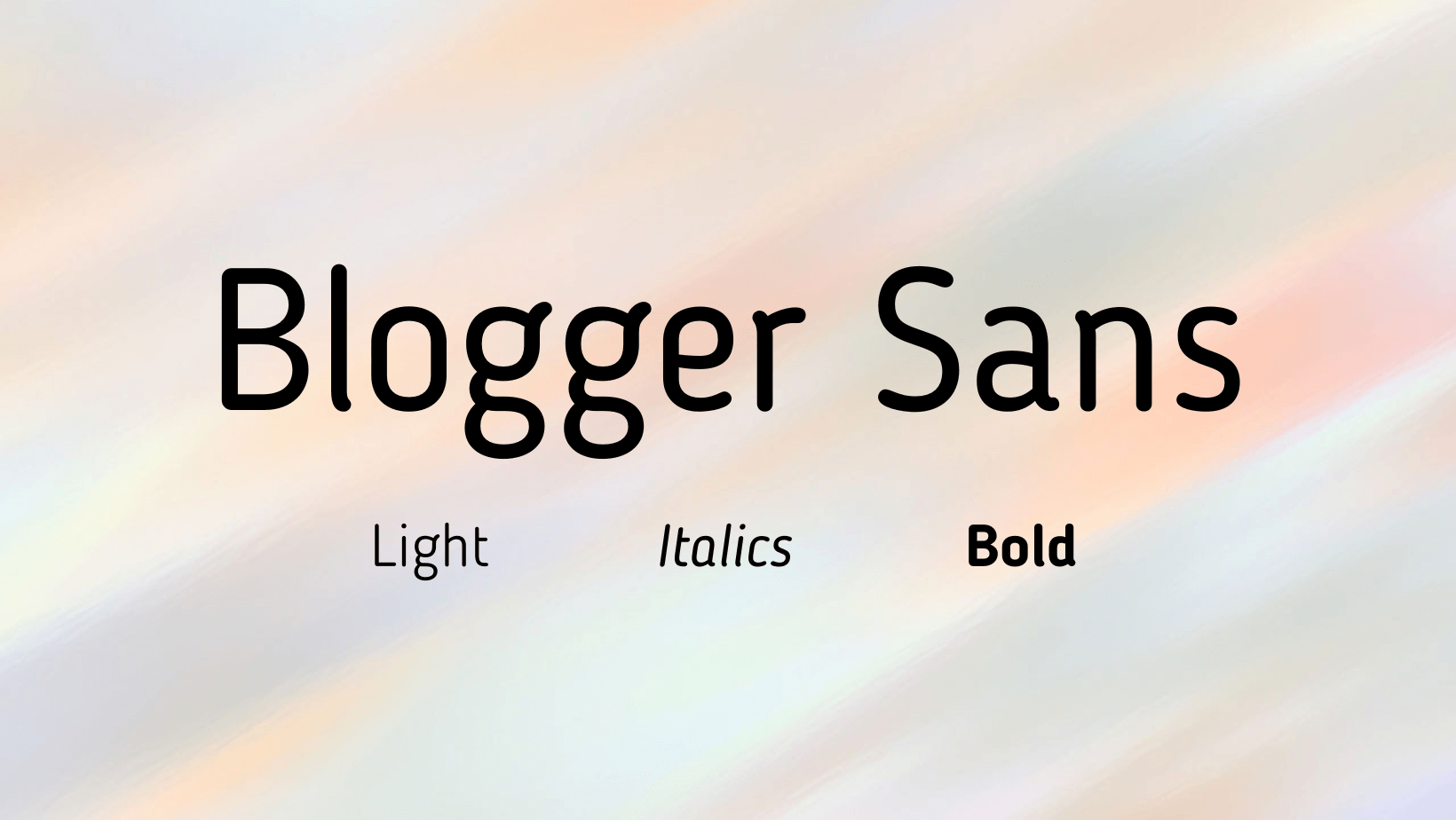
Blogger Sans was specifically crafted for captivating website headlines, boasting a sleek and clear design. This typeface offers four weights along with matching italics, providing versatility and coherence.
Chrome Extensions to Identify Fonts
Owing to a myriad of font choices and their strikingly similar characteristics, it becomes difficult to distinguish between typefaces. That’s why we have created a list of Chrome extensions you can use to identify fonts.
1. Fonts Ninja
Fonts Ninja has over 400k users and an average rating of 4.4 out of 5. The free version of the extension helps you quickly identify fonts by hovering over the text.
Furthermore, it provides a summary and preview of all the fonts and lets you bookmark them. This extension is our go-to for identifying that minimalist font we adore!
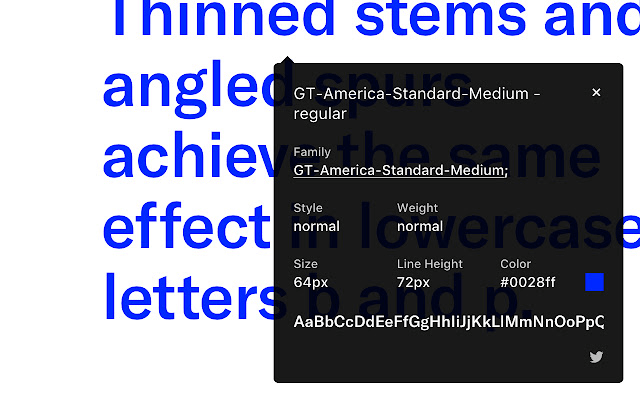
2. WhatFont
This font finder has over a million users on the Chrome Web Store and an average rating of 4.1 out of 5.
3. Font Finder
This extension is perfect for power users and web developers. This extension, similar to WhatFont, has over a million users and an average rating of 4.1 out of 5.
It helps identify fonts quickly, not to mention, its uncanny ability to replace a type on a live web page with another for testing.
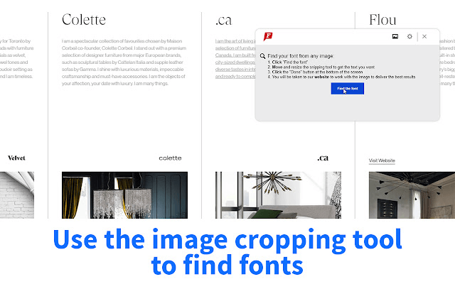
4. WhatFontIs
If you are looking for an extension to find fonts within an image, WhatFontIs is your best bet.
Agreed, it doesn’t give the most perfect match at all times, but it throws out loads of related fonts to help you identify the right one. WhatFontIs has over 10k users and an average rating of 3.7 out of 5.
Download Your Favorite Minimalist Fonts for Free Here
- FontM
- DaFont
- Creative Market
- Behance
- Google Fonts
- Fontasy
- Neogrey
We hope this Simplified guide to minimalist fonts will help you pick the right typefaces for your next project. You can use Simplified default fonts or upload your own fonts to create a range of graphics!

![10 Best AI Image Restoration Tools to Try in 2025 [Free & Paid] 10 Best AI Image Restoration Tools to Try in 2025 [Free & Paid]](https://siteimages.simplified.com/blog/Best-AI-Image-Restoration-Tools-01.png?auto=compress&fit=crop&fm=png&h=400&w=400)
![How to Use Photoshop AI Generative Fill Feature [2025] How to Use Photoshop AI Generative Fill Feature [2025]](https://siteimages.simplified.com/blog/How-to-Use-Photoshop-AI-Generative-Fill-01-1.png?auto=compress&fit=crop&fm=png&h=400&w=400)
![20 Podcast Thumbnail Ideas to Boost Your Show’s Visual Appeal + Best Practices [2025] 20 Podcast Thumbnail Ideas to Boost Your Show’s Visual Appeal + Best Practices [2025]](https://siteimages.simplified.com/blog/Podcast-Thumbnail-Ideas-to-Boost-Your-Show-02-1.png?auto=compress&fit=crop&fm=png&h=400&w=400)
