You should never judge a book by its cover, or so the saying goes. But no one ever said anything about a YouTube video! Truthfully, though, whether you’re choosing a book or a video, the cover is what gets you inside. So, you could argue, the YouTube thumbnail is even more important than the YouTube video title for attracting viewers.
The YouTube thumbnail should grab the attention of your target audience. Give them the first glimpse of what your video offers. You may have spent days creating an amazing video, but all of that will be in vain if you do not nail the art of making the perfect YouTube thumbnail !
You want to create a thumbnail that goes hand in hand with your YouTube branding. Read this guide to discover how to create a YouTube thumbnail that gets you all the clicks, views, and followers you’ve been waiting for.
Not only does Simplified have the best hints and tips on this subject, but we’ve also got an excellent (free!) YouTube thumbnail tool to help you out.
Related: How to Create a YouTube Channel and Grow Your Network
1. Use the Right YouTube Thumbnail Dimensions
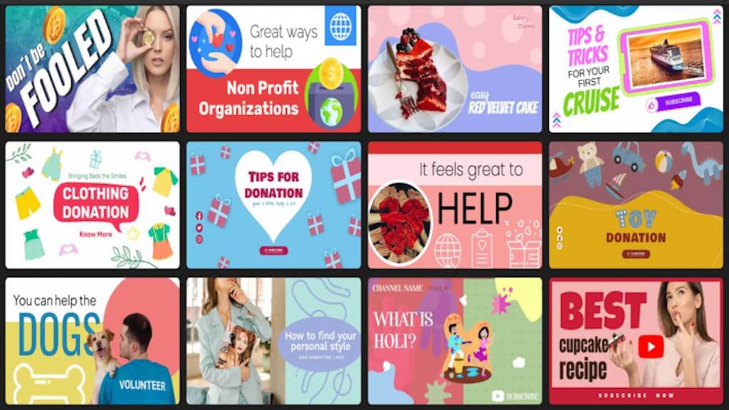
The basics always come first. So, make sure to get them right. Check out the latest YouTube guidelines to make sure you have the right YouTube thumbnail size.
- Recommended YouTube thumbnail size: 1280 x 720 pixels
- Maximum width of the YouTube thumbnail: 640 pixels
- Recommended YouTube thumbnail ratio: 16:9
- Accepted file types: .jpg, .png, .gif, .bmp
Once you’ve got the technical aspects down, then you can focus on the fun stuff!
2. Less Clickbait, More Relevance!
For video creators, it might often be tempting to use clickbait content and visuals. But let’s be honest, it really misleads viewers. Therefore, clickbait might make customers lose confidence in your brand.
Moreover, your YouTube thumbnail should give your audience a true insight into what the video is about. It should set the stage for the video before they jump in.
A relevant YouTube thumbnail will give viewers a glimpse of what’s to come – nothing less and nothing more. It’s okay to use a hook to draw the viewer’s attention as long as your video content follows through.
Related: 5 Epic Ingredients For A Successful Social Video Marketing Strategy
3. The Power of Colors
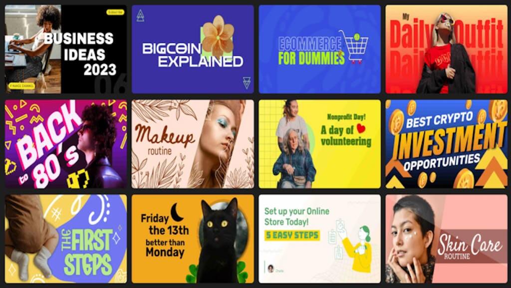
We can’t stress enough how important colors are when it comes to creating attention-grabbing content. No one wants to waste their time on what looks like a boring video with a dull YouTube thumbnail.
Use bright, contrasting shades that stand out in the YouTube feed. Make sure that the thumbnail pops on the big screen as well as on smaller smartphone screens.
The color palette should be carefully chosen for both the text and the images. They should be consistent with your brand concept and your YouTube channel art.
4. Check the Logo Placement
These days, having a brand strategy is a must. And it’s important to include your brand logo in every piece of content you upload. Building brand loyalty is essential not only for businesses but also for entrepreneurs and influencers. Your brand logo will enhance your YouTube marketing strategy because it will help viewers recognize your brand and return to your page.

Moreover, logos are the most recognizable brand identifiers at 75%. Just don’t let your logo overpower your YouTube thumbnail. Your brand logo should always be placed in the same spot and should not get in the way of the viewing experience.
Related :What Are YouTube Tags And How To Find Them
5. Simple but concise design
The YouTube thumbnail conveys a lot of information about your video to potential viewers for something so little. But it doesn’t mean you should stuff it full of text and pictures. You should design a clean and uncomplicated YouTube thumbnail for the sake of clarity.
It’s important to include an expression, whether it’s in a character, picture, or emoji. Utilize high-quality photos that follow the suggested YouTube thumbnail size. It works great with a small amount of text in a huge font. Additionally, you choose a powerful backdrop image to support your content.
The Simplified AI copywriting tool can come in very handy here, to help you create short and compelling headline phrases.
6. Spark Curiosity with your Copy
Your copy and special effects should connect with your target audience and spark their curiosity, making them want to click and watch. Using facial expressions, good graphics, and colors can do half the task for you. A simple and catchy text phrase does the rest.
Do not copy your title into the thumbnail. Shorten your headline to keep things concise, and remember to include those all-important keywords. Check out these 17 AI copywriting tools to help you create content in seconds! A couple of smartly-picked words will do.
The color of the text should match your thumbnail image and the words should let people know what your video is about. Again, simple but compelling!
7. Play around with Graphical Elements
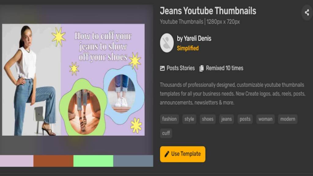
If graphics complement the mood of your video content, be sure to include them in your thumbnail image. Include related pictures or text in your thumbnail if your video has any additional information. It may be pictures, stickers, emoticons, or just plain text.
8. Incorporate Close-Ups
Close-up images in your video’s thumbnail image have the potential to do wonders. Do you se e why?


On smartphones, your YouTube thumbnail picture is displayed quite small. So if it’s too wide, it becomes much more difficult to understand the image’s purpose and details. On the other hand, close-up pictures are certainly easier to view and make an impact quickly.
Related: 5 Best Youtube Title Generators That You Can Use For Free
9. Test your YouTube Thumbnails
Finally, be sure to experiment with various YouTube thumbnail templates. You could create several different thumbnails for a single video by using the guidelines and tips mentioned above. You might use an illustration or an actual image from your gallery that relates to your writing.
Play around with the text phrases and backdrop colors. Finding out just what is motivating your target audience might need some work. Testing a few YouTube thumbnails before selecting the best one is recommended.

Swap your thumbnails in a couple of weeks and see if the number of views and clicks goes up or down. Measure the difference and you will eventually settle on the perfect YouTube thumbnail maker that appeals to the majority of your target audience.
Elevate your YouTube Game
YouTube is a competitive world, and every little detail matters. The perfect YouTube thumbnail should excite your current audience base. And ideally, it should also grab the attention of new viewers. What’s more, it should be absolutely relevant to your content. If you follow these simple guidelines, you’ll keep your audience coming back for more of your content.
The Simplified YouTube thumbnail tool is exactly what you need to get started. With tons of creative templates, fonts, and colors, plus an excellent AI copywriting generator, your YouTube thumbnail will have the potential to reach millions. Additionally, there are also a variety of YouTube Management Tools to boost your YouTube branding strategy.
Now over to you to create great content! Head over to Simplified to start creating a brilliant YouTube thumbnail now!
Create Youtube Thumbnails with stunning images and videos
With Simplified, you can tap into the world of unexplored creativity using tools such as design, AI copy, and collaboration to scale your brand.



![10 Best AI Image Restoration Tools to Try in 2025 [Free & Paid] 10 Best AI Image Restoration Tools to Try in 2025 [Free & Paid]](https://siteimages.simplified.com/blog/Best-AI-Image-Restoration-Tools-01.png?auto=compress&fit=crop&fm=png&h=400&w=400)
![How to Use Photoshop AI Generative Fill Feature [2025] How to Use Photoshop AI Generative Fill Feature [2025]](https://siteimages.simplified.com/blog/How-to-Use-Photoshop-AI-Generative-Fill-01-1.png?auto=compress&fit=crop&fm=png&h=400&w=400)
![20 Podcast Thumbnail Ideas to Boost Your Show’s Visual Appeal + Best Practices [2025] 20 Podcast Thumbnail Ideas to Boost Your Show’s Visual Appeal + Best Practices [2025]](https://siteimages.simplified.com/blog/Podcast-Thumbnail-Ideas-to-Boost-Your-Show-02-1.png?auto=compress&fit=crop&fm=png&h=400&w=400)
