Graphic design is a huge part of our lives, whether we realize it or not. It’s everywhere, from the houses we live in, to the cereal we eat. A good design can be really awesome, while a bad design can be a total turn-off.
If you’re looking to express yourself creatively, graphic design is a great place to start. It’s accessible to beginners and can be used for both personal and professional projects. But it can also be easy to make graphic design mistakes when you are new to it.
So let’s uncover the 7 most common graphic design mistakes made by beginners, and ways to correct them!
Related: Simplified Tips For Designing Facebook Ads That Actually Work
Top Graphic Design Mistakes by Beginners
1. Improper use of fonts
With so many fonts to choose from it can be difficult to settle for just one. Here’s a short guide to making your text legible to avoid this design mistake:
- What’s the mood of my graphic? Try to use a font that goes well with the mood of your image.
- How can I keep my text short and still convey the message?
Simplified Design Tip: For readability stick to an average of 50-60 characters in a sentence.
Related: Simplified’s smart alignment & grouping
2. Clashing colors
Having fun with your designs is great, but you don’t want to end up with a clash of colors that turns your audience away. To combat this problem try using this method:
- Layer your base color with a contrasting color.
- Choose a color that aids readability.
Simplified Design Tip: Look for color palette inspiration on platforms like Pinterest & Coolors.
3. Convoluted configurations
Graphic design is all about patience and creativity. Many novice designers make the mistake of over-complicating their designs due to limited app knowledge.
- Choose user-friendly graphic design tools instead of niche professional tools.
- Watch tutorials and learn key shortcuts to make designing quick and easy.
Related: Best Graphic Design Tips For Non-Designers And Beginners
4. Breaking the visual hierarchy of text
when it comes to reading text, our brains are pretty much hardwired to do it in a specific order. So if you go ahead and break the visual hierarchy, there’s a decent chance that your message will get lost in the shuffle.
- Follow this text rule of thumb: big font to small font.
- Use the heading structure to emphasize the information you want the reader to retain.
5. Cluttered designs (most common graphic design mistake!)
Having too many elements in your design is one of the gravest design mistakes. It can be really overwhelming and confusing for viewers. As a designer, it’s important to remember the saying “less is more.” Try to stick with a minimalistic approach for a cleaner and more sophisticated look.
- Use your negative space well!
- Add less text.
- Use fewer illustrations and elements.
Related: Digital Design vs. Graphic Design: What’s The Difference?
6. Inconsistency
This graphic design mistake is most relevant to small business owners. When creating your brand’s logo, be mindful of how you can apply the same style to your other marketing designs in the future: business cards, packaging, etc.
- Create a color palette for your brand and stick to it!
- Make sure your logo is multi-purpose and works well for both online and offline marketing.
Simplified Design Tip: Consistency is key when it comes to a brand’s identity and voice. So figuring out these tiny details at the beginning can help you save time and money later.
Related: Picking The Right Fonts For Your Website: Simplified Guide
7. Overlooking file formats and mediums
Another overlooked graphic design mistake is not knowing the medium for your designs. Identifying where your design will be used can help you save tons of time and perhaps a facepalm moment later!
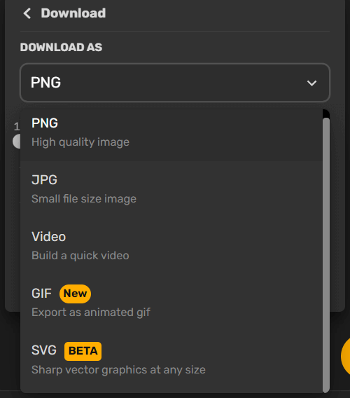
- Determine the medium: print or digital? Use RGB format for digital graphics and CMYK for prints.
Simplified Design Tip: Be mindful of your spacing especially when designing print material. For example, the space between two pages is called a gutter. So if you are working on designs for a book/magazine, leave enough gutter margin for readability.
8. Unchecked alignment
If you want your design to look neat and orderly, make sure to align your elements properly. Misaligned elements can make your design look crazy and all over the place.
- Make use of grids to check the alignment
- Notice the alignment lines that appear when moving elements around
9. Hard-to-read text
Design isn’t just about making things look good; it’s about effective communication. This means that text shouldn’t just be designed to look good, but also to be easy to read. The placement of text and the contrast between the text and the background are both important factors to consider.
Ease Your Design Worries With Simplified
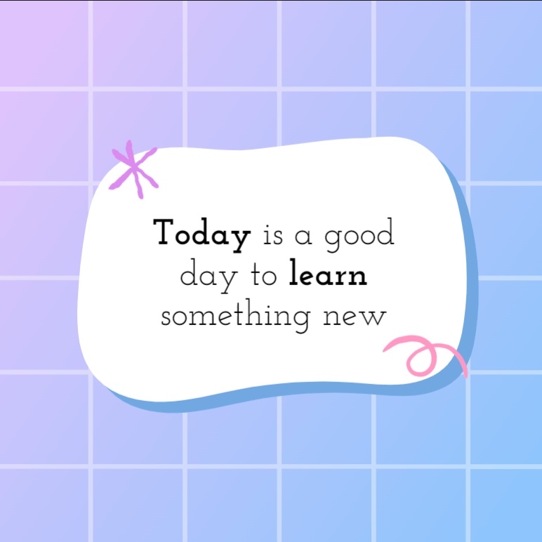
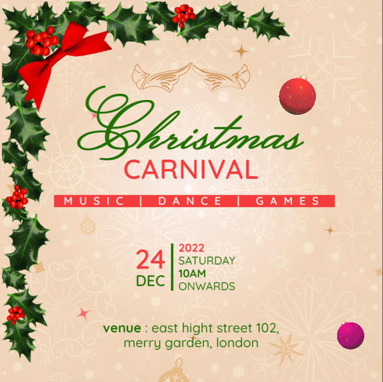
Creating amazing social media posts, videos and more is a breeze with Simplified. The all-in-one workspace lets you design, write, collaborate and scale your brand easily. With our design tools, you can create stunning designs quickly and easily. And with our brand kit feature, you can add your brand logo, color palettes, and fonts.






![10 Best AI Image Restoration Tools to Try in 2025 [Free & Paid] 10 Best AI Image Restoration Tools to Try in 2025 [Free & Paid]](https://siteimages.simplified.com/blog/Best-AI-Image-Restoration-Tools-01.png?auto=compress&fit=crop&fm=png&h=400&w=400)
![How to Use Photoshop AI Generative Fill Feature [2025] How to Use Photoshop AI Generative Fill Feature [2025]](https://siteimages.simplified.com/blog/How-to-Use-Photoshop-AI-Generative-Fill-01-1.png?auto=compress&fit=crop&fm=png&h=400&w=400)
![20 Podcast Thumbnail Ideas to Boost Your Show’s Visual Appeal + Best Practices [2025] 20 Podcast Thumbnail Ideas to Boost Your Show’s Visual Appeal + Best Practices [2025]](https://siteimages.simplified.com/blog/Podcast-Thumbnail-Ideas-to-Boost-Your-Show-02-1.png?auto=compress&fit=crop&fm=png&h=400&w=400)

