
The Golden Ratio pattern is a mathematical ratio commonly found in nature. In graphic design, it instantly attracts viewers because of its symmetry and visual appeal. Read this short guide to know what the golden ratio is, and how you can use it in graphic design!
The Golden Ratio Pattern: From The Pyramids of Giza To Apple Inc.
Hyped or Extraordinary: What’s Golden Ratio in Graphic Design?
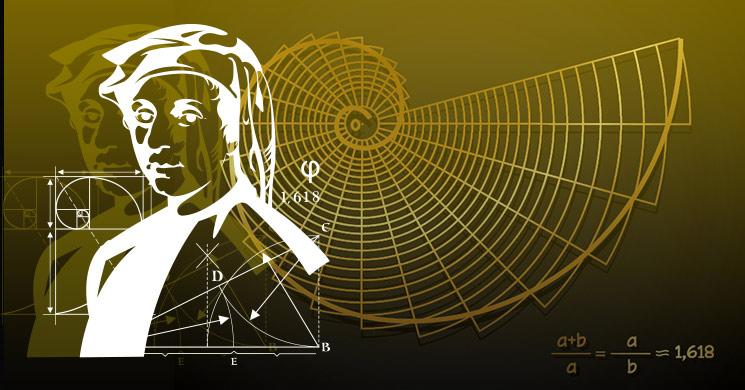
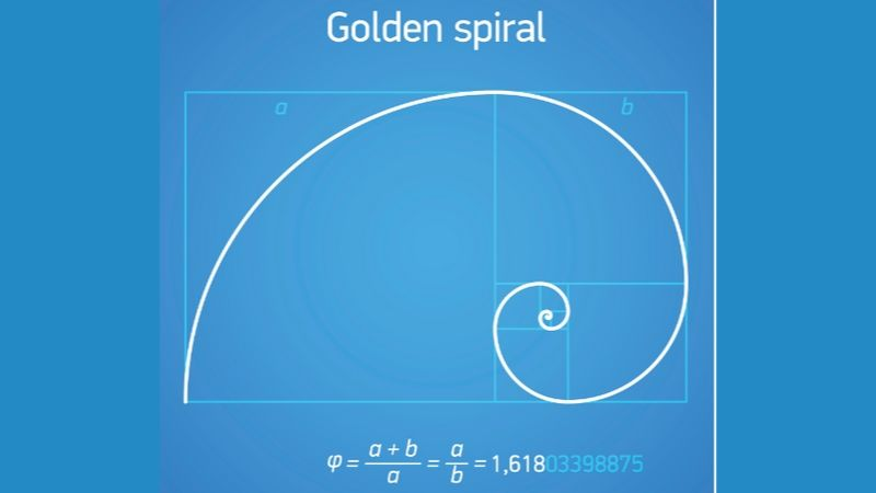
The ratio’s numeric value is approximately 1.618. The Greek alphabet Phi φ symbolizes The Golden Ration. The Golden Ratio is a crucial element of design because it achieves harmonization in nature and even within our bodies. That’s why when you look at images online, you can spot how different brands use the Golden Ratio in graphic design.
The Golden Ratio Pattern In and Around Us
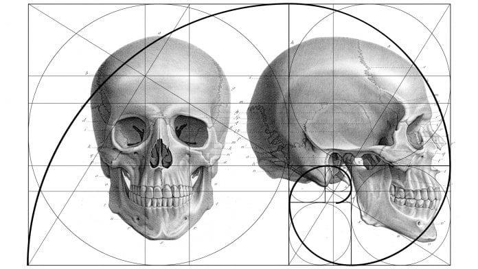
- This magical ratio exists in flowers, leaves, and even within us… in the shape of our skulls!
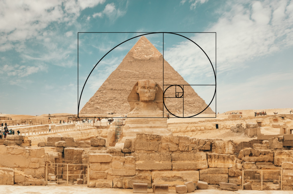
- In architecture, namely, the studies of the Pyramids of Giza (one of the Seven Wonders of The World) have revealed that their design follows the Golden Ratio pattern.
Related: How to Change the Aspect Ratio of Your iMovie Project
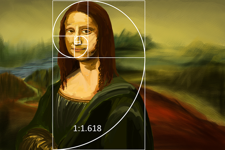
- In the world of art, Leonardo Da Vinci’s iconic masterpiece, The Mona Lisa, is painted to the ratio’s proportions.
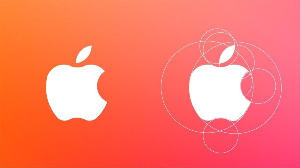
- Similarly, the golden ratio is also in Apple’s graphic design, which has championed its use within its brand logo. This itself is a subtle nod to the Most Beautiful Number in The Universe.
The Fibonacci Sequence
Wondering what the circles are around the Apple logo? What you’re seeing is the work of mathematician Leonardo Fibonacci, who devised a sequence of numbers in which each member is the sum of the previous two. These “spiral geometries” are best approximated through the golden ratio, and run from 1,1,2,3,5,8,13,21,34 to infinity. Therefore, as it turns out, there is never-ending symmetry in nature!
What Do Snails and the Apple Logo Have in Common?
You guessed right: the Fibonacci Sequence!
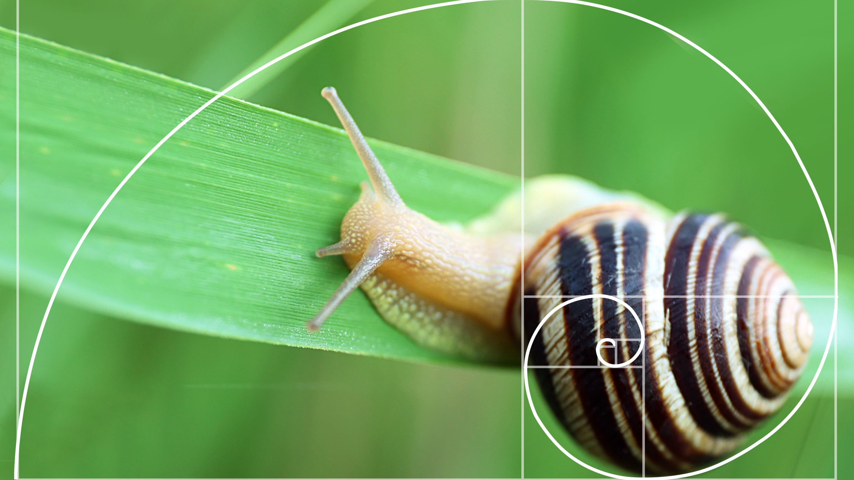
The shell of a snail is as perfectly approximated to the Golden Ratio in nature as the Apple logo is in its proportions.
The shell that you see on a snail is a self-similar object – repeating itself in the same way, but smaller and smaller, and at all scales. Likewise, Apple has used these repetitive spirals in its branding to achieve the same symmetry.
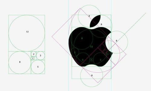
via Edutopia
Using the Fibonacci Sequence and the Golden Ratio together is called The Golden Spiral, most famously used by Salvador Dali in The Sacrament of the Last Supper.

How To Design Keeping The Golden Ratio Pattern in Mind
Before we deep dive into the how of using the golden ratio, let’s first take a short look at the why of using the golden ratio in graphic design.
3 Ways Using the Golden Ratio in Graphic Design Helps Your Images:
- Faster Recognition: Prominent research and studies posit that when the golden ratio is a fundamental element of design, the human eye registers it much quicker than any other design. This is the first call to effective design – attracting eyeballs.
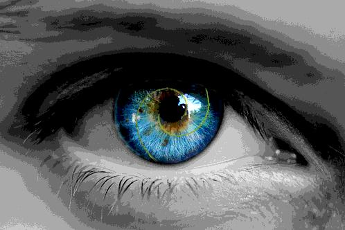
- Visual Balance: What makes you linger on one design and scroll past the next? The answer is consistent – it’s the golden ratio! We are hardwired to prefer images with a perfect harmony of elements. In summary, the golden ratio in graphic design is what makes us stay longer on an image.
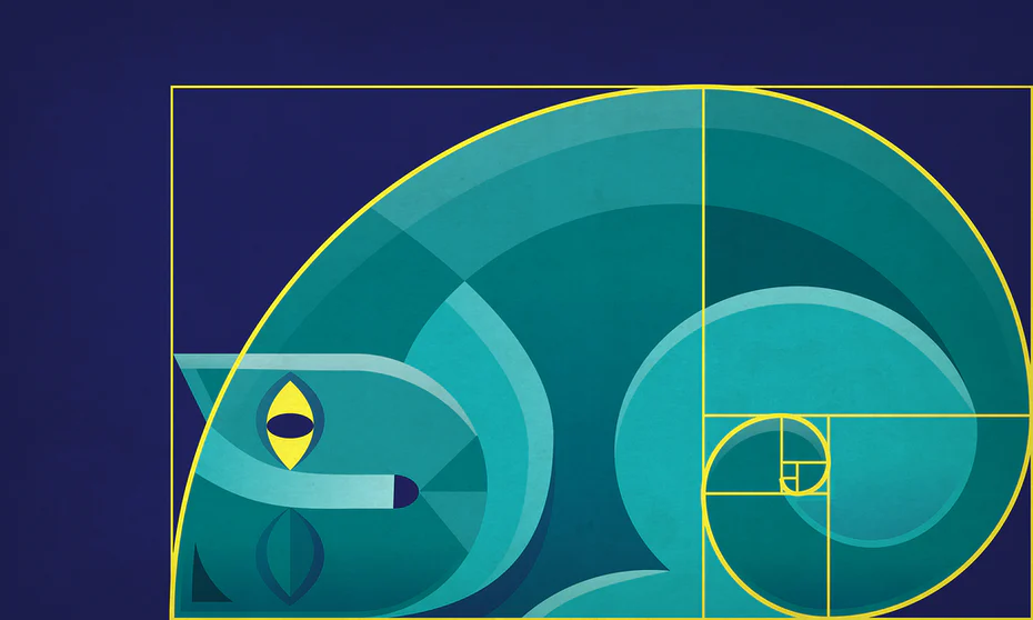
- Perception of Beauty: The application of the golden ratio to gauge symmetry and the alignment of human faces and bodies is well known. What happens when we include this perfect ratio in our designs? The audience is more likely to engage with our brands because of the perception of beauty mirrored in our graphic designs.
The Golden Ratio In Graphic Design: How To Incorporate in Your Process
Think of your brand’s needs when you start designing using the Fibonacci Sequence and the Golden Ratio. Perhaps you want to re-brand your logo for scaling your company? Or you want a more effective logomark that will instantly connect with your brand logo? Either way, we have you covered!
3 Ways You Can Use the Golden Ratio:
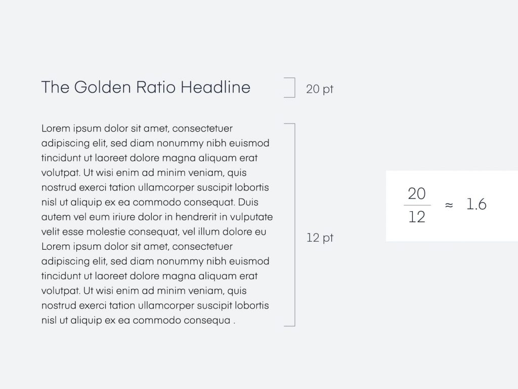
- Typography: The golden ratio is not exclusive to media! You can just as effectively use it to make your type more visually appealing. Moreover, the ratio can help you decide what size font to use for headers, on your landing page, or even a feed advertisement.
Related: How to Use Geometric Patterns Creatively in Graphic Design
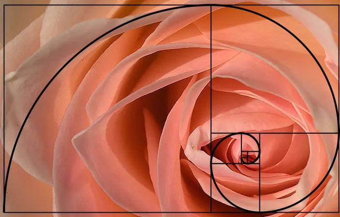
- Cropping and Resizing Images: When you crop images to fit your design, canceling out the negative space is easy by cutting out white borders. How do you know that your resized image carries the same visual attractiveness? We recommend overlaying the Golden Spiral on your image, like below, with the focal point in the middle of the spiral.
- TIP: Start with this Golden Ratio Generator!
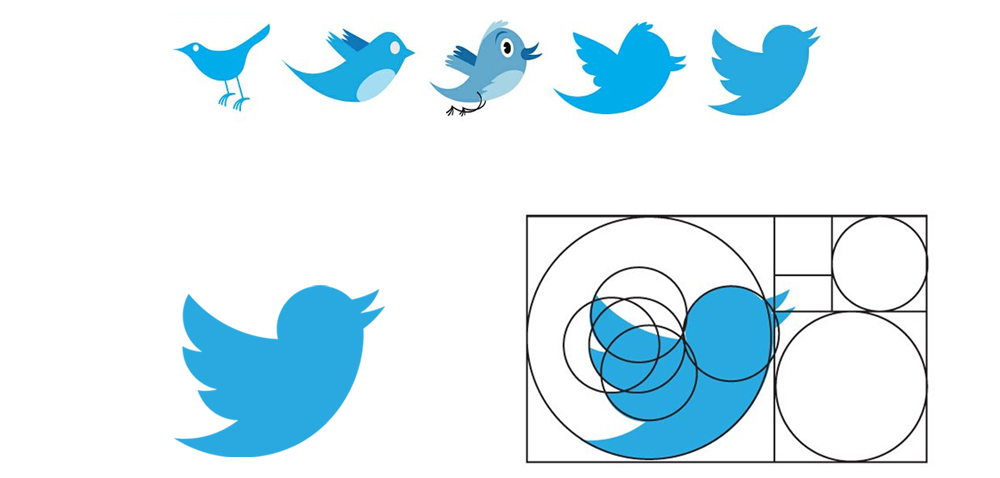
- Brand Logo or Logomark: You can turn to the Golden Ratio whenever you’re stuck and in need of some inspiration. Furthermore, its perfect measurements can guide you on the size and alignment of your logo or logomark. For instance, brands like Apple, Twitter, and Pepsi have successfully done this.
Verdict:
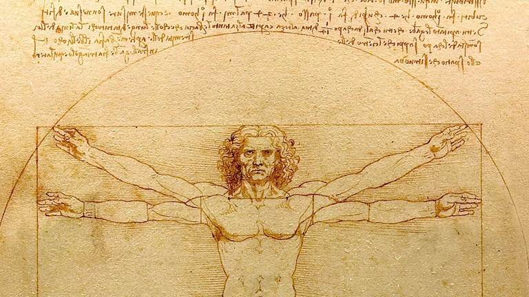
There is no one-size-fits-all when it comes to graphic design – to each their own! However, by using the golden ratio in graphic design, you’ll be following in Da Vinci’s, Dali’s, and Apple’s footsteps. Who are all recognized connoisseurs of art and design.

Finally, to get you started with the Golden Ratio, use this template to create stunning designs on Simplified!


![10 Best AI Image Restoration Tools to Try in 2025 [Free & Paid] 10 Best AI Image Restoration Tools to Try in 2025 [Free & Paid]](https://siteimages.simplified.com/blog/Best-AI-Image-Restoration-Tools-01.png?auto=compress&fit=crop&fm=png&h=400&w=400)
![How to Use Photoshop AI Generative Fill Feature [2025] How to Use Photoshop AI Generative Fill Feature [2025]](https://siteimages.simplified.com/blog/How-to-Use-Photoshop-AI-Generative-Fill-01-1.png?auto=compress&fit=crop&fm=png&h=400&w=400)
![20 Podcast Thumbnail Ideas to Boost Your Show’s Visual Appeal + Best Practices [2025] 20 Podcast Thumbnail Ideas to Boost Your Show’s Visual Appeal + Best Practices [2025]](https://siteimages.simplified.com/blog/Podcast-Thumbnail-Ideas-to-Boost-Your-Show-02-1.png?auto=compress&fit=crop&fm=png&h=400&w=400)


