Background holds immense importance in any creative design. Why? Because it brings completeness to the image, adds context to your illustration, facilitates visual understanding for the audience, and enhances the overall composition.
In essence, backgrounds provide the structural foundation for your images, significantly influencing how they are perceived. Without the right background, your images or illustrations may lack a sense of completeness and personality.
However, selecting the perfect background graphic design can be challenging due to the myriad of composition options available. Interestingly, in this Simplified blog post, you will not only learn when to use a creative use background but also discover which one will effectively convey your message
Bonus: Be Meeting-Ready: 10 Free Zoom Backgrounds You Can Use
How To Level Up Designs With Beautiful Simplified Background
Using beautiful backgrounds enhances the appeal and communicative power of your designs. With Simplified, you can overcome the challenge of starting with a blank page, as the application has varieties of design background ideas. The software will give you the freedom to customize each background by adding colors to your gradients and incorporating text to make it truly yours.
So, how do you get this done? After you sign up on our website, you can choose a preset and easily resize it later to perfectly suit all your social media outlets. Let’s now embark on an exciting background designing experience with Simplified!
1. Solid background designs
Background design help strikes a balance between all elements. Using a flat solid background is an incredibly effective way to create minimalist designs. The most important element to remember when applying solid backgrounds is the mood you want to create. Meanwhile, A contrasting duo of a light and dark color, or perhaps complementary colors from opposite sides of the color wheel, will create impact. While a lighter combination will exude a more calming effect, giving space for text to play a domineering role
Bonus: 6 Tips For Designing Graphics That Are Colorblind Friendly
2. Gradient background designs
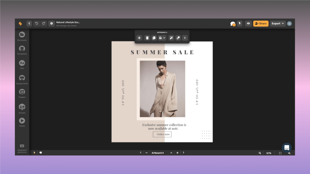
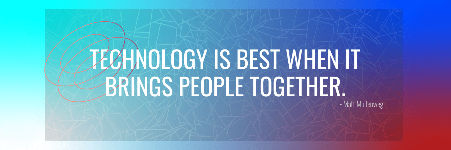
Gradients offer incredible versatility and can be an excellent choice for background design. Using a gradient on digital or print-based projects gives a beautiful design idea. The beauty of a gradient lies in its ability to combine almost any color, whether neutral or bold. Gradients offer a more subtle approach compared to solid or block colors. When applying a radial or linear gradient, you will observe varying effects on your designs. The direction of the gradient directly influences the focal point for your audience.
3. Transparent background designs
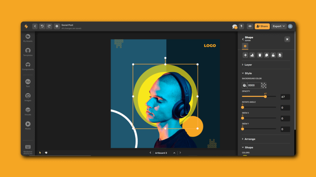
Transparent or background remover is a design element that allows the underlying content to show through. More so in design, simplicity often holds the key to effective techniques. By increasing the transparency of your background, you can reduce unnecessary details and make the foreground elements easier to read. Meanwhile, one common mistake people make is using too much transparency, so it’s important to apply it wisely. However, you need to improve your text by adjusting the transparency without making the background image too faint. Otherwise, your design will appear dull and weak.
4. Illustrated backgrounds Design
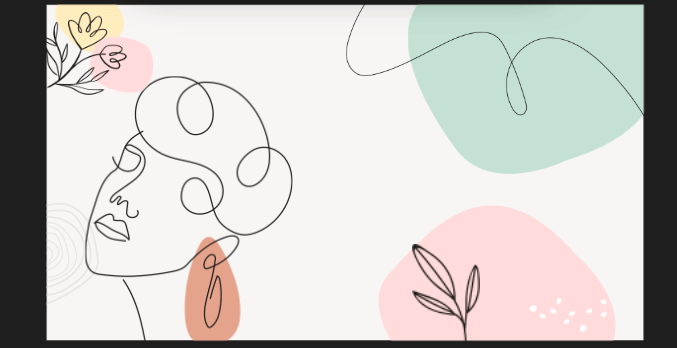
Background texture designs with illustrations are visually appealing and engaging for your readers. One advantage is that these illustrations can be customized to match the content of your design. They work particularly well for a younger audience, as they have a playful and easily understandable design style compared to other background techniques. However, it’s important to be cautious with illustrations as they can overwhelm your design and distract from your content. To prevent this, you can follow the rule of thirds when placing icons and elements. This guideline helps maintain a sense of balance and hierarchy.
5. White background design

A white background is a clean and minimalistic design choice that utilizes a plain white canvas as the backdrop for your content. This beautiful background design helps you to simplify your design by appreciating the power of white space. When your design feels crowded or overwhelmed with elements, remember to streamline it. Avoid adding images and elements just to fill up space. Instead, consider using a white background to enhance your perception and draw attention to important elements in your design. In addition to being a current trend, minimal design requires you to invest more effort into the other features on the page.
6. Image backgrounds design
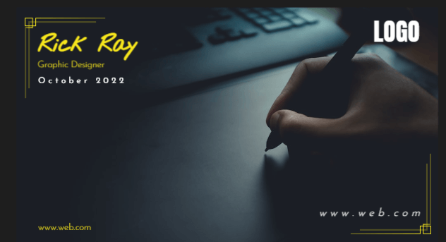
First, we need to establish that Images serve as striking backgrounds design when placed correctly rather than just accompanying your graphic elements. Background design colors create depth and contrast, furthermore allowing designs to stand out and grab the attention of the audience. Creating an image background helps your audience quickly and immediately relate your message visually.
Simplified Tip: Sometimes, an image as a design background can clash with font colors and make it difficult to read what’s on the page. Make sure to use colors trends that are easy to read against your background image.
7. Pattern backgrounds design
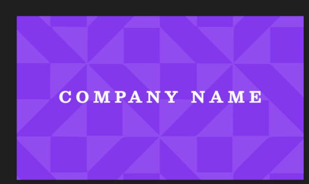
Patterned backgrounds involve the use of repetitive elements or motifs to create visually appealing designs. They range from simple geometric shapes to intricate patterns. These backgrounds add visual interest and enhance the overall aesthetic of your design. Patterns bring energy, texture, and depth, creating a captivating composition. When selecting a pattern background, ensure it complements your design elements without overpowering them. Strike a balance that allows the pattern to enhance your design without distracting from its focal points.
Bonus: 15 Websites With Beautifully Patterned Backgrounds
Key Takeaway
When selecting background designs, it is crucial to prioritize simplicity and thoughtful use of design elements. Whether you prefer a white background or a patterned one, the goal is to create visually appealing designs that effectively convey your intended message. It is important to avoid overcrowding your background designs with excessive elements. Additionally, maintaining a balance between design elements, regardless of the background choice, ensures that they work harmoniously to convey the desired message.
It is worth noting that Simplified has been customized to meet these requirements for you. Our advanced editing tools, including layering, blending modes, and filters, offer additional possibilities to enhance your background designs. These tools empower you to explore creative options and take your designs to the next level. Try any of our templates today to bring your various creative designs alive! Try any of our templates today to bring your various creative designs alive!


![10 Best AI Image Restoration Tools to Try in 2025 [Free & Paid] 10 Best AI Image Restoration Tools to Try in 2025 [Free & Paid]](https://siteimages.simplified.com/blog/Best-AI-Image-Restoration-Tools-01.png?auto=compress&fit=crop&fm=png&h=400&w=400)
![How to Use Photoshop AI Generative Fill Feature [2025] How to Use Photoshop AI Generative Fill Feature [2025]](https://siteimages.simplified.com/blog/How-to-Use-Photoshop-AI-Generative-Fill-01-1.png?auto=compress&fit=crop&fm=png&h=400&w=400)
![20 Podcast Thumbnail Ideas to Boost Your Show’s Visual Appeal + Best Practices [2025] 20 Podcast Thumbnail Ideas to Boost Your Show’s Visual Appeal + Best Practices [2025]](https://siteimages.simplified.com/blog/Podcast-Thumbnail-Ideas-to-Boost-Your-Show-02-1.png?auto=compress&fit=crop&fm=png&h=400&w=400)


