
When it comes to the world of design, communicating ideas from an expert to a rookie may seem like a total language barrier. With technical jargon like ‘CMYK’ and ‘Kerning,’ it is safe to say that any non-designer may feel discouraged due to their unfamiliarity with certain vocabulary. However, don’t worry because we are here to make this task much more Simplified! In this blog, we’ll take you through 20 essential social media design terms to serve as your beginner’s glossary.
Moreover, feel free to save this page like a dictionary for all future references. So let’s get learning!
1. Logo
A representative component of branding that uses a graphic design, symbol, or text. Further, we can say that it is an element that promotes visual recognition across all your products and creatives.
2. Typography
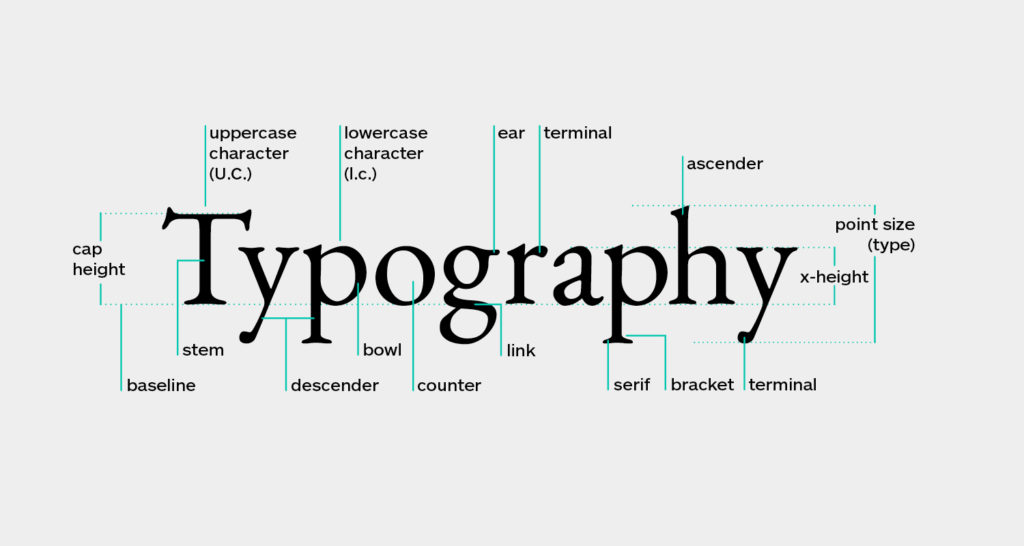
The artistic arrangement of text, according to a given style, format, spacing, etc. Additionally, it primarily includes four types: Serif, Sans Serif, Script, and Slab Serif.
Related: Design Terms: A Must Read for Beginners!
3. Balance
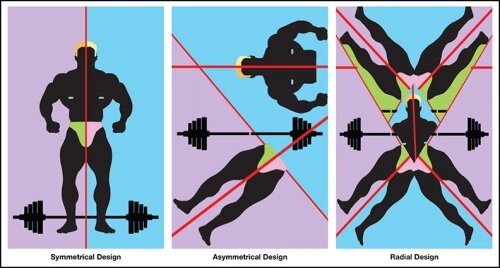
In social media design terms, balance refers to the distribution of graphic elements along any hypothetical line- Symmetrical, Asymmetrical, or Radial.
4. Negative Space
Also known as White Space, it is the intentional use of vacant areas around a design that allows graphic elements to “breathe better.” Moreover, they are devoid of all types of logos, text, images, or any other visual content.
So, check out how you can make use of negative space in your web design!
5. Contrast
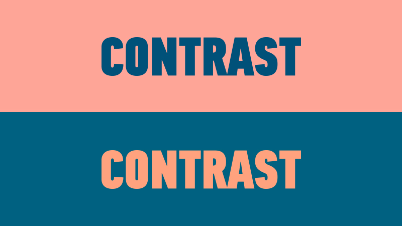
It is the level of difference between any two visual elements of design. In most cases, it comes up through measurable opposites, especially with colors in black vs. white.
6. Icon
In simple words, it is a symbol that represents your branding identity, usually as a part of the brand logo; For example, the flame icon for Tinder
Simplified Design Tip: Did you know with your Simplified workspace, you have access to tons of icons to include in your marketing assets? Go to ‘Visuals‘ on your workspace, and choose from the listed categories!
8. Vector File
A flexible and infinitely stretchable file (Encapsulated PostScript) used by designers that synthesize lines, curves, and points. Thus, making it a perfect option for all your printing needs!
9. DPI
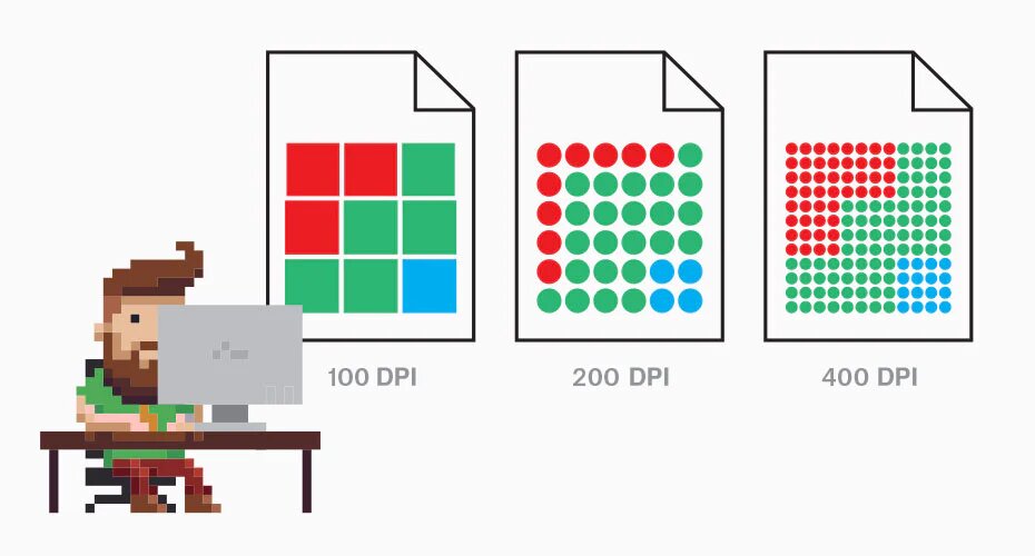
DPI is a unit of measurement that stands for ‘Dots Per Inch,’ indicating the resolution quality of a given image.
10. PPI
A synonymous type of resolution measure, but denotes ‘Pixels Per Inch.’ Ideally, the print recommendation used by designers is 300 PPI.
11. Weight
The level of ‘boldness,’ or in Simplified words, the amount of thickness of any font, ranging from 100-900.
12. CMYK
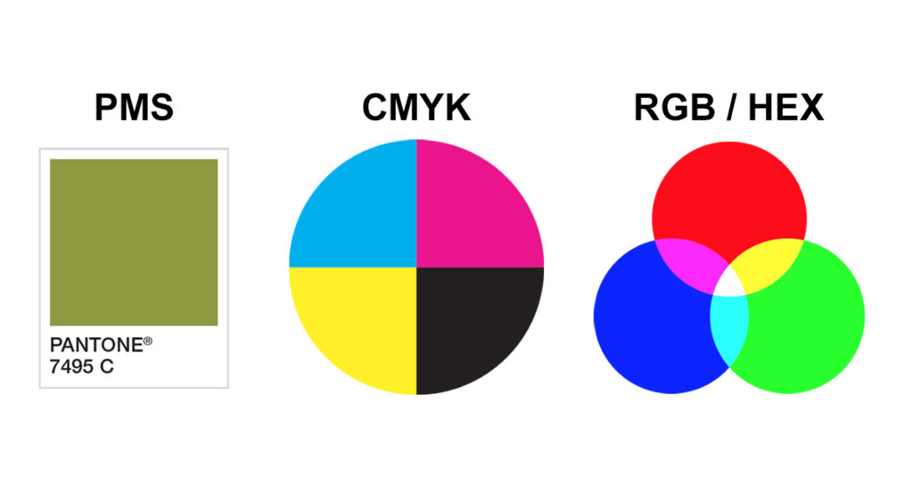
CMYK, or ‘Cyan-Magenta-Yellow-Key,’ is simply a color model used for printing purposes. It is obtainable by removing the primary color wheel, starting with white and ending in black.
Related: What Is Balance In Graphic Design And Why Is It Important?
13. Alignment
It refers to the positioning of any element, especially text, to the left, center, or right side of any design. Want to achieve a more balanced look? Align your design elements with the margins in mind!
14. RGB
A fundamental color model using the primary colors in the color wheel, i.e., Red-Green-Blue, to produce more variations.
15. Saturation
Saturation is a commonly used social media design term for any Instagram feed-curator and the fans of aesthetic edits. It refers to the intensity of colors visible in any given picture. In other words, low saturation: dark and faded; high saturation: bright and loud colors.
Check out our 10 favorite photo-editing apps that perfectly execute these social media design terms!
16. Hue
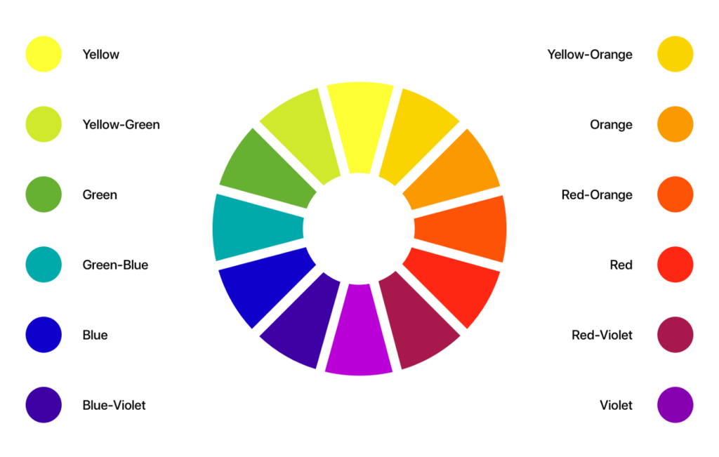
The purest form, or shade, of any color that one can perceive in their design.
17. Opacity
It is the degree of transparency of an image, ranging from entirely invisible (low opacity) to pure solid (high opacity).
18. Kerning
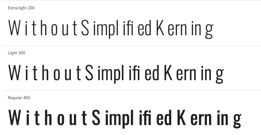
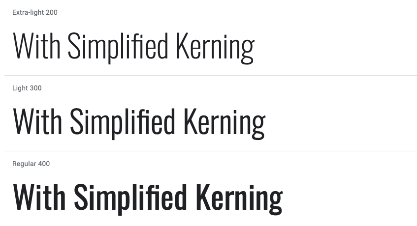
Though the word may sound a tad bit weird, it is pretty commonly used in typography and refers to the space between characters to produce a visually pleasing and readable body of text.
19. Pantone
It is the most widely used system of color by the Pantone Corporation, with swatches, color palettes, codes, etc., for mixing or design purposes in a color wheel.
20. Proximity
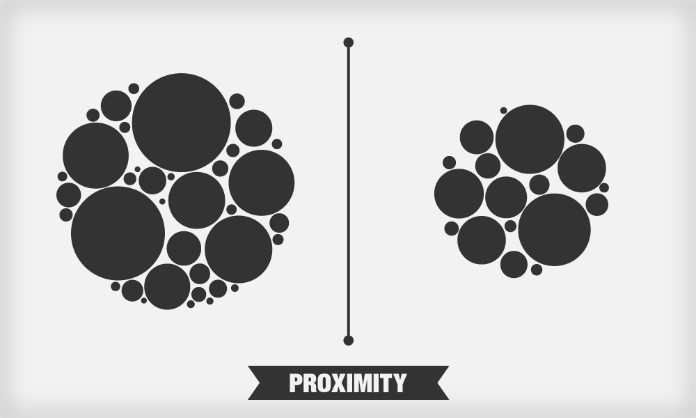
The level of closeness between two or more design elements. For example, in social media design terms, it can be how closely placed or far away your GIFs and text boxes are from each other.


![10 Best AI Image Restoration Tools to Try in 2025 [Free & Paid]](https://siteimages.simplified.com/blog/Best-AI-Image-Restoration-Tools-01.png?auto=compress&fit=crop&fm=png&h=400&w=400 "10 Best AI Image Restoration Tools to Try in 2025 [Free & Paid]")
![How to Use Photoshop AI Generative Fill Feature [2025]](https://siteimages.simplified.com/blog/How-to-Use-Photoshop-AI-Generative-Fill-01-1.png?auto=compress&fit=crop&fm=png&h=400&w=400 "How to Use Photoshop AI Generative Fill Feature [2025]")
![20 Podcast Thumbnail Ideas to Boost Your Show’s Visual Appeal + Best Practices [2025]](https://siteimages.simplified.com/blog/Podcast-Thumbnail-Ideas-to-Boost-Your-Show-02-1.png?auto=compress&fit=crop&fm=png&h=400&w=400 "20 Podcast Thumbnail Ideas to Boost Your Show’s Visual Appeal + Best Practices [2025]")


