Graphic design is an art form that thrives on creativity, symbolism, and the power to bring out emotions. Among the various elements at a designer’s disposal, foliage stands out as a versatile and captivating choice.
In this article, Simplified will be your guide, demonstrating numerous ways to use foliage to your advantage.
Simplified also has a variety of design templates that are easily accessible for FREE!
So, read on.
What is Foliage?
In graphic design, foliage can refer to the depiction or representation of leaves, branches, and greenery in various forms. It’s often used to create realistic or artistic natural elements in digital or visual media, such as video games, illustrations, or 3D modeling.
Designers and artists may use foliage textures, brushes, or elements to enhance the visual appeal of their creations, particularly when creating outdoor or nature-related scenes.
One of the most widely recognized instances of foliage in design is undoubtedly the fall season. From jack-o’-lanterns and pumpkin spice lattes to the hand-lettering on coffee cup sleeves, it seems like every social media post from October through November celebrates the essence of autumn.
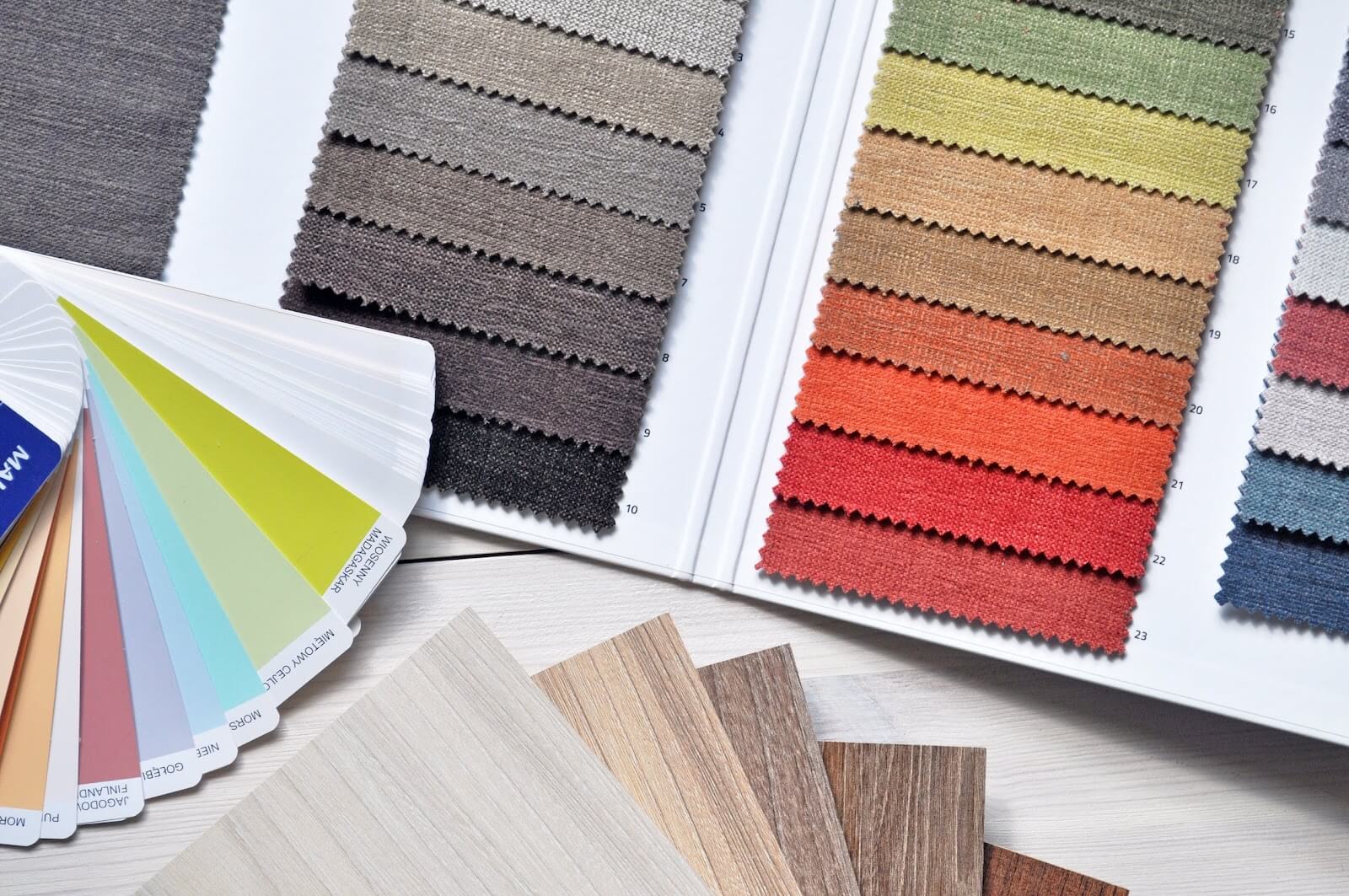
Furthermore, the color palettes used in the creative designs for this time of year often incorporate browns, beige, green, and orange, evoking images of rustling leaves and, naturally, the cozy embrace of sweater weather.
Psychologists suggest that elements like falling leaves, shorter days, and cooler temperatures, combined with the quintessential fall color palette, are advantageous in creative branding.
Bonus: 5 Golden Rules of Crafting Creative Logos: Welcome to the World of Creative Logo Design!
Color Palette and Mood
Source: Pexels
These elements have the potential to bring out feelings of happiness and overall well-being among the audience.
- Brown: This color symbolizes stability, health, and comfort. It represents the grounding feeling of being close to nature. When using brown in foliage design, it can evoke a sense of reliability and well-being. Making it an excellent choice for brands that want to convey reliability and a sense of well-being.
- Green: The color green is associated with growth and peace, making it ideal for brands that want to promote environmental consciousness or a sense of tranquility. It’s commonly used in foliage design to convey environmental consciousness, tranquility, and a connection to the natural world. Green can make viewers feel refreshed and at one with nature.
- Yellow: Yellow is known for representing happiness and energy. When used in foliage design, it can infuse a sense of positivity and liveliness. It’s a color that grabs attention and radiates warmth, making it suitable for designs that want to convey a sunny disposition.
- Orange: Orange is often linked to fun and playfulness, making it a suitable option for brands that want to create a lively and cheerful brand identity. In foliage design, orange can add a playful twist to the natural elements, making the design feel vibrant and exciting.
By incorporating these fall-inspired colors into their branding, businesses can tap into these psychological associations to connect with their audience on a deeper emotional level. Luckily, Simplified has customizable design templates for businesses that will enable them to design everything from the official website to social media ads.
Bonus: Top 17 Illustrators On Instagram You Should Be Following Right Now
Types of Foliage

Source: Pexels
When we delve into the world of foliage in graphic design, it’s essential to understand the various types of foliage elements that designers can incorporate into their projects.
Foliage, in this context, includes leaves, trees, plants, and branches, each offering a unique set of visual possibilities.
Leaves: Leaves are one of the most common and versatile foliage elements used in graphic design. They come in a myriad of shapes, sizes, and textures.
From the elegant and elongated leaves of the palm tree to the intricate, serrated edges of oak leaves, there’s a leaf for every design need.
They can be arranged in patterns, used as decorative elements, or even serve as the primary focus of a design.
Trees: Trees are emblematic of nature’s grandeur, and their inclusion in graphic design can create a sense of scale, majesty, and stability. The silhouette of a mighty oak or the delicate branches of a cherry blossom tree can evoke various emotions and themes in your design.
Plants: The world of plants provides an endless array of foliage options. From lush, tropical greenery to delicate wildflowers, the choice of plants can significantly influence the atmosphere of a design. Plants can be used to create intricate borders, add depth to illustrations, or convey a sense of natural abundance.
Branches: Branches can be particularly useful for framing or adding structure to a design. The twisting, winding forms of branches can create visually interesting compositions, whether they’re used to encircle text or create a dynamic visual flow.
Bonus: 5 Major Distinctions Between Art And Design You May Not Know
Where to Use Foliage?
Now let’s see how these elements can be used in different design applications.
Backgrounds and Textures

Foliage can be used to craft captivating backgrounds, whether it’s a forest of trees for a website header or a subtle leaf pattern for a brochure. These backgrounds can establish a visual theme and set the tone for the entire design.
Logos and Branding

Many businesses and organizations, especially those focused on nature, sustainability, or wellness, incorporate foliage into their logos. Foliage elements can symbolize growth, health, or environmental consciousness, providing a strong visual identity. Luckily, there’s a wide variety of designs and templates to choose from on Simplified that will make your foliage logo stand out.
Illustrations and Artwork
Source: Keeley Sherman
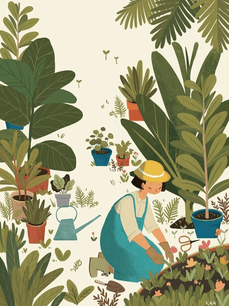
Foliage can breathe life into illustrations and artwork. From creating lush landscapes to adding intricate details to character designs, foliage enhances the visual storytelling of various projects.
User Interfaces
Source: Pinterest
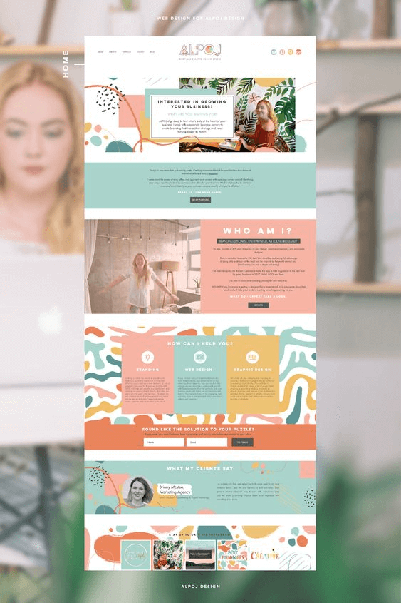
In the realm of user interface (UI) design, foliage elements can soften digital interfaces and provide a sense of familiarity. They are often used in apps related to gardening, hiking, or travel to create visually appealing and immersive experiences.
Print Materials
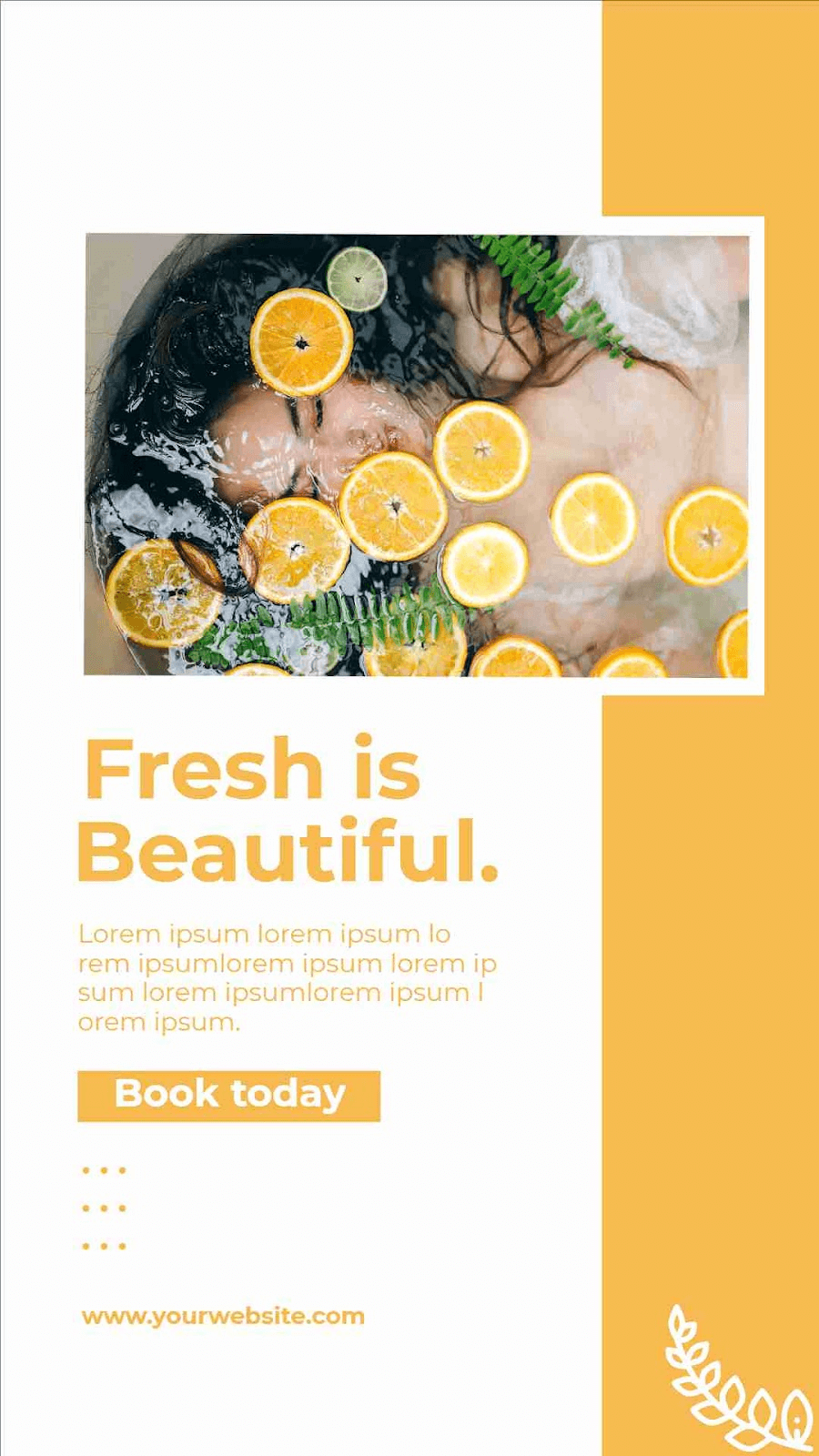
Foliage can elevate printed materials such as brochures, flyers, or catalogs. It adds a touch of natural beauty and can be particularly effective for businesses in the outdoor or environmental sector, reinforcing their brand identity.
Social Media Graphics

Foliage can make social media posts and graphics stand out, especially for seasonal promotions or content related to nature and wellness. It captures the essence of a particular season or mood, making posts more engaging.
Bonus: 15 Poster Design Ideas (and Templates) for Event Marketing
Practical Tips

Source: Pexels
Now that we’ve explored the creative possibilities and psychological impact of foliage in design, it’s essential to dive into some practical tips for designers looking to incorporate foliage elements seamlessly and effectively into their projects.
Context
Before integrating foliage, think about the context of your design. What message or mood are you trying to convey? Foliage can evoke various emotions, so choose elements and colors that align with your design’s purpose.
Balance and Composition
Pay attention to the balance and composition of foliage elements. They should enhance the overall design without overwhelming it. Consider the placement and scale of foliage to create visual harmony.
Texture and Detail
Foliage often contains intricate details. Ensure that these details are retained, especially when using foliage in illustrations or textures. They can add depth and realism to your design.
Color Harmony
Harmonize the colors of your foliage with the overall color palette of your design. A well-coordinated color scheme can make the design more visually appealing and cohesive.
Responsive Design
If your design will be viewed on various devices, consider how foliage elements will adapt to different screen sizes. Ensure that they remain visually appealing and functional across all platforms.
Authenticity
When using foliage textures or images, opt for high-quality, authentic sources. Realistic and high-resolution foliage elements contribute to the overall quality of the design.
Feedback and Testing
Seek feedback from colleagues or target users to gauge the effectiveness of your foliage design. Testing can help identify any issues with usability or visual impact.
Resources
Familiarize yourself with design resources that offer foliage graphics, textures, and brushes. These can save time and provide valuable assets for your projects.
Examples of Foliage in Designs
To truly appreciate the impact of foliage in graphic design, let’s explore some real-world case studies where designers have masterfully incorporated foliage elements to create compelling and memorable visuals.
Bonus: Fun Ideas Of Earth Illustrations To Use In Your Next Design
National Park Branding
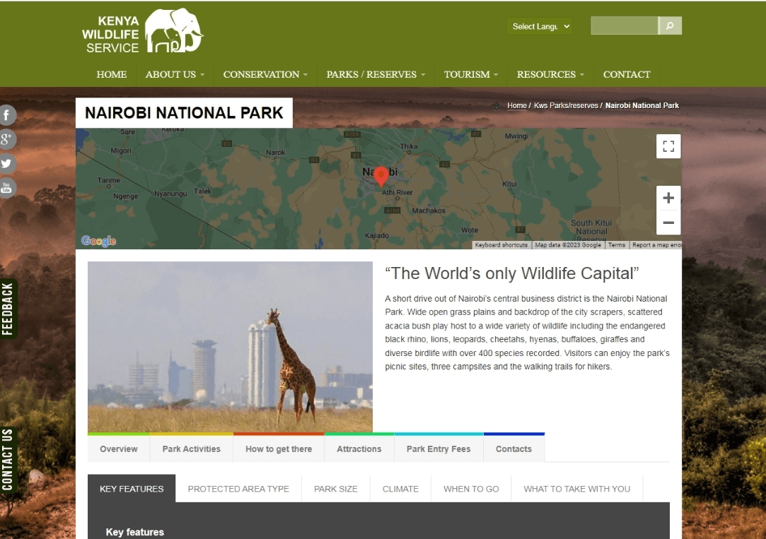
Source: Kenya Wildlife Service
In the branding of a national park, designers integrated various foliage elements, including lush greenery and trees, into the logo and promotional materials. This effectively conveyed the park’s commitment to preserving natural beauty and providing a serene, eco-friendly environment for visitors.
Seasonal Coffee Campaign

Source: Pexels
A coffee brand launched a seasonal campaign for autumn. Foliage, including leaves in vibrant shades of red, orange, and brown, was used extensively in their advertising materials, evoking the cozy feeling of sipping coffee amid falling leaves. This campaign successfully capitalized on the emotional connection people have with autumn and its colors.
Gardening App
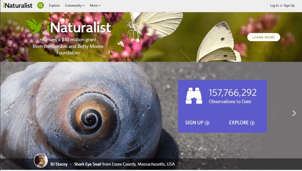
Source: iNaturalist
An app for gardening enthusiasts incorporated foliage elements such as plant leaves and vines into its user interface design. This not only made the app visually appealing but also enhanced the user experience by creating an immersive garden-like environment.
Environmental Nonprofit Brochure
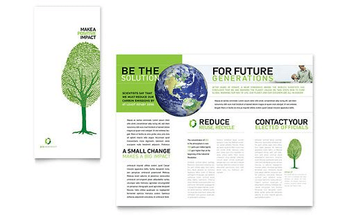
Source: Pinterest
An environmental nonprofit organization designed a brochure to raise awareness about conservation efforts. They used images of vibrant green leaves and trees to emphasize their commitment to preserving nature. The foliage imagery conveyed a sense of hope and growth, aligning with their mission.
Wellness Retreat Website

Source: Healing Holidays
A wellness retreat website integrated calming foliage backgrounds featuring shades of green and blue. This design choice immediately conveyed a sense of serenity and rejuvenation, appealing to individuals seeking relaxation and inner peace
Bonus: 10 Of The Best Logo Makers To Kickstart Your Branding
Conclusion
Foliage, as highlighted in this article, holds significant importance in the design realm. To make your creative journey easier, Simplified offers a range of customizable logo templates, social media posts, and more. The best part? Simplified is absolutely free for individuals!


![10 Best AI Image Restoration Tools to Try in 2025 [Free & Paid] 10 Best AI Image Restoration Tools to Try in 2025 [Free & Paid]](https://siteimages.simplified.com/blog/Best-AI-Image-Restoration-Tools-01.png?auto=compress&fit=crop&fm=png&h=400&w=400)
![How to Use Photoshop AI Generative Fill Feature [2025] How to Use Photoshop AI Generative Fill Feature [2025]](https://siteimages.simplified.com/blog/How-to-Use-Photoshop-AI-Generative-Fill-01-1.png?auto=compress&fit=crop&fm=png&h=400&w=400)
![20 Podcast Thumbnail Ideas to Boost Your Show’s Visual Appeal + Best Practices [2025] 20 Podcast Thumbnail Ideas to Boost Your Show’s Visual Appeal + Best Practices [2025]](https://siteimages.simplified.com/blog/Podcast-Thumbnail-Ideas-to-Boost-Your-Show-02-1.png?auto=compress&fit=crop&fm=png&h=400&w=400)


